Button Background in Kotlin Android
There is a default style for a Button in Android, but it may not fit your application theme. In this Android Tutorial, we shall present you on ways to create custom design for Button background.
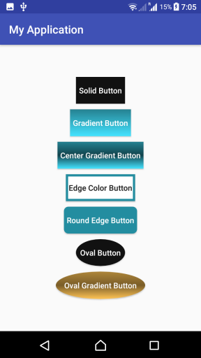
In the following screenshot will have custom Button designs that we shall create in this tutorial.
Create Custom Button Background in Kotlin Android
Following are the steps in creating a custom background drawable for a Button in Android.
Step 1: Create a drawable xml file in /app/res/drawable/ folder. Say button_background.xml
Step 2: Mention the shape of drawable, and its properties in the xml. An example would be as shown in the following.
button_background.xml
<?xml version="1.0" encoding="utf-8"?>
<shape xmlns:android="http://schemas.android.com/apk/res/android"
    android:shape="rectangle">
    <gradient android:startColor="#777"
        android:centerColor="#000"
        android:endColor="#444"
        android:angle="90" />
    <corners android:radius="2dp" />
    <stroke android:width="6px" android:color="#cc9b0a" />
</shape>
Step 3: Create a button in the layout xml file and provide the drawable, button_background.xml as background. Example code snippet is shown in the following.
<Button
    android:layout_width="wrap_content"
    android:layout_height="wrap_content"
    android:background="@drawable/button_background"
    android:textColor="#FFFFFF"
    android:layout_margin="5dp"
    android:padding="5dp"
    android:textAllCaps="false"
    android:text="Custom Button"/>
Step 4: You may change some properties of the Button like padding, margin, textColor etc., for a proper look and to suit your application theme.
Example Kotlin Android Application details for customizing Button Backgrounds
Following are the layout file, Activity file and drawable resources that could generate the buttons shown at the starting of the tutorial.
res/drawable/btn_solid_color.xml
<?xml version="1.0" encoding="utf-8"?>
<shape xmlns:android="http://schemas.android.com/apk/res/android"
    android:shape="rectangle" android:tint="#111">
</shape>
res/drawable/btn_gradient.xml
<?xml version="1.0" encoding="utf-8"?>
<shape xmlns:android="http://schemas.android.com/apk/res/android"
    android:shape="rectangle">
    <gradient android:startColor="#44e3ff"
        android:endColor="#258191"
        android:angle="90" />
</shape>
res/drawable/btn_center_gradient.xml
<?xml version="1.0" encoding="utf-8"?>
<shape xmlns:android="http://schemas.android.com/apk/res/android"
    android:shape="rectangle">
    <gradient android:startColor="#44e3ff"
        android:centerColor="#12434c"
        android:endColor="#258191"
        android:angle="90" />
</shape>
res/drawable/btn_edge_color.xml
<?xml version="1.0" encoding="utf-8"?>
<shape xmlns:android="http://schemas.android.com/apk/res/android"
    android:shape="rectangle">
    <gradient android:startColor="#FFFFFF"
        android:endColor="#FFFFFF"
        android:angle="90" />
    <stroke android:width="4dp" android:color="#238da0" />
</shape>
res/drawable/btn_round_edge.xml
<?xml version="1.0" encoding="utf-8"?>
<shape xmlns:android="http://schemas.android.com/apk/res/android"
    android:shape="rectangle">
    <gradient android:startColor="#FFFFFF"
        android:endColor="#FFFFFF"
        android:angle="90" />
    <stroke android:width="4dp" android:color="#238da0" />
</shape>
res/drawable/btn_oval.xml
<?xml version="1.0" encoding="utf-8"?>
<shape xmlns:android="http://schemas.android.com/apk/res/android"
    android:shape="oval">
    <gradient android:startColor="#111"
        android:endColor="#111"
    />
</shape>
res/drawable/btn_oval_gradient.xml
<?xml version="1.0" encoding="utf-8"?>
<shape xmlns:android="http://schemas.android.com/apk/res/android"
    android:shape="oval">
    <gradient android:startColor="#ffc456"
        android:centerColor="#7a5d28"
        android:endColor="#ad853a"
        android:angle="90"
    />
</shape>
Till now are the drawable resources that we are going to use as background for buttons. You may choose only one or some of these in your project, and discard the rest. Accordingly make changes in the layout file.
You may also change the colors, or other values like stroke widths, border radius, etc., based on the requirement.
activity_custom_button.xml
<?xml version="1.0" encoding="utf-8"?>
<LinearLayout xmlns:android="http://schemas.android.com/apk/res/android"
    xmlns:tools="http://schemas.android.com/tools"
    android:layout_width="match_parent"
    android:layout_height="match_parent"
    android:orientation="vertical"
    android:gravity="center"
    tools:context="com.tutorialkart.myapplication.CustomButtonActivity">

    <Button
        android:layout_width="wrap_content"
        android:layout_height="wrap_content"
        android:background="@drawable/btn_solid_color"
        android:textColor="#FFFFFF"
        android:layout_margin="5dp"
        android:padding="5dp"
        android:textAllCaps="false"
        android:text="Solid Button"/>
    <Button
        android:layout_width="wrap_content"
        android:layout_height="wrap_content"
        android:background="@drawable/btn_gradient"
        android:textColor="#FFFFFF"
        android:layout_margin="5dp"
        android:padding="5dp"
        android:textAllCaps="false"
        android:text="Gradient Button"/>
    <Button
        android:layout_width="wrap_content"
        android:layout_height="wrap_content"
        android:background="@drawable/btn_center_gradient"
        android:textColor="#FFFFFF"
        android:layout_margin="5dp"
        android:padding="5dp"
        android:textAllCaps="false"
        android:text="Center Gradient Button"/>

    <Button
        android:layout_width="wrap_content"
        android:layout_height="wrap_content"
        android:background="@drawable/btn_edge_color"
        android:layout_margin="5dp"
        android:padding="5dp"
        android:textAllCaps="false"
        android:text="Edge Color Button"/>

    <Button
        android:layout_width="wrap_content"
        android:layout_height="wrap_content"
        android:background="@drawable/btn_round_edge"
        android:textColor="#FFFFFF"
        android:layout_margin="5dp"
        android:padding="5dp"
        android:textAllCaps="false"
        android:text="Round Edge Button"/>

    <Button
        android:layout_width="wrap_content"
        android:layout_height="wrap_content"
        android:background="@drawable/btn_oval"
        android:textColor="#FFFFFF"
        android:layout_margin="5dp"
        android:padding="5dp"
        android:textAllCaps="false"
        android:text="Oval Button"/>

    <Button
        android:layout_width="wrap_content"
        android:layout_height="wrap_content"
        android:background="@drawable/btn_oval_gradient"
        android:textColor="#FFFFFF"
        android:layout_margin="5dp"
        android:padding="15dp"
        android:textAllCaps="false"
        android:text="Oval Gradient Button"/>

</LinearLayout>
CustomButtonActivity.kt
package com.tutorialkart.myapplication

import android.support.v7.app.AppCompatActivity
import android.os.Bundle

class CustomButtonActivity : AppCompatActivity() {

    override fun onCreate(savedInstanceState: Bundle?) {
        super.onCreate(savedInstanceState)
        setContentView(R.layout.activity_custom_button)
    }
}
Run this application, and you would get the following output on your Android Screen.
Conclusion
In this Kotlin Android Tutorial, we have learnt how to set custom backgrounds to Button widget in Android using Kotlin.