 TutorialKart.com
Julia Plots with Plots.jl
Plots are used to visualize numerical data. In Julia, the Plots.jl package provides a common interface for line plots, scatter plots, bar charts, and other chart types.
This tutorial explains how to install Plots.jl, draw a 2D plot with the GR backend, add points, label the axes, set a title, control the legend and aspect ratio, and save the plot.
Install the Plots.jl Package
You have to install Plots.jl package in Julia if you have already not installed.
To install Plots.jl, add “Plots” package using Pkg as shown below:
julia> using Pkg

julia> Pkg.add("Plots")
   Cloning default registries into C:\Users\TutorialKart\.julia\registries
   Cloning registry General from "https://github.com/JuliaRegistries/General.git"
 Resolving package versions...
 Installed Missings ??????????? v0.4.0
 Installed PlotThemes ????????? v0.3.0
 Installed FixedPointNumbers ?? v0.5.3
 . . .
 Building GR ???? `C:\Users\TutorialKart\.julia\packages\GR\shnUy\deps\build.log`
 Building Plots ? `C:\Users\TutorialKart\.julia\packages\Plots\qh1wV\deps\build.log`
The exact installation output depends on the Julia, operating-system, and package versions. The first using Plots command may take longer while Julia loads and precompiles the package.
Create a 2D Julia Plot with GR
In this example, we shall draw a 2D plot in Julia.
Plots package supports multiple backend libraries that actually do the drawing which implement the same API ofcourse. In this example, we will use GR module. GR is essentially based on an implementation of a Graphical Kernel System (GKS) and OpenGL.
Plots.jl sends plotting instructions to a rendering backend. GR is the default backend in current Plots.jl installations, and gr() selects it explicitly.
script.jl
using Plots

#data to plot
globaltemperatures = [14.4, 14.5, 14.8, 15.2, 15.5, 15.8];
numindustries = [17, 400, 5000, 15000, 20000, 45000];

#use GR module
gr();

#plot
plot(numpirates, globaltemperatures, label="line")
Output
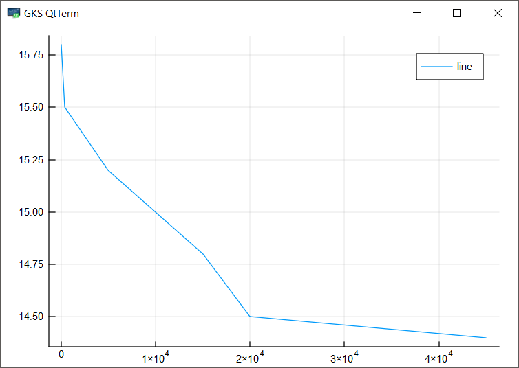
The original example has a variable-name mismatch: it defines numindustries but calls plot() with numpirates. Use the defined variable when running the code:
plot(numindustries, globaltemperatures, label="line")The first collection supplies the x-values and the second supplies the y-values. Both collections must contain the same number of elements.
Add Scatter Points to an Existing Julia Plot
Let us now add small circles at the points.
We shall use scatter() function. Using ! in scatter!() makes scatter! a mutating function, indicating that the scattered points will be added onto the pre-existing plot.
Functions ending in ! modify the current plot. Therefore, scatter!() overlays points on the existing line instead of opening a separate plot.
script.jl
using Plots

#data to plot
globaltemperatures = [14.4, 14.5, 14.8, 15.2, 15.5, 15.8];
numindustries = [17, 400, 5000, 15000, 20000, 45000];

#use GR module
gr();

#plot
plot(numpirates, globaltemperatures, label="line")
#add points
scatter!(numpirates, globaltemperatures, label="points")
Output
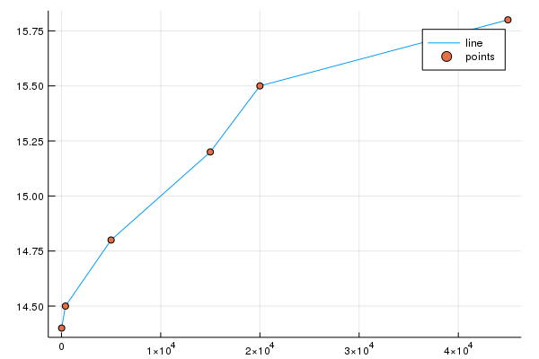
The same variable-name correction applies to both calls in this sample. You can also draw a line with circular markers in one call.
plot(numindustries, globaltemperatures; label="Temperature", marker=:circle)Add X-Axis and Y-Axis Labels in Plots.jl
Let us complete this plot with all the basic information. We will add labels to X and Y axes using xlabel() and ylabel() functions.
script.jl
using Plots

#data to plot
globaltemperatures = [14.4, 14.5, 14.8, 15.2, 15.5, 15.8];
numindustries = [17, 400, 5000, 15000, 20000, 45000];

#use GR module
gr();

#plot
plot(numindustries, globaltemperatures, label="line")
#add points
scatter!(numindustries, globaltemperatures, label="points")

#adding labels to plot
xlabel!("Number of Industries")
ylabel!("Global Temperature (°C)")

#save plot
png("C:\\plot")
X and Y labels are added to the plot.
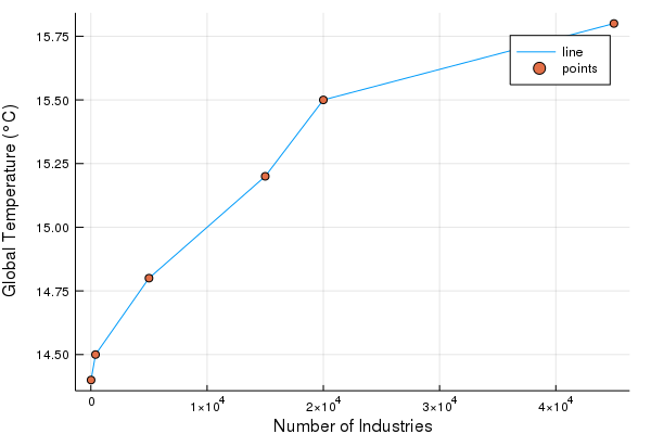
You can also provide axis labels as keyword arguments in the initial plotting call.
plot(
    numindustries,
    globaltemperatures;
    xlabel="Number of Industries",
    ylabel="Global Temperature (°C)",
    label="Temperature"
)
Set a Title on a Julia Plot
To give a title to the plot, use the function title().
script.jl
using Plots

#data to plot
globaltemperatures = [14.4, 14.5, 14.8, 15.2, 15.5, 15.8];
numindustries = [17, 400, 5000, 15000, 20000, 45000];

#use GR module
gr();

#plot
plot(numindustries, globaltemperatures, label="line")
#add points
scatter!(numindustries, globaltemperatures, label="points")

#adding labels to plot
xlabel!("Number of Industries")
ylabel!("Global Temperature (°C)")

#title to the plot
title!("Influence of Industries on Global Warming")

#save plot
png("C:\\plot")
The title, xlabel, ylabel, and label settings can be supplied together:
plot(
    numindustries,
    globaltemperatures;
    title="Industries and Global Temperature",
    xlabel="Number of Industries",
    ylabel="Global Temperature (°C)",
    label="Temperature",
    marker=:circle
)
Configure the Julia Plot Legend, Axes, and Aspect Ratio
Use plot attributes to control the legend, axis range, ticks, and proportions. For example, legend=:topleft moves the legend, while legend=false hides it.
plot(
    numindustries,
    globaltemperatures;
    label="Temperature",
    marker=:circle,
    legend=:topleft,
    xlims=(0, 50000),
    ylims=(14.0, 16.0),
    yticks=14.0:0.5:16.0
)
For geometric data, aspect_ratio=:equal keeps one x-unit and one y-unit at the same visual scale.
x = [0, 1, 1, 0, 0]
y = [0, 0, 1, 1, 0]

plot(x, y; aspect_ratio=:equal, label="Unit square")
Create Julia Scatter and Bar Plots
Use scatter() for unconnected points and bar() for categorical values.
x = 1:6
y = [2, 5, 3, 7, 6, 9]
scatter(x, y; xlabel="Observation", ylabel="Value", label="Samples")

categories = ["A", "B", "C"]
values = [12, 19, 14]
bar(categories, values; xlabel="Category", ylabel="Value", legend=false)
Save a Julia Plot as PNG, SVG, or PDF
Use savefig() to save a plot. Supplying the plot object is useful when a script creates more than one figure.
p = plot(numindustries, globaltemperatures; marker=:circle, label="Temperature")

savefig(p, "temperature-plot.png")
savefig(p, "temperature-plot.svg")
savefig(p, "temperature-plot.pdf")
Without a plot object, savefig("plot.png") saves the current plot. Use a writable path. On Windows, escape backslashes inside Julia strings or use forward slashes.
Select a Plots.jl Backend
Plots.jl uses a shared API over multiple rendering backends. GR is suitable for many standard plots. Other backends may be chosen for browser interactivity, publication output, or backend-specific features.
using Plots

gr()          # Select GR
# plotlyjs()  # Select PlotlyJS when available
Attribute and output-format support can differ by backend. Refer to the Plots.jl backend documentation when switching renderers.
Fix Common Julia Plotting Problems
- UndefVarError: Check the variable spelling and capitalization. Replace
numpirateswithnumindustriesin the original samples. - Different x and y lengths: Ensure there is one y-value for every x-value.
- No plot window: Assign the plot to a variable and call
display(p), or save it withsavefig()in a non-graphical environment. - File is not saved: Check that the folder exists and that Julia can write to it.
Julia Plots.jl FAQs
What is a plot in Julia?
A plot is a graphical representation of data. With Plots.jl, Julia describes the data and visual attributes, while the selected backend renders the chart.
How do you make a plot in Julia?
Install Plots.jl, run using Plots, and call plot(x, y) with equal-length x and y collections. Add attributes such as xlabel, ylabel, title, and label as needed.
What is the difference between plot() and plot!()?
plot() normally creates a new plot. plot!() modifies the current plot or a supplied plot object. The same convention applies to scatter() and scatter!().
How do you hide or move the Plots.jl legend?
Set legend=false to hide it. To move it, use a position such as legend=:topleft or legend=:bottomright.
Should you use Plots.jl or Makie?
Plots.jl offers a compact API that works with multiple backends. Makie is a separate visualization ecosystem with its own rendering and interaction model. Choose based on the chart types, interactivity, performance, and output requirements of the project.
Julia Plots Tutorial Summary
In this Julia Tutorial, we learned how to install Plots.jl, create line and scatter plots, add labels and a title, configure the legend and axes, set an equal aspect ratio, choose a backend, and save plots.
Editorial QA Checklist for the Julia Plots Tutorial
- Confirm that every x-y example uses collections of equal length.
- Check that corrected examples consistently use
numindustries. - Run new code samples with the current stable Julia and Plots.jl versions.
- Verify the stated save formats with the selected backend.
- Confirm that the existing screenshots still match their surrounding examples.