SwiftUI – Button Actions
In SwiftUI, a Button is a versatile UI component that allows users to trigger specific actions when tapped. The functionality of a button is defined by its action closure, where you can execute code, navigate views, or perform any operation required by your app.
In this tutorial, we’ll explore how to implement and customize button actions in SwiftUI with practical examples.
Button Action Syntax
The Button initializer takes two main parameters:
action: A closure containing the code to execute when the button is tapped.label: A view that defines the appearance of the button (e.g., text or image).
The basic syntax is:
Button(action: {
    // Action to execute
}) {
    Label
}
Here, the action defines what happens when the button is tapped, and the label determines how the button looks.
Examples
Let’s explore different ways to define actions for buttons in SwiftUI.
Example 1: Simple Button Action
This example shows a button that prints a message to the console when tapped:
Code Example:
import SwiftUI

struct ContentView: View {
    var body: some View {
        Button(action: {
            print("Button tapped!")
        }) {
            Text("Tap Me")
                .padding()
                .foregroundColor(.white)
                .background(Color.blue)
                .cornerRadius(8)
        }
    }
}
Video:
Explanation:
- The
actionclosure prints “Button tapped!” to the console when the button is tapped. - The
Text("Tap Me")defines the button’s label. - The button is styled with padding, a blue background, and rounded corners.
Result: A blue button labeled “Tap Me” that prints a message to the console when tapped.
Example 2: Button with State Update
This example demonstrates how to update a state variable when the button is tapped:
Code Example:
import SwiftUI

struct ContentView: View {
    @State private var count: Int = 0

    var body: some View {
        VStack {
            Text("Count: \(count)")
                .font(.headline)
                .padding()

            Button(action: {
                count += 1 // Increment the count
            }) {
                Text("Increment")
                    .padding()
                    .foregroundColor(.white)
                    .background(Color.green)
                    .cornerRadius(8)
            }
        }
        .padding()
    }
}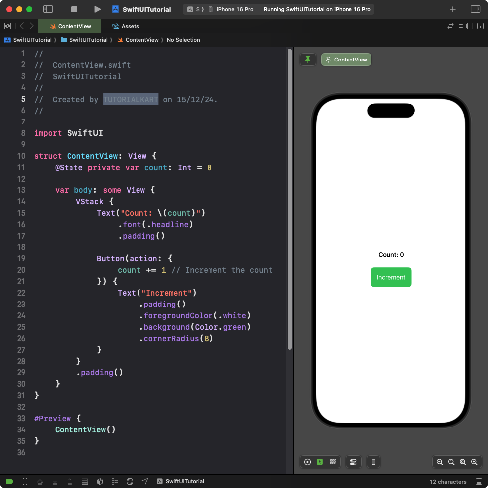
Explanation:
- The
@Statevariablecounttracks the current count value. - The
actionclosure increments the count by 1 each time the button is tapped. - The
Textview dynamically updates to display the current count.
Result: A button labeled “Increment” that updates and displays the count each time it is tapped.
Example 3: Button with Navigation Action
This example demonstrates a button that navigates to a new view when tapped:
Code Example:
import SwiftUI

struct ContentView: View {
    var body: some View {
        NavigationView {
            VStack {
                Text("Welcome to the Home Screen")
                    .font(.title)
                    .padding()

                NavigationLink(destination: DetailView()) {
                    Text("Go to Details")
                        .padding()
                        .foregroundColor(.white)
                        .background(Color.orange)
                        .cornerRadius(8)
                }
            }
            .padding()
        }
    }
}

struct DetailView: View {
    var body: some View {
        Text("This is the Detail Screen")
            .font(.title)
            .padding()
    }
}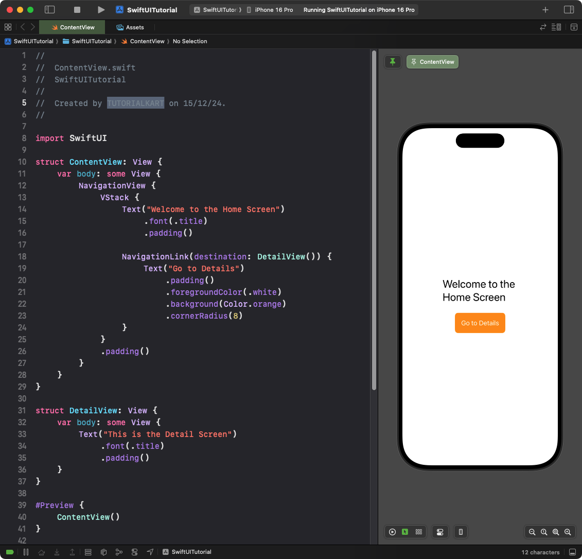
Explanation:
- The
NavigationLinkacts as a button and navigates toDetailViewwhen tapped. - The
NavigationViewprovides a container for navigation between views. - The
Textlabels define the content of the buttons and screens.
Result: A button labeled “Go to Details” navigates to a new screen when tapped.
Conclusion
In SwiftUI, button actions are highly customizable and can perform a variety of tasks, such as updating state, navigating views, or executing custom logic. By combining the action closure with SwiftUI’s declarative syntax, you can easily create interactive buttons tailored to your app’s functionality.