SwiftUI Divider
In SwiftUI, the Divider is a simple view used to create visual separators between elements. It is commonly used in lists, forms, stacks, and other layouts to add structure and improve visual clarity.


By default, the Divider creates a thin, horizontal line. However, it can also be customised for appearance, alignment, and size.
Basic Syntax of Divider
The basic syntax to use a Divider is as follows:
Divider()This creates a horizontal line that spans the available width. The Divider does not require additional parameters but can be styled using modifiers like .frame(), .background(), and .padding().
Examples of Divider
Let’s explore various examples of using and customizing the Divider in SwiftUI.
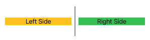
Example 1: Basic Divider
This example demonstrates a simple Divider used to separate two Text views:
Code Example:
import SwiftUI

struct ContentView: View {
    var body: some View {
        VStack {
            Text("First Section")
                .font(.headline)

            Divider() // Adds a horizontal line

            Text("Second Section")
                .font(.headline)
        }
        .padding()
    }
}
Xcode Screenshot:
Explanation:
- The
Divider()creates a thin horizontal line that spans the available width. - The
VStackarranges the twoTextviews vertically with the divider in between.
Result: A horizontal line visually separates the two text sections.
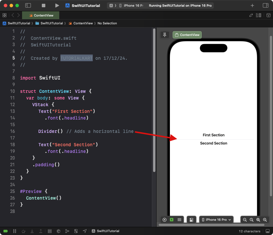
Example 2: Divider with Padding
This example adds spacing above and below the divider using the .padding() modifier:
Code Example:
import SwiftUI

struct ContentView: View {
  var body: some View {
    VStack {
      Text("First Section")
        .font(.headline)

      Divider()
        .padding(.vertical, 20) // Adds space above and below the divider

      Text("Second Section")
        .font(.headline)
    }
    .padding()
  }
}
Xcode Screenshot:
Explanation:
- The
.padding(.vertical, 20)modifier adds vertical spacing to the divider. - This creates visual separation without affecting the surrounding views.
Result: A horizontal divider with increased spacing above and below it.
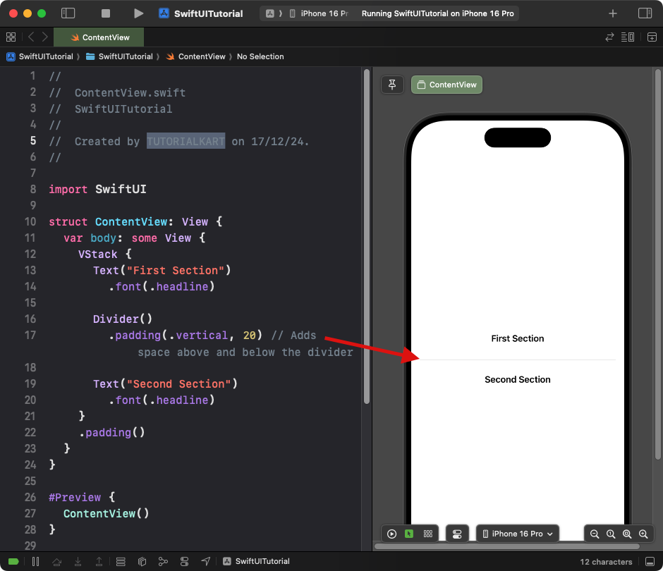
Example 3: Custom Divider Thickness and Color
This example customizes the divider’s thickness and background color:
Code Example:
import SwiftUI

struct ContentView: View {
  var body: some View {
    VStack {
      Text("First Section")
        .font(.headline)

      Divider()
        .frame(height: 3) // Custom thickness
        .background(Color.blue) // Custom color
        .padding(.vertical, 10)

      Text("Second Section")
        .font(.headline)
    }
    .padding()
  }
}
Xcode Screenshot:
Explanation:
- The
.frame(height: 3)modifier sets the height (thickness) of the divider. - The
.background(Color.blue)modifier changes the color of the divider. - Padding ensures proper spacing around the divider.
Result: A blue, thick divider separates the content sections.
Example 4: Vertical Divider
By customizing a Divider inside an HStack, you can create a vertical divider:
Code Example:
import SwiftUI

struct ContentView: View {
    var body: some View {
        HStack {
            Text("Left Side")
                .frame(maxWidth: .infinity)
                .background(Color.yellow)

            Divider()
                .frame(width: 2) // Custom width for vertical divider
                .background(Color.gray)
                .padding(.vertical, 10)

            Text("Right Side")
                .frame(maxWidth: .infinity)
                .background(Color.green)
        }
        .frame(height: 100)
        .padding()
    }
}
Xcode Screenshot:
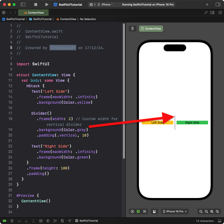
Explanation:
- The
HStackarranges content horizontally. - The
Divider()is customized with a fixed width (2) to make it vertical. - The vertical divider is styled with a gray background color.
Result: A vertical divider separates two sections horizontally.
Conclusion
SwiftUI’s Divider is a simple yet versatile tool for creating visual separators in your app. By customising its color, thickness, and alignment, you can use it effectively in both horizontal and vertical layouts to enhance the clarity and organisation of your user interface.