SwiftUI RoundedRectangle
The RoundedRectangle in SwiftUI is used to create rectangles with rounded corners. It is highly customizable and can be used for buttons, backgrounds, or any UI elements that require a smooth, rounded appearance.
In this tutorial, we’ll explore how to use RoundedRectangle, customise it with colors, gradients, and borders, and apply it in different contexts like buttons or overlays.
Basic Syntax of RoundedRectangle
The basic syntax of a RoundedRectangle is:
RoundedRectangle(cornerRadius: 20)
    .frame(width: 100, height: 50)
    .foregroundColor(.blue)
Here:
cornerRadius: Specifies the radius for rounding the corners..frame(width: 100, height: 50): Sets the size of the rounded rectangle..foregroundColor(.blue): Sets the fill color of the shape.
Examples of RoundedRectangle in SwiftUI
Let’s look at examples demonstrating how to use and customize the RoundedRectangle shape.
Example 1: Basic RoundedRectangle
This example creates a simple RoundedRectangle with a fixed corner radius and color:
Code Example:
import SwiftUI
struct ContentView: View {
var body: some View {
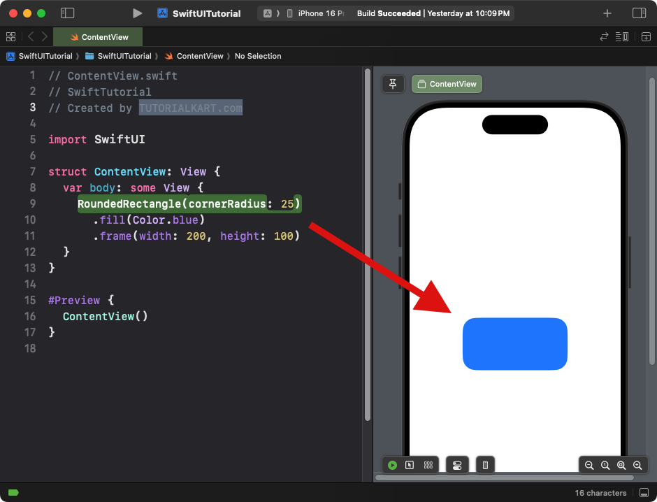
RoundedRectangle(cornerRadius: 25)
.fill(Color.blue)
.frame(width: 200, height: 100)
}
}Xcode Screenshot:
Explanation:
- The
cornerRadiusis set to 25, giving the rectangle rounded corners. - The shape is filled with a blue color using
.fill(Color.blue). - The
.framesets the size of the rectangle to 200×100.
Result: A blue rectangle with rounded corners.
Example 2: RoundedRectangle with Border
This example adds a border to the RoundedRectangle instead of a solid fill:
Code Example:
import SwiftUI
struct ContentView: View {
var body: some View {
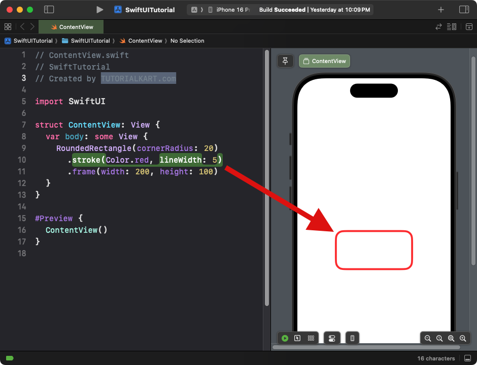
RoundedRectangle(cornerRadius: 20)
.stroke(Color.red, lineWidth: 5)
.frame(width: 200, height: 100)
}
}Xcode Screenshot:
Explanation:
- The
.stroke()modifier applies a red border to the rectangle. - The
lineWidthis set to 5 points. - The
.framesets the size of the rectangle.
Result: A rounded rectangle with a red border and no fill.
Example 3: RoundedRectangle with Gradient
This example applies a gradient fill to the RoundedRectangle:
Code Example:
import SwiftUI
struct ContentView: View {
var body: some View {
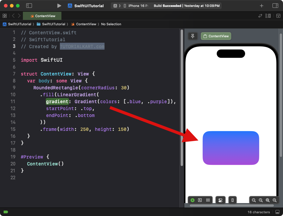
RoundedRectangle(cornerRadius: 30)
.fill(LinearGradient(
gradient: Gradient(colors: [.blue, .purple]),
startPoint: .top,
endPoint: .bottom
))
.frame(width: 250, height: 150)
}
}Xcode Screenshot:
Explanation:
- The
.fill()modifier applies a linear gradient transitioning from blue to purple. - The corner radius is set to 30 for smooth edges.
- The size of the rectangle is defined using the
.framemodifier.
Result: A gradient-filled rounded rectangle transitioning from blue to purple.
Example 4: RoundedRectangle as a Button
You can use a RoundedRectangle as a button by overlaying text or images:
Code Example:
import SwiftUI

struct ContentView: View {
    var body: some View {
        Button(action: {
            print("Button Tapped!")
        }) {
            RoundedRectangle(cornerRadius: 15)
                .fill(Color.green)
                .frame(width: 200, height: 50)
                .overlay(
                    Text("Tap Me")
                        .foregroundColor(.white)
                        .font(.headline)
                )
        }
    }
}
Xcode Screenshot:
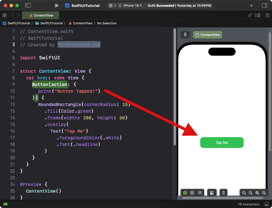
Explanation:
- The
Buttoncontains aRoundedRectangleas its background. - The
.overlay()modifier adds a text label to the button. - The button is styled with a green fill and white text.
Result: A clickable rounded rectangle button with the text “Tap Me.”
Example 5: RoundedRectangle with Dynamic Corner Radius
This example demonstrates how to dynamically adjust the corner radius of a RoundedRectangle:
Code Example:
import SwiftUI

struct ContentView: View {
    @State private var cornerRadius: CGFloat = 10

    var body: some View {
        VStack {
            RoundedRectangle(cornerRadius: cornerRadius)
                .fill(Color.orange)
                .frame(width: 200, height: 100)
                .animation(.easeInOut, value: cornerRadius)

            Slider(value: $cornerRadius, in: 0...50)
                .padding()
        }
    }
}
Xcode Screenshot:
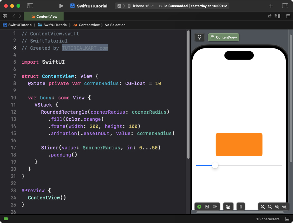
Explanation:
- The corner radius is controlled by a slider bound to a
@Stateproperty. - The
.animation()modifier adds a smooth transition when the radius changes.
Result: A rounded rectangle with a dynamic corner radius that updates as the slider is moved.
Conclusion
The RoundedRectangle in SwiftUI is a highly versatile shape, perfect for creating smooth, rounded UI components. With modifiers like .fill(), .stroke(), .overlay(), and animations, you can easily customise its appearance and behaviour for a variety of use cases, from buttons to dynamic layouts.