SwiftUI SecureField Height
In SwiftUI, the SecureField provides a simple way to handle secure text input, such as passwords. By default, it comes with a standard height defined by the system. However, there are situations where you might want to customize the height of a SecureField to better match your app’s design.
In this tutorial, we will guide you through customizing the height of a SecureField in a SwiftUI layout.
When to Set SecureField Height
Customizing the height of a SecureField is useful in scenarios such as:
- Creating a consistent visual style for forms with larger or smaller input fields.
- Adjusting for accessibility needs by providing more space for text entry.
- Matching the design guidelines of a specific app or brand.
Syntax to Set SecureField Height
To customize the height of a SecureField, you can use modifiers like .frame or wrap it in a container view with custom dimensions. Here is a basic syntax example:
SecureField("Placeholder", text: $bindingVariable)
    .frame(height: customHeight)
Example for Setting SecureField Height
The following example demonstrates how to create a SecureField with a custom height and style to align with the overall design of a form.
File: ContentView.swift
import SwiftUI

struct ContentView: View {
    @State private var password: String = ""

    var body: some View {
        VStack(spacing: 20) {
            SecureField("Enter your password", text: $password)
                .padding(.horizontal)
                .frame(height: 50)
                .background(Color.gray.opacity(0.2))
                .cornerRadius(8)
                .padding(.horizontal)

            Text("Password: \(password.isEmpty ? "Not entered" : password)")
                .font(.headline)

            Spacer()
        }
        .padding()
    }
}

struct ContentView_Previews: PreviewProvider {
    static var previews: some View {
        ContentView()
    }
}
Detailed Explanation
- SecureField: Captures the user’s password securely and binds it to the
@Statevariablepassword. The placeholder text guides the user. - .frame(height: 50): Adjusts the height of the
SecureFieldto 50 points, overriding the default height. - .background: Adds a light gray background for visual distinction.
- .cornerRadius: Rounds the corners of the background for a modern appearance.
- .padding: Adds spacing inside and around the
SecureFieldto ensure it fits well within the layout. - Text View: Displays the entered password for demonstration purposes. This would not be used in production for security reasons.
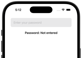
Output
Conclusion
Customizing the height of a SecureField in SwiftUI allows you to create input fields that align with your app’s design and user experience goals.