SwiftUI – TextEditor
In SwiftUI, the TextEditor view provides a way to create a multi-line, editable text input field. It allows users to type and edit long pieces of text, such as notes, comments, or detailed input forms. Unlike TextField, which is primarily for single-line input, TextEditor supports multi-line input by default.
In this SwiftUI tutorial, we will cover the basic usage of TextEditor, customization options, and examples to help you integrate it into your SwiftUI projects.
Basic Syntax of TextEditor
The basic syntax for creating a TextEditor is:
TextEditor(text: $inputText)Here:
$inputText: A binding variable that holds the text input by the user. It must be a@Stateor@Bindingvariable.
The TextEditor automatically adjusts to display the content and allows for scrolling when the text exceeds the available space.
Examples
Let’s look at some examples to understand how to use TextEditor in SwiftUI.
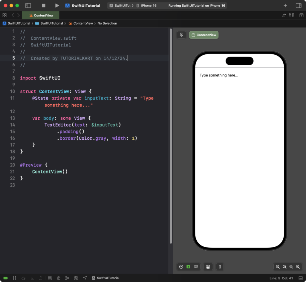
Example 1: Basic TextEditor
This example demonstrates how to create a basic TextEditor for multi-line text input.
Code Example:
import SwiftUI

struct ContentView: View {
    @State private var inputText: String = "Type something here..."

    var body: some View {
        TextEditor(text: $inputText)
            .padding()
            .border(Color.gray, width: 1)
    }
}
Explanation:
- The
@StatevariableinputTextholds the user’s input. - The
.border(Color.gray, width: 1)adds a border around theTextEditor. - The
.padding()adds space around theTextEditor.
Result: A simple, scrollable text editor with a gray border is displayed, allowing users to type multi-line text.
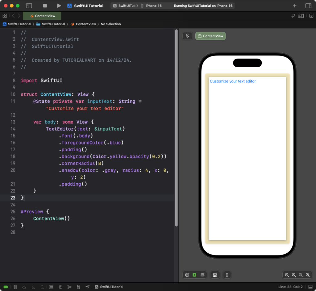
Example 2: Customising TextEditor Appearance
You can customize the appearance of the TextEditor with background colors, fonts, and more:
Code Example:
import SwiftUI

struct ContentView: View {
    @State private var inputText: String = "Customize your text editor"

    var body: some View {
        TextEditor(text: $inputText)
            .font(.body)
            .foregroundColor(.blue)
            .padding()
            .background(Color.yellow.opacity(0.2))
            .cornerRadius(8)
            .shadow(color: .gray, radius: 4, x: 0, y: 2)
            .padding()
    }
}
Explanation:
.font(.body): Sets the font style to body text..foregroundColor(.blue): Changes the text color to blue..background(Color.yellow.opacity(0.2)): Adds a light yellow background with transparency..cornerRadius(8): Rounds the corners of the background..shadow(color: .gray, radius: 4, x: 0, y: 2): Adds a shadow for depth.
Result: A visually styled TextEditor with a rounded yellow background and blue text is displayed.
Conclusion
SwiftUI’s TextEditor is a versatile and powerful tool for creating multi-line, editable text input fields. By combining basic usage with customization options, you can design text editors that fit seamlessly into your app’s user interface.