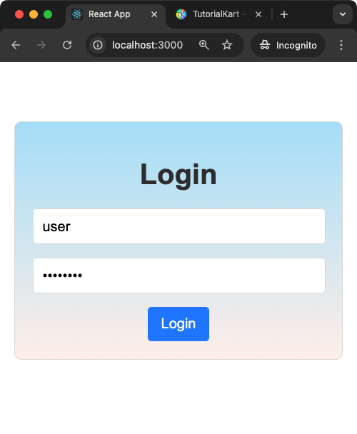
React Login Page
A React Login Page is a basic component of many web applications, enabling users to securely access personalised content. This guide demonstrates a simple login form with validation and dynamic feedback for a user-friendly experience.
Features of the Login Page
- Input fields for username and password.
- Validation for empty fields and dynamic feedback.
- A Submit button to process login information.
- Styling to make the page visually appealing and accessible.
Steps to Use the Login Page
- Enter a username and password in the respective fields.
- Click the “Login” button to submit the form.
- Feedback will be displayed if any fields are empty or if login credentials are invalid.
Complete React Login Page Application
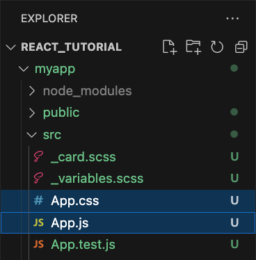
Create an empty React Application, and edit the App.js, and App.css files.
The following is the screenshot of project explorer in Visual Studio Code.
Explorer
App.js
import React, { useState } from 'react';
import './App.css';

function LoginPage() {
  const [username, setUsername] = useState('');
  const [password, setPassword] = useState('');
  const [error, setError] = useState('');

  const handleLogin = () => {
    if (!username || !password) {
      setError('Please fill in both fields.');
      return;
    }

    // Simulated login validation
    if (username === 'user' && password === 'password') {
      setError('');
      alert('Login Successful!');
    } else {
      setError('Invalid username or password.');
    }
  };

  return (
    <div className="login-page">
      <h1>Login</h1>
      <div className="form-group">
        <input
          type="text"
          placeholder="Username"
          value={username}
          onChange={(e) => setUsername(e.target.value)}
        />
      </div>
      <div className="form-group">
        <input
          type="password"
          placeholder="Password"
          value={password}
          onChange={(e) => setPassword(e.target.value)}
        />
      </div>
      {error && <p className="error">{error}</p>}
      <button onClick={handleLogin}>Login</button>
    </div>
  );
}

export default LoginPage;
App.css
.login-page {
  font-family: Arial, sans-serif;
  margin: 50px auto;
  max-width: 400px;
  padding: 20px;
  border: 1px solid #ddd;
  border-radius: 8px;
  background-image: linear-gradient(to top, #fff1eb 0%, #ace0f9 100%);
  text-align: center;
}

h1 {
  color: #333;
  margin-bottom: 20px;
}

.form-group {
  margin-bottom: 15px;
}

input {
  width: calc(100% - 20px);
  padding: 10px;
  border: 1px solid #ddd;
  border-radius: 4px;
  font-size: 16px;
}

button {
  padding: 10px 15px;
  border: none;
  border-radius: 4px;
  background-color: #007bff;
  color: white;
  cursor: pointer;
  font-size: 16px;
}

button:hover {
  background-color: #0056b3;
}

.error {
  color: #dc3545;
  font-size: 14px;
  margin-bottom: 10px;
}
Explanation of the Program
The program uses the useState hook to manage the state of the form. Here’s a detailed explanation:
1. State Management with useState
const [username, setUsername] = useState('');: This state variable tracks the input value for the username field. ThesetUsernamefunction is used to update this value when the user types into the input box.const [password, setPassword] = useState('');: Similarly, this state variable tracks the input value for the password field. ThesetPasswordfunction updates it.const [error, setError] = useState('');: This state variable is used to store error messages. It is updated when the user submits the form with invalid or missing data.
2. Event Handling and Validation
The handleLogin function is triggered when the user clicks the “Login” button. Here’s what it does:
- Validation: Checks if both the username and password fields are filled. If either is empty, it sets an appropriate error message using
setError. - Simulated Login: Compares the entered username and password with predefined values. If they match, a success message is displayed using
alert. Otherwise, an error message is set.
3. Dynamic Feedback
The error state is conditionally rendered below the input fields. If there is an error message, it is displayed in a styled <p> tag with the “error” class for visual emphasis.
4. Styling
The CSS file provides a visually appealing layout with proper spacing, alignment, and hover effects for the button. The “error” class is styled to make error messages stand out in red.
Conclusion
The React Login Page is a simple yet essential component of many applications. This guide lays the foundation for adding more advanced features like authentication, password recovery, or integration with backend APIs. Experiment with styling and functionality to enhance your understanding of React components!