 TutorialKart.com
Getting Started with Tableau for Beginners
This beginner Tableau tutorial explains how to connect to data, prepare a data source, create a worksheet, choose a suitable chart, add filters, build a dashboard, and save or share the finished workbook. The steps focus on the main workflow used in Tableau Desktop and related Tableau authoring products.
You do not need advanced programming knowledge to begin. Familiarity with spreadsheets, rows, columns, categories, and numerical fields is enough for the examples on this page. Basic SQL becomes useful later when you work with databases or need to prepare complex source queries, but it is not required for creating your first Tableau visualization.
What Tableau Is Used For
Tableau is a visual analytics platform used to explore data and present findings through charts, tables, maps, dashboards, and interactive filters. A typical Tableau workflow involves connecting to a source, reviewing field types, creating one or more worksheets, combining those worksheets in a dashboard, and publishing or exporting the result.
- Explore trends over time.
- Compare categories, products, regions, or business units.
- Analyze totals, averages, percentages, and other measures.
- Create maps from geographic fields.
- Build dashboards that combine related visualizations.
- Allow users to filter and inspect the displayed data.
Choose a Tableau Product for Learning and Practice
The Tableau interface and available publishing options depend on the product you use. Tableau Desktop is commonly used for authoring workbooks on a computer. Tableau Public provides a way to create and publicly share visualizations. Tableau Cloud and Tableau Server are used by organizations to publish, manage, and collaborate on analytics content.
For private or confidential data, review the storage and publishing rules of the selected product before uploading a workbook or data source. Tableau Public content is intended for public sharing, so it should not be used for sensitive information.
For current installation, trial, and product-access instructions, refer to Tableau’s official getting started resources.
Connect Tableau to a Local File
The first practical step in Tableau is connecting to data. Tableau can connect to local files such as Excel workbooks, text files, CSV files, statistical files, and supported database files. The exact connectors shown in the interface depend on the Tableau product and installed drivers.
A local file is suitable for beginner practice because it is easy to inspect and does not require database credentials. Before connecting, check that the file has a clear header row, consistent column names, and one record per row.
Connect Tableau to a Database or Server
Tableau can also connect to supported databases, cloud data platforms, analytics services, and Tableau-hosted data sources. A server connection usually requires a server address, authentication details, and permission to access the required database, schema, table, or published data source.
Examples of connectors that may be available in Tableau include:
- Tableau Server.
- Google Analytics.
- Google BigQuery.
- Hortonworks.
- Hadoop Hive.
- MapR Hadoop Hive.
- IBM DB2.
- IBM BigInsights.
- IBM Netezza.
- Microsoft SQL Server
- Microsoft Analysis Services.
- Oracle.
- Oracle Essbase.
- MySQL.
- PostgreSQL.
- SAP
Connector availability changes by product edition and version. Some connectors also require a separate database driver. Use Tableau’s current connector documentation when a source does not appear or a connection fails.
Understand Tableau Live Connections and Extracts
After connecting to a supported data source, Tableau may allow either a live connection or an extract.
- Live connection: Tableau sends queries to the source when the view needs data. Changes in the source can appear when the visualization is refreshed, subject to caching, permissions, and source availability.
- Extract: Tableau stores a snapshot of selected data in an optimized extract. The extract must be refreshed when newer source data is required.
A live connection can be appropriate when current source data is required and the database can support interactive queries. An extract can improve portability and may improve performance when the source is slow, remote, or too large for repeated direct queries. The correct choice depends on refresh requirements, security rules, query performance, and publishing arrangements.
Connect Tableau to an Excel Workbook
To connect to an Excel file, select the Excel connector from the connection pane, browse to the workbook on your computer, and open it. For this Tableau tutorial, the example uses the Sample Superstore data commonly provided for training. You can use another workbook with similar fields.
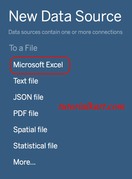
After opening the workbook, Tableau displays the Data Source page. Drag the required sheet or table onto the data model area. If the workbook contains multiple sheets, confirm that you selected the correct one before opening a worksheet.
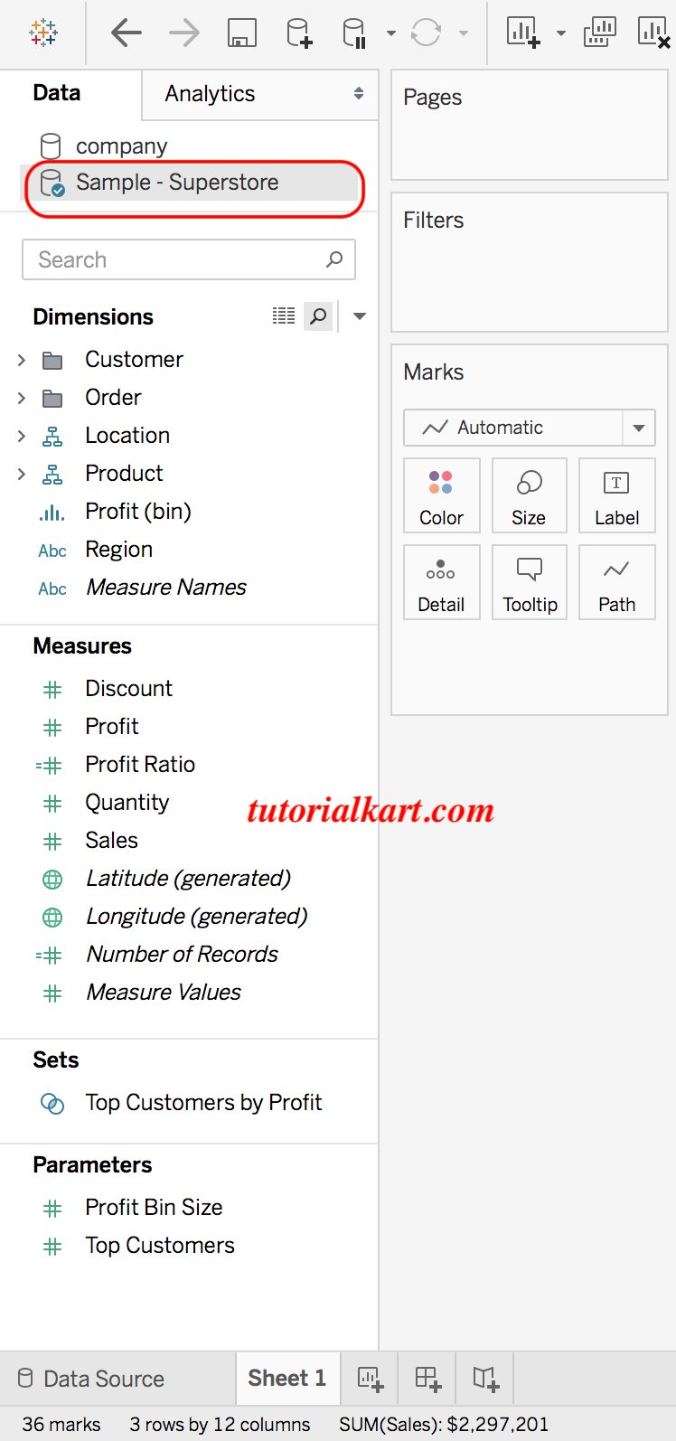
Review Excel Fields Before Building a Tableau Chart
Inspect the data preview before moving to a worksheet. Check the following items:
- Column names are clear and unique.
- Dates are recognized as date fields rather than text.
- Sales, quantity, profit, and similar fields are recognized as numbers.
- Geographic fields such as country, state, city, or postal code have suitable geographic roles.
- Blank rows, repeated headers, totals, and notes are not being interpreted as ordinary records.
- Each row represents the intended level of detail, such as one order line or one transaction.
You can change an incorrectly detected data type from the field’s data-type icon. Correcting field types before creating charts prevents many date, aggregation, and sorting problems.
Understand Tableau Dimensions, Measures, Discrete Fields, and Continuous Fields
Tableau organizes fields according to how they are used in a view. A useful beginner distinction is between dimensions and measures.
- Dimensions usually identify, group, or label records. Examples include Category, Customer Name, Region, and Order Date.
- Measures usually contain numerical values that Tableau can aggregate. Examples include Sales, Profit, Quantity, and Discount.
Tableau also classifies fields as discrete or continuous. Discrete fields create headers and separate categories. Continuous fields create axes and represent a range of values. A date field, for example, can be used as either a discrete date part or a continuous timeline depending on the analysis.
Tableau automatically separates the data into Dimensions and Measures. You can change a field’s role when the automatic classification does not match the intended analysis.
Create Your First Tableau Chart from Sample Superstore Data
Open a new worksheet after connecting the data. The Rows shelf, Columns shelf, Marks card, Filters shelf, Pages shelf, and Data pane are the main areas used to construct a visualization.
- Drag Order Date to the Columns shelf.
- Drag Sales to the Rows shelf.
- Drag Category to Color on the Marks card.
- Use the Order Date menu to choose the required date level, such as year, quarter, month, or exact date.
- Check whether Tableau is using SUM(Sales) or another aggregation.
After adding Order Date, Category, and Sales, the view may appear similar to the following example:
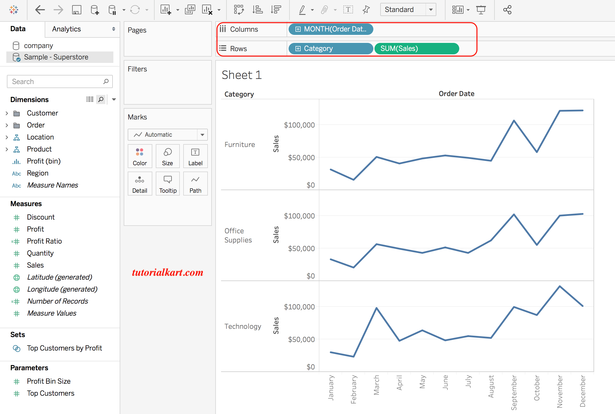
The exact appearance depends on the selected mark type, date granularity, field order, Tableau version, and the sample data available in your workbook.
Use the Tableau Marks Card to Control the Chart
The Marks card controls how data marks are displayed. Depending on the selected chart, it may include Color, Size, Label, Detail, Tooltip, Shape, Path, and other properties.
- Color: separates marks by category or shows a value scale.
- Size: changes mark size based on a measure.
- Label: displays text directly on marks.
- Detail: increases the level of detail without necessarily changing color or labels.
- Tooltip: controls the information displayed when a user points to a mark.
Avoid adding too many fields to Color, Label, or Detail at once. Each additional dimension can increase the number of marks and make the chart harder to read.
Select a Suitable Tableau Chart with Show Me
Tableau includes the Show Me panel, which suggests chart types based on the selected fields. Select two or more fields in the Data pane to see which chart types are available for that combination.
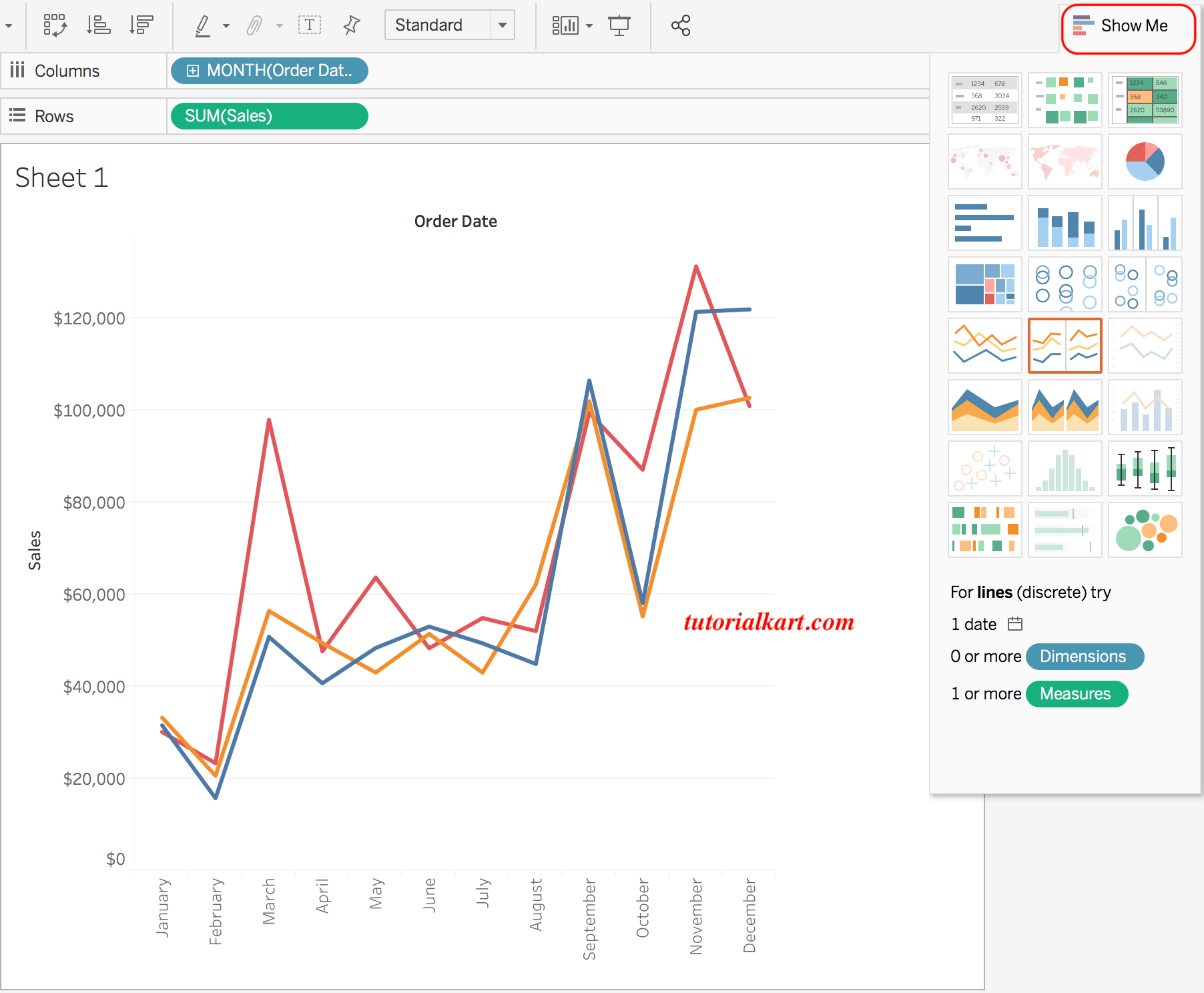
Show Me is a starting point rather than a substitute for chart selection. Choose the chart according to the question being answered:
| Analysis question | Common Tableau chart choice |
|---|---|
| How has a measure changed over time? | Line chart |
| How do categories compare? | Bar chart |
| How are two numerical measures related? | Scatter plot |
| Where are values located geographically? | Symbol map or filled map |
| How is a measure distributed? | Histogram or box plot |
| How do multiple measures compare in a table? | Text table or highlight table |
Pie charts should generally be limited to a small number of clearly distinguishable categories. A bar chart is usually easier to compare when categories have similar values.
Add Tableau Filters to a Worksheet
Filters limit the records included in a view. You can drag a field to the Filters shelf, choose the values or range to include, and then display an interactive filter control for the viewer.
To display a filter from a field already used in the view, open the field menu and choose the option to show the filter. Older versions and older tutorials may refer to this as a quick filter.
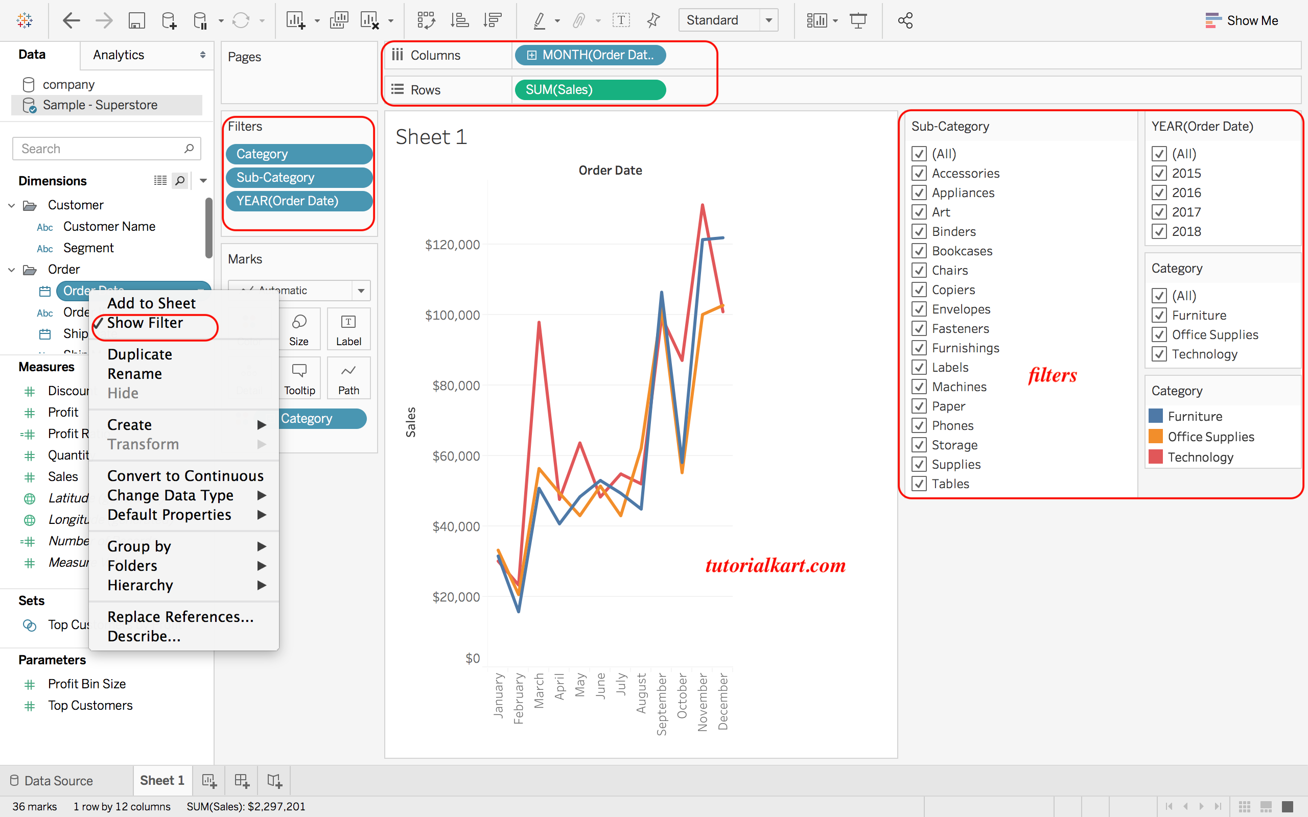
Common beginner filters include Region, Category, Order Date, Customer Segment, and a numerical range such as Sales or Profit. After adding a filter, verify that totals and comparisons still answer the intended question.
Apply a Tableau Filter to Multiple Worksheets
When several worksheets use the same or a related data source, a filter can often be applied to selected worksheets or all eligible worksheets. This is useful in dashboards where one Region or Date filter should update multiple charts.
Check the filter’s application scope carefully. A filter that affects only one worksheet can make a dashboard appear inconsistent when other charts continue to display unfiltered data.
Sort, Group, and Create Hierarchies in Tableau
Sorting helps arrange categories by a field value, alphabetically, or manually. Grouping combines selected members into a new category. A hierarchy provides a drill path between related fields, such as Country, State, City, and Postal Code.
- Sort product categories by descending Sales to identify the largest categories.
- Group several low-volume product types under a shared label when the grouping is analytically justified.
- Create a geographic hierarchy to move from country-level analysis to city-level detail.
- Use a date hierarchy to move between year, quarter, month, and day.
Document manual groups because they do not automatically update when new category values appear in the source.
Create a Basic Calculated Field in Tableau
A calculated field creates a new value from existing fields. Calculations can classify records, derive ratios, handle null values, or create metrics that are not stored directly in the source.
For example, a beginner calculation can classify an order according to whether Profit is positive:
IF [Profit] > 0 THEN
    "Profitable"
ELSEIF [Profit] < 0 THEN
    "Loss"
ELSE
    "Break-even"
END
After creating the field, place it on Color, Filters, Rows, or Columns depending on the analysis. Confirm how null values should be handled before relying on a calculated classification.
Create a Tableau Dashboard from Multiple Worksheets
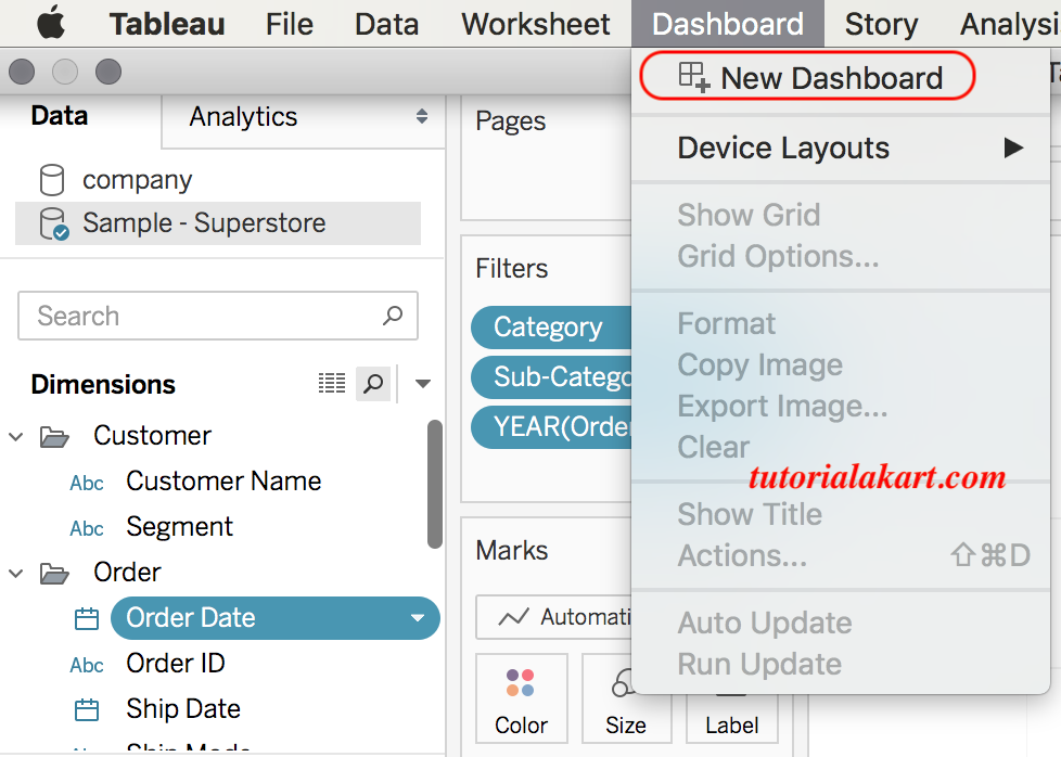
A Tableau dashboard combines worksheets, filters, text, images, legends, and other objects in one layout. To create a dashboard, select the New Dashboard icon near the worksheet tabs.
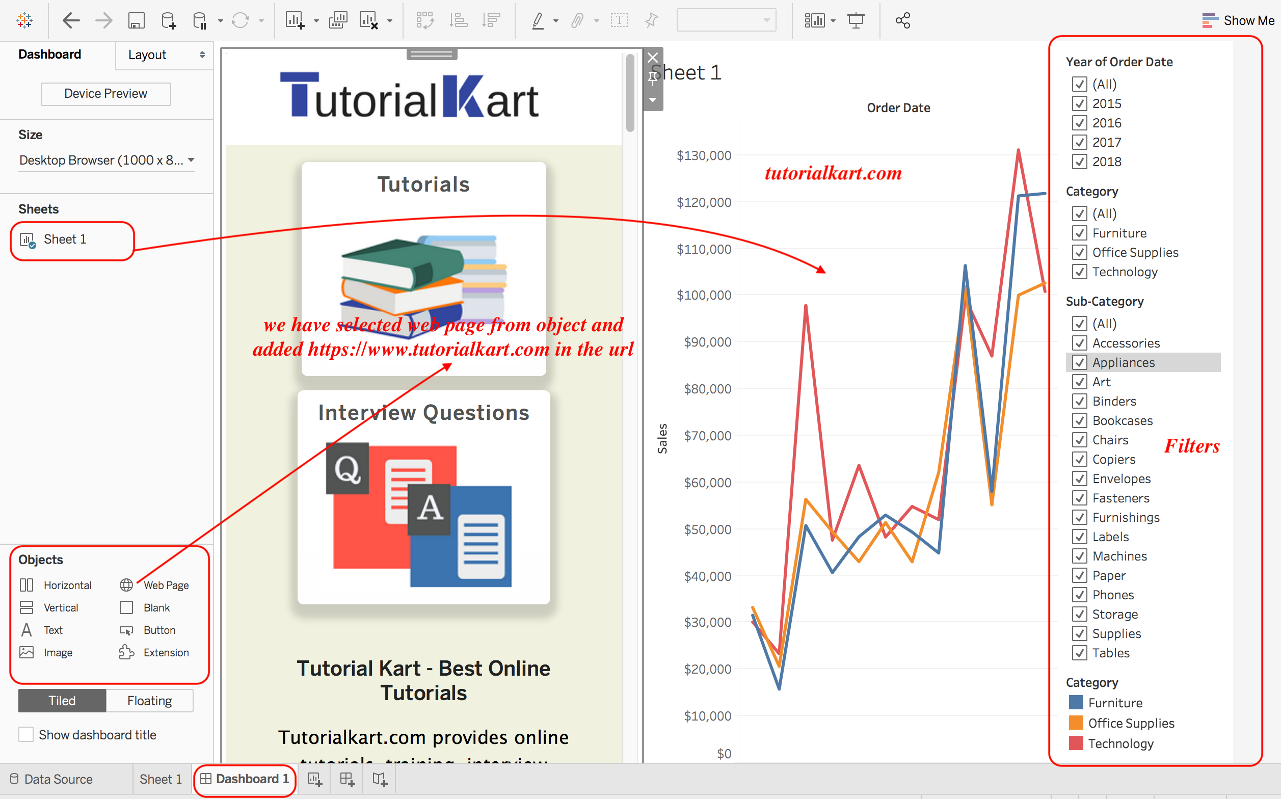
The Dashboard pane displays available worksheets. Drag the required sheets onto the dashboard canvas and arrange them using tiled or floating layouts.
Organize a Tableau Dashboard for Clear Reading
- Place the main summary or most important chart near the top.
- Use a consistent order for filters, legends, and supporting charts.
- Keep titles specific to the measure, category, and time period shown.
- Avoid repeating the same information in several chart types.
- Use containers and padding to maintain alignment.
- Test the dashboard at its intended display size.
- Remove unnecessary gridlines, labels, and legends when their meaning is already clear.
Add Dashboard Filter and Highlight Actions in Tableau
Dashboard actions allow one worksheet to affect another. A filter action can use a selected mark to limit another chart. A highlight action emphasizes related marks while keeping the rest of the data visible. URL actions can open an external page based on a selected field.
For a simple interactive dashboard, configure a category chart to filter a sales trend when the user selects a category. Test what happens when the user selects one mark, multiple marks, or clears the selection.
Save, Export, and Publish a Tableau Workbook
Saving and sharing options depend on the Tableau product and the permissions available to your account.
- Save a workbook locally for continued editing.
- Use a packaged workbook when the workbook and supported local resources need to be bundled together.
- Export a worksheet or dashboard to an available image, PDF, or data format when a static copy is needed.
- Publish to Tableau Server or Tableau Cloud when organizational sharing and permissions are configured.
- Publish to Tableau Public only when the workbook and its data are suitable for public access.
Before publishing, review data-source credentials, extract refresh settings, user permissions, hidden sheets, tooltips, titles, and any sensitive fields included in the workbook.
Recommended Tableau Learning Path for Beginners
- Connect to a small Excel or CSV file.
- Review data types, field names, and row-level detail.
- Create bar, line, text-table, scatter, and map views.
- Practice dimensions, measures, discrete fields, and continuous fields.
- Add filters, sorts, groups, hierarchies, and simple calculated fields.
- Build a dashboard from two or three related worksheets.
- Add one filter or highlight action and test the interaction.
- Learn data joins, relationships, unions, table calculations, and level-of-detail expressions after the basic workflow is clear.
Tableau can be self-taught through repeated practice with small datasets. The official Tableau getting started tutorial provides a structured example using Tableau’s current documentation.
Common Tableau Beginner Mistakes
- Using the wrong data type: a date stored as text cannot be used correctly on a date axis until its type is corrected.
- Ignoring aggregation: Tableau commonly displays measures as SUM, AVG, MIN, MAX, or another aggregation. Check the aggregation shown on the field pill.
- Adding too many dimensions: each dimension can increase the number of marks and make the view difficult to interpret.
- Using an unsuitable chart: choose the chart according to the analytical question rather than selecting a chart only because Show Me enables it.
- Confusing live data with an extract: an extract does not automatically contain new source records until it is refreshed.
- Applying a dashboard filter to only one sheet: confirm which worksheets the filter controls.
- Publishing sensitive information: review workbook data and the privacy rules of the publishing destination.
- Designing only for a large monitor: test dashboard size, scrolling, labels, and filters on the intended screen.
Getting Started with Tableau FAQs
Is Tableau suitable for beginners?
Yes. Beginners can create basic charts by dragging fields to shelves and the Marks card. The parts that usually require more practice are data modeling, calculated fields, table calculations, level-of-detail expressions, performance tuning, and dashboard design.
Can I learn Tableau by myself?
Yes. Start with a small spreadsheet, reproduce a few basic charts, and then build one dashboard that answers a specific question. Official tutorials, documentation, practice workbooks, and repeated work with real datasets can provide a structured self-learning path.
Do I need SQL before learning Tableau?
No. SQL is not required for learning Tableau with Excel, CSV, extracts, or published data sources. SQL becomes useful when connecting to relational databases, validating source data, writing custom queries, or preparing data before visualization.
Is Tableau harder to learn than SQL?
Tableau and SQL solve different problems. Tableau focuses on visual analysis and dashboard creation, while SQL focuses on retrieving and transforming data in relational databases. Basic Tableau chart creation may feel more visual, but advanced Tableau analysis has its own concepts and learning curve.
Can Tableau be used for free?
Tableau’s available free options, trials, learning editions, and licensing terms can change. Check Tableau’s official product pages for current access options. When using a public publishing service, do not upload confidential or restricted data.
Tableau Beginner Tutorial Editorial QA Checklist
- Confirm that the connection steps match the current Tableau interface and product edition being described.
- Verify that connector examples are presented as product-dependent rather than universally available.
- Check that live connections and extracts are explained accurately, including refresh behavior.
- Confirm that every screenshot remains next to the step it illustrates and that its existing image URL is unchanged.
- Verify that the Dimensions and Measures link remains unchanged and still supports the surrounding explanation.
- Check that worksheet instructions identify the correct Rows, Columns, Marks, and Filters locations.
- Confirm that dashboard filters and actions are tested across all intended worksheets.
- Review Tableau Public guidance so readers are warned not to publish confidential data.
- Verify that FAQ answers distinguish Tableau visualization skills from SQL data-query skills.
- Check official Tableau links periodically for redirects, renamed products, and updated documentation paths.