 TutorialKart.com
CSS backdrop-filter
The backdrop-filter property in CSS applies graphical effects, such as blurring or color shifting, to the area behind an element. It allows for the creation of visually appealing effects, such as frosted glass, by applying filters to the backdrop of an element.
Syntax of backdrop-filter
backdrop-filter: none | filter | initial | inherit;Values
| Value | Description |
|---|---|
none | No effects are applied to the backdrop. This is the default value. |
filter | Specifies one or more filter functions to apply to the backdrop (e.g., blur(5px), brightness(0.8)). |
initial | Sets the property to its default value (none). |
inherit | Inherits the value from the parent element. |
The following are some of the filter functions.
blur(radius)- Applies a Gaussian blur to the element.
- Syntax:
blur(5px)(blur with a radius of 5px). - Default:
blur(0)(no blur).
brightness(percentage)- Adjusts the brightness of the element.
- Syntax:
brightness(1.2)(120% brightness). - Default:
brightness(1)(original brightness).
contrast(percentage)- Adjusts the contrast of the element.
- Syntax:
contrast(2)(200% contrast). - Default:
contrast(1)(original contrast).
grayscale(percentage)- Converts the element to grayscale.
- Syntax:
grayscale(1)(100% grayscale). - Default:
grayscale(0)(no grayscale).
invert(percentage)- Inverts the colors of the element.
- Syntax:
invert(1)(100% inversion). - Default:
invert(0)(no inversion).
opacity(percentage)- Adjusts the transparency level of the element.
- Syntax:
opacity(0.5)(50% opacity). - Default:
opacity(1)(fully opaque).
saturate(percentage)- Adjusts the saturation of the element.
- Syntax:
saturate(2)(200% saturation). - Default:
saturate(1)(original saturation).
sepia(percentage)- Applies a sepia tone to the element.
- Syntax:
sepia(1)(100% sepia). - Default:
sepia(0)(no sepia).
hue-rotate(angle)- Rotates the hue of the element’s colors.
- Syntax:
hue-rotate(90deg)(rotates hue by 90 degrees). - Default:
hue-rotate(0deg)(no rotation).
drop-shadow(offset-x offset-y blur-radius color)- Applies a shadow to the element.
- Syntax:
drop-shadow(5px 5px 10px rgba(0,0,0,0.5)). - Default: No drop-shadow.
Default Value
none
Examples for backdrop-filter
Using the CSS backdrop-filter Property
The following examples demonstrate how the backdrop-filter property can be used to create various effects like blurring or changing the brightness of the backdrop.
/* Apply a blur effect to the backdrop */
.element {
  backdrop-filter: blur(5px);
}

/* Increase the brightness of the backdrop */
.element {
  backdrop-filter: brightness(0.8);
}

/* Apply multiple filters to the backdrop */
.element {
  backdrop-filter: blur(5px) brightness(0.8);
}

/* Disable all effects */
.element {
  backdrop-filter: none;
}
Example for Applying backdrop-filter
The following example demonstrates the use of backdrop-filter to create a frosted glass effect.
index.html
<!DOCTYPE html>
<html lang="en">
<head>
<style>
  body {
    background-image: url('https://www.tutorialkart.com/img/lion.jpg');
    background-repeat: no-repeat;
    background-size: cover;
    height: 600px;
    margin: 0;
    display: flex;
    justify-content: center;
    align-items: center;
  }

  .frosted {
    width: 300px;
    height: 200px;
    background-color: rgba(255, 255, 255, 0.5);
    backdrop-filter: blur(10px);
    border: 1px solid rgba(255, 255, 255, 0.3);
    display: flex;
    justify-content: center;
    align-items: center;
    font-size: 20px;
    color: #000;
  }
</style>
</head>
<body>

<div class="frosted">Frosted Glass</div>

</body>
</html>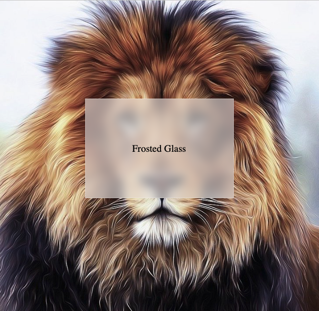
Explanation of backdrop-filter Property
- In this example, the class
.frostedusesbackdrop-filter: blur(10px);, which blurs the background image behind the element by 10px. - The
background-color: rgba(255, 255, 255, 0.5);adds a semi-transparent white overlay, enhancing the frosted glass effect. - The
border: 1px solid rgba(255, 255, 255, 0.3);provides a subtle border to define the frosted area visually. - The
display: flex;,justify-content: center;, andalign-items: center;center the text inside the frosted box. - The result is a “frosted glass” effect, where the background image is blurred behind the semi-transparent element, creating a visually appealing design.
Browser Support
The backdrop-filter property is supported in most modern browsers. Below is a compatibility table:
| Browser | Version |
|---|---|
| Chrome | 76 |
| Edge | 79 |
| Firefox | 103 |
| Safari | 9 (with -webkit-) |
| Opera | 63 |