 TutorialKart.com
CSS block-size
The block-size property in CSS defines the size of an element in the block direction of its writing mode. The block direction can be vertical or horizontal, depending on the writing mode (e.g., ltr, rtl, or vertical-rl). This property is useful for creating flexible layouts that adapt to different writing modes.
Syntax of block-size
block-size: auto | value | initial | inherit;Values
| Value | Description |
|---|---|
auto | The block size is automatically determined based on the content and other properties (default). |
value | Specifies the block size using any valid CSS unit, such as px, em, %, etc. |
initial | Sets the property to its default value (auto). |
inherit | Inherits the value from its parent element. |
Default Value
auto
Examples for block-size
Using the CSS block-size Property
The following examples demonstrate how to use the block-size property with different values:
/* Block size is automatically determined */
.element {
  block-size: auto;
}

/* Block size set to 200px */
.element {
  block-size: 200px;
}

/* Block size set to 50% of the parent element */
.element {
  block-size: 50%;
}

/* Block size inherits from the parent element */
.element {
  block-size: inherit;
}
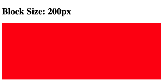
Example for Fixed Block Size
Below is an example demonstrating how to use block-size: 200px to set a fixed block size for an element:
index.html
<!DOCTYPE html>
<html lang="en">
<head>
<style>
  .box {
    block-size: 200px;
    background: red;
  }
</style>
</head>
<body>

<h1>Block Size: 200px</h1>
<div class="box"></div>

</body>
</html>
Since the div used in this example is a block, the block direction is vertical, and therefore the block size of 200px is in the vertical direction.
Browser Support
The block-size property is supported in most modern browsers. Below is a compatibility table:
| Browser | Version |
|---|---|
| Chrome | 57.0 |
| Edge | 79.0 |
| Firefox | 41.0 |
| Safari | 12.1 |
| Opera | 44.0 |