CSS border-image-slice
The border-image-slice property in CSS specifies how an image is sliced into regions to create a border around an element. The slicing is determined by values specified for the top, right, bottom, and left sides. This property is often used with the border-image-source property to define how the border image is applied.
Syntax of border-image-slice
border-image-slice: number | % | fill | initial | inherit;Values
| Value | Description |
|---|---|
number | A number that specifies the number of pixels to slice the border image from its edges. |
% | A percentage of the border image’s width/height to slice. |
fill | Indicates that the center of the border image should be preserved and displayed. |
initial | Sets the property to its default value (no slicing). |
inherit | Inherits the value from its parent element. |
Default Value
100% (slices the image at its edges without displaying the center)
Examples for border-image-slice
Using the CSS border-image-slice Property
The following examples demonstrate how to use the border-image-slice property to slice an image for a border.
/* Slice the border image 30px from all edges */
.element {
  border-image-source: url('border-image.png');
  border-image-slice: 30;
}

/* Slice the border image 25% from all edges */
.element {
  border-image-source: url('border-image.png');
  border-image-slice: 25%;
}

/* Slice and preserve the center of the border image */
.element {
  border-image-source: url('border-image.png');
  border-image-slice: 40 fill;
}

/* Inherit the border image slice value */
.element {
  border-image-slice: inherit;
}
Example with Border Image
Below is an example demonstrating how to apply a sliced border image using border-image-slice:
index.html
<!DOCTYPE html>
<html lang="en">
<head>
<style>
  .highlight {
    border: 20px solid transparent;
    padding: 20px;
    border-image-source: url('https://www.tutorialkart.com/img/border-star.png');
    border-image-repeat: round;
    border-image-slice: 80;
    border-image-width: 10px;
  }
</style>
</head>
<body>

<h2 class="highlight">Lorem Ipsum</h2>

</body>
</html>
Another Example with Border Image Slice
Below is an example demonstrating how to apply a sliced border image using border-image-slice:
index.html
<!DOCTYPE html>
<html lang="en">
<head>
<style>
  .highlight {
    border: 20px solid transparent;
    padding: 20px;
    border-image-source: url('https://www.tutorialkart.com/img/border-star.png');
    border-image-repeat: round;
    border-image-slice: 40;
    border-image-width: 10px;
  }
</style>
</head>
<body>

<h2 class="highlight">Lorem Ipsum</h2>

</body>
</html>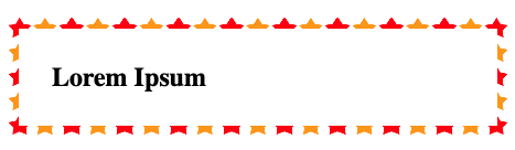
Browser Support
The border-image-slice property is supported in modern browsers. Below is a compatibility table:
| Browser | Version |
|---|---|
| Chrome | 15.0 |
| Edge | 11.0 |
| Firefox | 15.0 |
| Safari | 6.0 |
| Opera | 15.0 |