Login forms are a fundamental part of most websites and applications, serving as a gateway for users to access their accounts or personalized content. A well-designed login form not only facilitates seamless authentication but also reflects the brand’s personality, engages users, and enhances their overall experience.
With the evolution of web design trends, login forms have transitioned from basic input boxes to highly interactive and visually appealing components. Today, designers focus on creating forms that are functional, accessible, and aesthetically pleasing, balancing user needs with creative expression.
This guide explores 13 unique login form designs, each tailored for different themes, audiences, and use cases. From minimalist and flat designs to futuristic and geometric styles, these designs showcase the versatility of login forms in modern web design. Whether you’re building a corporate portal, a creative portfolio, or a gaming platform, you’ll find inspiration to craft a login form that not only works efficiently but also stands out.
Glossary of the Login Form Designs
- Minimalistic Login Form
- Gradient Background Form
- Dark Mode Form
- Material Design Form
- Glassmorphism Login Form
- Neon Style Login Form
- Flat Design Form
- Animated Input Fields
- Split-Screen Form
- 3D Box Style Form
- Social Media Login Form
- Geometric Shape Design
- Login Form with Tabs (Login/Signup)
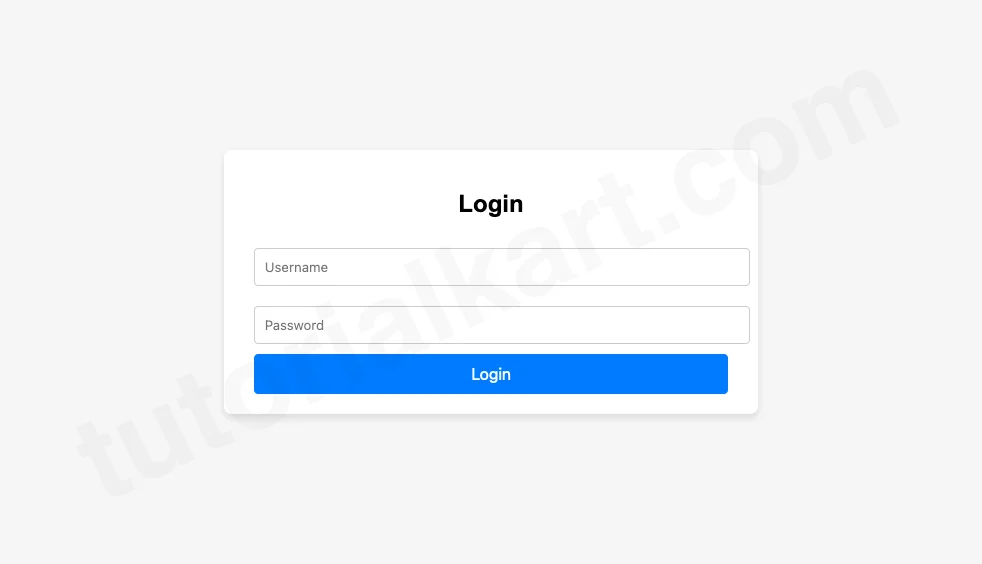
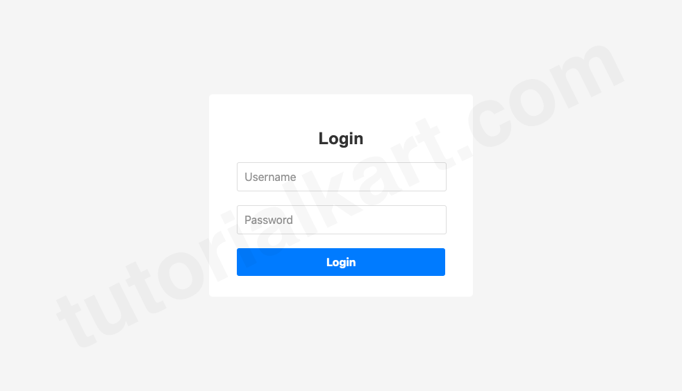
Design 1: Minimalistic Login Form
The minimalistic login form focuses on simplicity and elegance. It eliminates distractions and emphasizes usability, making it a perfect choice for clean and modern websites. This form uses rounded input fields, soft shadows, and a vibrant button for a professional look.
Its accessible design ensures users can interact with the form on any device or screen size. The minimal styling also speeds up load times, contributing to a seamless user experience.
login.html
<!DOCTYPE html>
<html lang="en">
<head>
    <meta charset="UTF-8">
    <meta name="viewport" content="width=device-width, initial-scale=1.0">
    <title>Minimalistic Login</title>
    <style>
        body {
            font-family: Arial, sans-serif;
            display: flex;
            justify-content: center;
            align-items: center;
            height: 100vh;
            margin: 0;
            background: #f5f5f5;
        }
        .login-form {
            background: #fff;
            padding: 20px 30px;
            box-shadow: 0 4px 6px rgba(0, 0, 0, 0.1);
            border-radius: 8px;
        }
        .login-form h2 {
            margin-bottom: 20px;
            font-size: 24px;
            text-align: center;
        }
        .login-form input {
            width: 100%;
            padding: 10px;
            margin: 10px 0;
            border: 1px solid #ccc;
            border-radius: 4px;
        }
        .login-form button {
            width: 100%;
            padding: 10px;
            border: none;
            background: #007BFF;
            color: white;
            font-size: 16px;
            border-radius: 4px;
            cursor: pointer;
        }
        .login-form button:hover {
            background: #0056b3;
        }
    </style>
</head>
<body>
    <div class="login-form">
        <h2>Login</h2>
        <form>
            <input type="text" placeholder="Username" required>
            <input type="password" placeholder="Password" required>
            <button type="submit">Login</button>
        </form>
    </div>
</body>
</html>
Preview
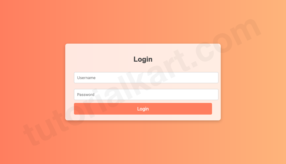
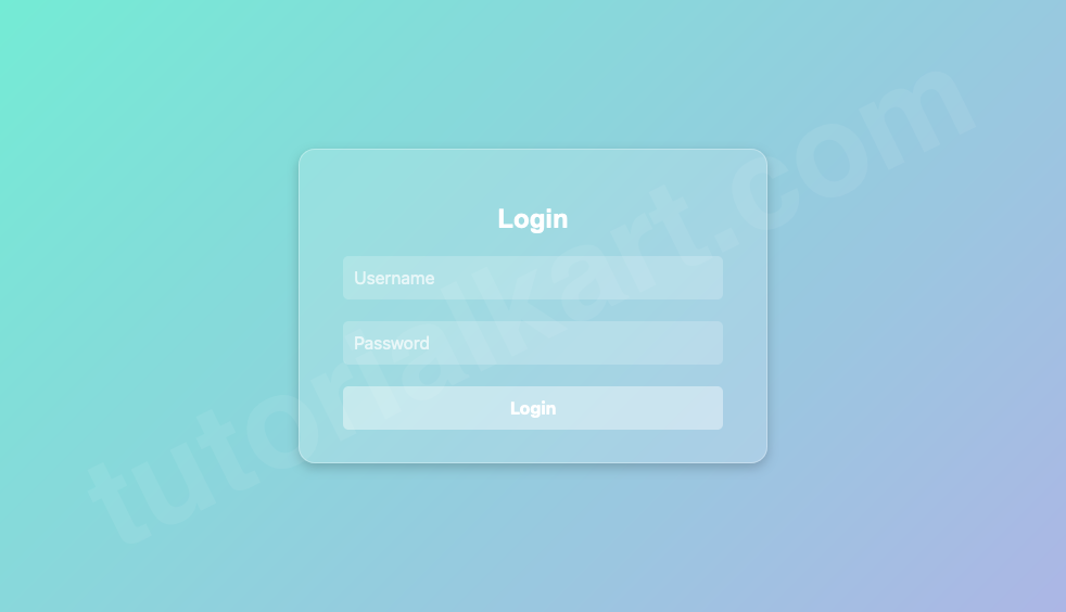
Design 2: Gradient Background Form
The gradient background login form provides a visually striking design that uses color transitions to create depth and elegance. The form stands out with transparent input fields and a bold login button, making it ideal for creative portfolios or entertainment websites.
The gradient background not only grabs attention but also sets a specific tone for the website. Paired with responsive design elements, this form ensures functionality and aesthetics across all devices.
login.html
<!DOCTYPE html>
<html lang="en">
<head>
    <meta charset="UTF-8">
    <meta name="viewport" content="width=device-width, initial-scale=1.0">
    <title>Gradient Login</title>
    <style>
        body {
            margin: 0;
            font-family: Arial, sans-serif;
            display: flex;
            justify-content: center;
            align-items: center;
            height: 100vh;
            background: linear-gradient(to right, #ff7e5f, #feb47b);
        }
        .login-form {
            background: rgba(255, 255, 255, 0.8);
            padding: 20px 30px;
            border-radius: 8px;
            box-shadow: 0 4px 10px rgba(0, 0, 0, 0.2);
        }
        .login-form h2 {
            text-align: center;
            color: #444;
        }
        .login-form input {
            width: 100%;
            padding: 10px;
            margin: 10px 0;
            border: 1px solid #ccc;
            border-radius: 4px;
        }
        .login-form button {
            width: 100%;
            padding: 10px;
            border: none;
            background: #ff7e5f;
            color: white;
            font-size: 16px;
            cursor: pointer;
            border-radius: 4px;
        }
        .login-form button:hover {
            background: #feb47b;
        }
    </style>
</head>
<body>
    <div class="login-form">
        <h2>Login</h2>
        <form>
            <input type="text" placeholder="Username" required>
            <input type="password" placeholder="Password" required>
            <button type="submit">Login</button>
        </form>
    </div>
</body>
</html>
Preview
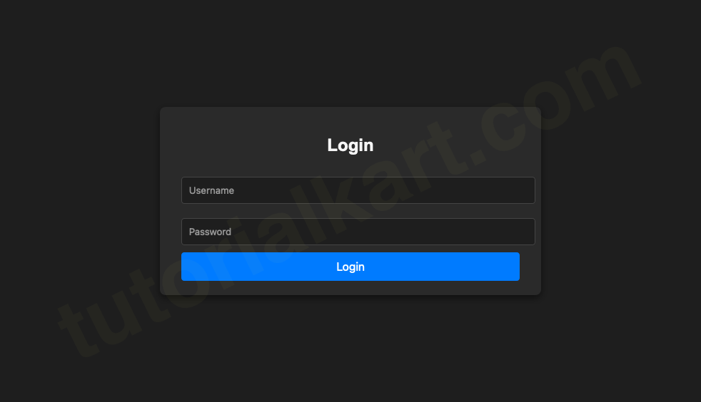
Design 3: Dark Mode Form
The dark mode login form is designed for apps or websites catering to users who prefer dark themes. The design uses subtle highlights, glowing effects, and a sleek, modern layout. The inputs and button have high contrast, ensuring usability in low-light settings.
This form is ideal for gaming platforms, tech blogs, or any site targeting younger, tech-savvy audiences. It creates a cool and immersive experience while maintaining accessibility.
login.html
<!DOCTYPE html>
<html lang="en">
<head>
    <meta charset="UTF-8">
    <meta name="viewport" content="width=device-width, initial-scale=1.0">
    <title>Dark Mode Login</title>
    <style>
        body {
            margin: 0;
            font-family: Arial, sans-serif;
            background: #1e1e1e;
            display: flex;
            justify-content: center;
            align-items: center;
            height: 100vh;
            color: #fff;
        }
        .login-form {
            background: #2a2a2a;
            padding: 20px 30px;
            border-radius: 8px;
            box-shadow: 0 4px 10px rgba(0, 0, 0, 0.5);
        }
        .login-form h2 {
            color: #f5f5f5;
            text-align: center;
        }
        .login-form input {
            width: 100%;
            padding: 10px;
            margin: 10px 0;
            border: 1px solid #444;
            border-radius: 4px;
            background: #1e1e1e;
            color: #fff;
        }
        .login-form button {
            width: 100%;
            padding: 10px;
            border: none;
            background: #007BFF;
            color: white;
            font-size: 16px;
            cursor: pointer;
            border-radius: 4px;
        }
        .login-form button:hover {
            background: #0056b3;
        }
    </style>
</head>
<body>
    <div class="login-form">
        <h2>Login</h2>
        <form>
            <input type="text" placeholder="Username" required>
            <input type="password" placeholder="Password" required>
            <button type="submit">Login</button>
        </form>
    </div>
</body>
</html>
Preview
Design 4: Material Design Login Form
The Material Design Login Form is inspired by Google’s Material Design guidelines, which emphasize a clean, structured, and intuitive user experience. This design incorporates subtle shadows, responsive animations, and bold typography, creating a professional and modern feel. The form inputs have floating labels that provide clear guidance without cluttering the interface.
This login form is ideal for business applications, SaaS platforms, and mobile-first websites. Its responsive design ensures it looks great on all devices, while the use of elevation and animation adds a touch of sophistication. By combining functionality and aesthetics, this form is a great example of how design principles can elevate user interactions.
login.html
<!DOCTYPE html>
<html lang="en">
<head>
    <meta charset="UTF-8">
    <meta name="viewport" content="width=device-width, initial-scale=1.0">
    <title>Material Design Login</title>
    <style>
        body {
            margin: 0;
            font-family: 'Roboto', sans-serif;
            display: flex;
            justify-content: center;
            align-items: center;
            height: 100vh;
            background: #f5f5f5;
        }

        .login-form {
            background: #fff;
            padding: 30px 40px;
            border-radius: 8px;
            box-shadow: 0 4px 8px rgba(0, 0, 0, 0.2);
            width: 300px;
        }

        .login-form h2 {
            font-size: 24px;
            margin-bottom: 20px;
            text-align: center;
            color: #333;
        }

        .form-group {
            position: relative;
            margin-bottom: 20px;
        }

        .form-group input {
            width: calc(100% - 20px);
            padding: 10px;
            border: 1px solid #ccc;
            border-radius: 4px;
            outline: none;
            font-size: 16px;
            transition: all 0.3s ease;
        }

        .form-group input:focus {
            border-color: #6200ee;
            box-shadow: 0 0 4px rgba(98, 0, 238, 0.5);
        }

        .form-group label {
            position: absolute;
            top: 10px;
            left: 10px;
            font-size: 16px;
            color: #888;
            pointer-events: none;
            transition: all 0.3s ease;
        }

        .form-group input:focus + label,
        .form-group input:not(:placeholder-shown) + label {
            top: -10px;
            left: 5px;
            font-size: 12px;
            color: #6200ee;
        }

        .login-form button {
            width: 100%;
            padding: 10px;
            background: #6200ee;
            color: white;
            font-size: 16px;
            border: none;
            border-radius: 4px;
            cursor: pointer;
            transition: background 0.3s ease;
        }

        .login-form button:hover {
            background: #3700b3;
        }
    </style>
</head>
<body>
    <div class="login-form">
        <h2>Login</h2>
        <form>
            <div class="form-group">
                <input type="text" required placeholder=" ">
                <label>Username</label>
            </div>
            <div class="form-group">
                <input type="password" required placeholder=" ">
                <label>Password</label>
            </div>
            <button type="submit">Login</button>
        </form>
    </div>
</body>
</html>
Preview
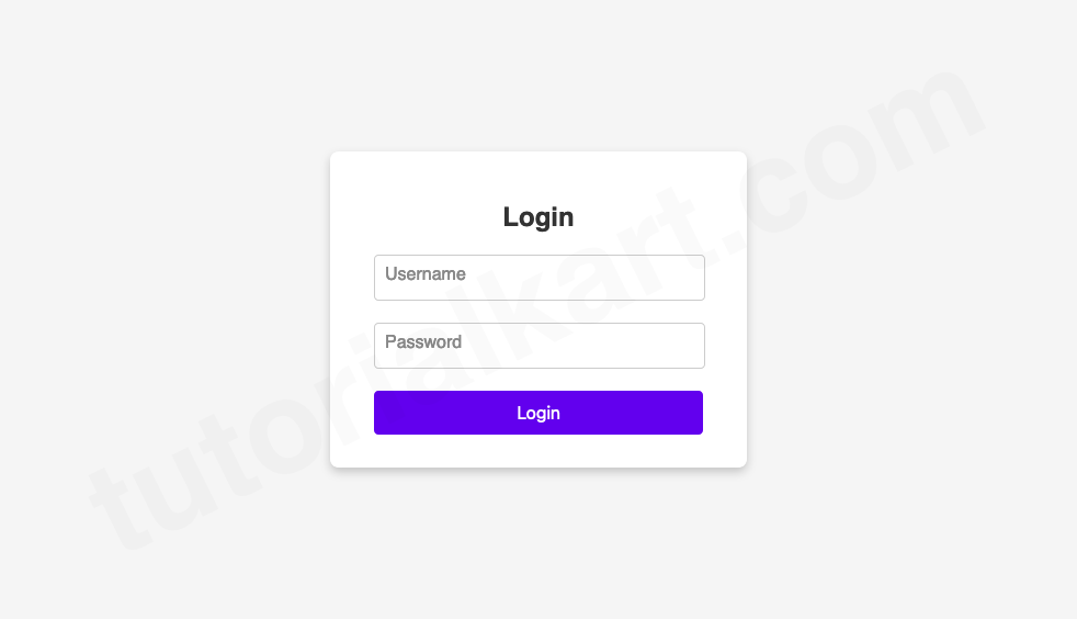
The form features:
- Floating Labels: Inputs dynamically shift labels to the top when focused or filled.
- Material Shadows: The card uses subtle shadows to create a sense of elevation.
- Modern Typography: Roboto font ensures clarity and readability.
Design 5: Glassmorphism Login Form
The Glassmorphism Login Form is a modern and stylish design that creates a semi-transparent “glass” effect for the form’s background. It combines blur and transparency with subtle frosted visuals, giving the impression of a glass pane floating over the page. This design is perfect for trendy websites, creative portfolios, or apps where aesthetics play a critical role in the user experience.
Glassmorphism emphasizes light and contrast to make input fields and buttons stand out. The background typically features a gradient or abstract image, adding depth and context to the form without overwhelming the user. This design enhances the visual appeal of a website while maintaining functionality and clarity.
login.html
<!DOCTYPE html>
<html lang="en">
<head>
    <meta charset="UTF-8">
    <meta name="viewport" content="width=device-width, initial-scale=1.0">
    <title>Glassmorphism Login</title>
    <style>
        body {
            margin: 0;
            font-family: 'Arial', sans-serif;
            display: flex;
            justify-content: center;
            align-items: center;
            height: 100vh;
            background: linear-gradient(135deg, #74ebd5, #acb6e5);
            overflow: hidden;
        }

        .login-form {
            background: rgba(255, 255, 255, 0.15);
            backdrop-filter: blur(10px);
            -webkit-backdrop-filter: blur(10px);
            border: 1px solid rgba(255, 255, 255, 0.3);
            padding: 30px 40px;
            border-radius: 15px;
            box-shadow: 0 4px 10px rgba(0, 0, 0, 0.2);
            text-align: center;
            color: white;
            width: 350px;
        }

        .login-form h2 {
            margin-bottom: 20px;
            font-size: 24px;
            font-weight: bold;
        }

        .form-group {
            margin-bottom: 20px;
        }

        .form-group input {
            width: calc(100% - 20px);
            padding: 10px;
            border: none;
            border-radius: 5px;
            outline: none;
            font-size: 16px;
            background: rgba(255, 255, 255, 0.2);
            color: white;
            backdrop-filter: blur(5px);
            -webkit-backdrop-filter: blur(5px);
        }

        .form-group input::placeholder {
            color: rgba(255, 255, 255, 0.7);
        }

        .form-group input:focus {
            background: rgba(255, 255, 255, 0.3);
        }

        .login-form button {
            width: 100%;
            padding: 10px;
            background: rgba(255, 255, 255, 0.4);
            border: none;
            border-radius: 5px;
            color: white;
            font-size: 16px;
            font-weight: bold;
            cursor: pointer;
            transition: background 0.3s ease;
        }

        .login-form button:hover {
            background: rgba(255, 255, 255, 0.6);
        }
    </style>
</head>
<body>
    <div class="login-form">
        <h2>Login</h2>
        <form>
            <div class="form-group">
                <input type="text" placeholder="Username" required>
            </div>
            <div class="form-group">
                <input type="password" placeholder="Password" required>
            </div>
            <button type="submit">Login</button>
        </form>
    </div>
</body>
</html>
Preview
The form features:
- Glass Effect: The transparent background with a blur effect creates the illusion of frosted glass.
- Light Text and Input Fields: Inputs have a subtle glow and maintain contrast over the gradient background.
- Modern Aesthetics: The clean, minimal design ensures the form looks contemporary and visually appealing.
Design 6: Neon Style Login Form
The Neon Style Login Form is a bold and visually striking design that leverages neon colors and glowing effects. This form stands out, especially in dark-themed or futuristic websites, by using vibrant hues against a dark background. With glowing borders, hover effects, and a sleek layout, this design is perfect for gaming platforms, tech blogs, or entertainment websites.
The neon style not only grabs attention but also conveys a high-energy and dynamic feel. The glowing effects highlight interactive elements like buttons and input fields, creating an engaging user experience that reflects modern trends in UI design.
login.html
<!DOCTYPE html>
<html lang="en">
<head>
    <meta charset="UTF-8">
    <meta name="viewport" content="width=device-width, initial-scale=1.0">
    <title>Neon Style Login</title>
    <style>
        body {
            margin: 0;
            font-family: 'Arial', sans-serif;
            display: flex;
            justify-content: center;
            align-items: center;
            height: 100vh;
            background: #000;
            color: #fff;
        }

        .login-form {
            background: #121212;
            padding: 30px 40px;
            border-radius: 10px;
            box-shadow: 0 0 20px rgba(0, 255, 255, 0.5);
            text-align: center;
            width: 300px;
        }

        .login-form h2 {
            margin-bottom: 20px;
            font-size: 24px;
            color: #00ffff;
        }

        .form-group {
            margin-bottom: 20px;
        }

        .form-group input {
            width: calc(100% - 20px);
            padding: 10px;
            border: 1px solid #00ffff;
            border-radius: 5px;
            outline: none;
            background: #000;
            color: #00ffff;
            font-size: 16px;
            transition: box-shadow 0.3s ease;
        }

        .form-group input:focus {
            box-shadow: 0 0 10px #00ffff;
        }

        .login-form button {
            width: 100%;
            padding: 10px;
            background: #00ffff;
            border: none;
            border-radius: 5px;
            color: #000;
            font-size: 16px;
            font-weight: bold;
            cursor: pointer;
            transition: box-shadow 0.3s ease;
        }

        .login-form button:hover {
            box-shadow: 0 0 15px #00ffff;
        }
    </style>
</head>
<body>
    <div class="login-form">
        <h2>Login</h2>
        <form>
            <div class="form-group">
                <input type="text" placeholder="Username" required>
            </div>
            <div class="form-group">
                <input type="password" placeholder="Password" required>
            </div>
            <button type="submit">Login</button>
        </form>
    </div>
</body>
</html>
Preview
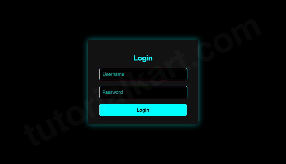
The form features:
- Glowing Effects: Neon borders and buttons create a futuristic vibe.
- Dark Background: The contrast enhances the glow and makes interactive elements stand out.
- Dynamic Interactivity: Hover and focus effects make the design more engaging.
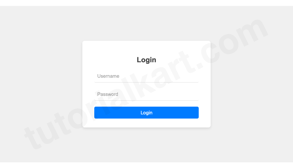
Design 7: Flat Design Form
The Flat Design Login Form adopts a clean and minimalist aesthetic by removing gradients, shadows, and textures. This design focuses on simplicity and functionality, making it perfect for professional websites, corporate portals, and modern applications.
Flat design principles prioritize usability and speed. The absence of distracting elements ensures users can quickly and efficiently interact with the form, while the bold use of color and typography maintains visual interest.
login.html
<!DOCTYPE html>
<html lang="en">
<head>
    <meta charset="UTF-8">
    <meta name="viewport" content="width=device-width, initial-scale=1.0">
    <title>Flat Design Login</title>
    <style>
        body {
            margin: 0;
            font-family: 'Arial', sans-serif;
            display: flex;
            justify-content: center;
            align-items: center;
            height: 100vh;
            background: #f5f5f5;
        }

        .login-form {
            background: #fff;
            padding: 30px 40px;
            border-radius: 5px;
            width: 300px;
            text-align: center;
        }

        .login-form h2 {
            margin-bottom: 20px;
            font-size: 24px;
            color: #333;
        }

        .form-group input {
            width: calc(100% - 20px);
            padding: 10px;
            margin-bottom: 20px;
            border: 1px solid #ddd;
            border-radius: 3px;
            font-size: 16px;
            color: #333;
        }

        .login-form button {
            width: 100%;
            padding: 10px;
            background: #007BFF;
            border: none;
            border-radius: 3px;
            color: white;
            font-size: 16px;
            font-weight: bold;
            cursor: pointer;
        }

        .login-form button:hover {
            background: #0056b3;
        }
    </style>
</head>
<body>
    <div class="login-form">
        <h2>Login</h2>
        <form>
            <div class="form-group">
                <input type="text" placeholder="Username" required>
            </div>
            <div class="form-group">
                <input type="password" placeholder="Password" required>
            </div>
            <button type="submit">Login</button>
        </form>
    </div>
</body>
</html>
Preview
The form features:
- No Shadows or Gradients: Focuses on a clean and straightforward layout.
- Bold Button Colors: Adds visual hierarchy and clarity.
- Compact Design: Ideal for professional or corporate websites.
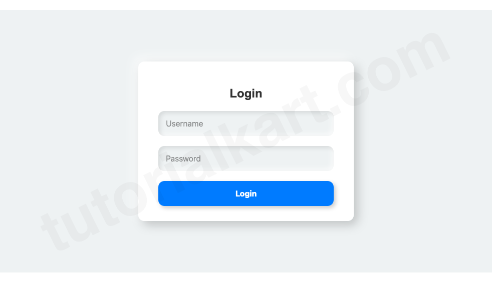
Design 8: Animated Input Fields
The Animated Input Fields Login Form introduces dynamic effects to input fields, making the login experience more engaging. Input animations like sliding labels, expanding borders, or glowing highlights add a layer of interactivity. This form is ideal for modern websites and applications that aim to create a memorable user experience.
Animations guide the user through the form, ensuring accessibility and clarity without overwhelming the interface. This design is suitable for portfolios, creative agencies, and any site targeting tech-savvy audiences.
login.html
<!DOCTYPE html>
<html lang="en">
<head>
    <meta charset="UTF-8">
    <meta name="viewport" content="width=device-width, initial-scale=1.0">
    <title>Animated Input Login</title>
    <style>
        body {
            margin: 0;
            font-family: 'Arial', sans-serif;
            display: flex;
            justify-content: center;
            align-items: center;
            height: 100vh;
            background: #f0f0f0;
        }

        .login-form {
            background: #fff;
            padding: 30px 40px;
            border-radius: 8px;
            box-shadow: 0 4px 8px rgba(0, 0, 0, 0.1);
            width: 350px;
            text-align: center;
        }

        .login-form h2 {
            margin-bottom: 20px;
            font-size: 24px;
            color: #444;
        }

        .form-group {
            position: relative;
            margin-bottom: 20px;
        }

        .form-group input {
            width: calc(100% - 20px);
            padding: 10px;
            border: 0;
            border-bottom: 1px solid #ddd;
            border-radius: 4px;
            font-size: 16px;
            outline: none;
            transition: border-color 0.3s ease;
        }

        .form-group input:focus {
            border-color: #007BFF;
        }

        .form-group label {
            position: absolute;
            top: 10px;
            left: 10px;
            font-size: 16px;
            color: #aaa;
            transition: all 0.3s ease;
        }

        .form-group input:focus + label,
        .form-group input:not(:placeholder-shown) + label {
            top: -10px;
            left: 5px;
            font-size: 12px;
            color: #007BFF;
        }

        .login-form button {
            width: 100%;
            padding: 10px;
            background: #007BFF;
            border: none;
            border-radius: 5px;
            color: white;
            font-size: 16px;
            cursor: pointer;
        }

        .login-form button:hover {
            background: #0056b3;
        }
    </style>
</head>
<body>
    <div class="login-form">
        <h2>Login</h2>
        <form>
            <div class="form-group">
                <input type="text" placeholder=" " required>
                <label>Username</label>
            </div>
            <div class="form-group">
                <input type="password" placeholder=" " required>
                <label>Password</label>
            </div>
            <button type="submit">Login</button>
        </form>
    </div>
</body>
</html>
Preview
The form features:
- Sliding Labels: Labels animate smoothly when the input is focused.
- Expanding Borders: Input fields highlight focus for better user guidance.
- Clean Design: Combines animations with minimal styling for modern appeal.
Design 9: Split-Screen Form
The Split-Screen Login Form divides the page into two sections, creating a visually balanced layout. One side typically features the login form, while the other showcases an image, graphic, or informative content like a tagline or call-to-action. This design is ideal for websites that want to make a strong first impression or emphasize brand identity.
Split-screen forms work particularly well for creative portfolios, product landing pages, or SaaS platforms. The layout ensures focus on the login form while utilizing the other half of the screen for visual storytelling or additional content.
login.html
<!DOCTYPE html>
<html lang="en">
<head>
    <meta charset="UTF-8">
    <meta name="viewport" content="width=device-width, initial-scale=1.0">
    <title>Split-Screen Login</title>
    <style>
        body {
            margin: 0;
            font-family: 'Arial', sans-serif;
            display: flex;
            height: 100vh;
        }

        .split-screen {
            display: flex;
            width: 100%;
        }

        .left {
            background: url('https://via.placeholder.com/600') no-repeat center center;
            background-size: cover;
            flex: 1;
        }

        .right {
            background: #f5f5f5;
            flex: 1;
            display: flex;
            justify-content: center;
            align-items: center;
        }

        .login-form {
            background: #fff;
            padding: 30px 40px;
            border-radius: 8px;
            box-shadow: 0 4px 8px rgba(0, 0, 0, 0.1);
            width: 300px;
            text-align: center;
        }

        .login-form h2 {
            margin-bottom: 20px;
            font-size: 24px;
            color: #333;
        }

        .form-group input {
            width: calc(100% - 22px);
            padding: 10px;
            margin-bottom: 20px;
            border: 1px solid #ddd;
            border-radius: 4px;
            font-size: 16px;
        }

        .login-form button {
            width: 100%;
            padding: 10px;
            background: #007BFF;
            border: none;
            border-radius: 4px;
            color: white;
            font-size: 16px;
            cursor: pointer;
        }

        .login-form button:hover {
            background: #0056b3;
        }
    </style>
</head>
<body>
    <div class="split-screen">
        <div class="left"></div>
        <div class="right">
            <div class="login-form">
                <h2>Login</h2>
                <form>
                    <div class="form-group">
                        <input type="text" placeholder="Username" required>
                    </div>
                    <div class="form-group">
                        <input type="password" placeholder="Password" required>
                    </div>
                    <button type="submit">Login</button>
                </form>
            </div>
        </div>
    </div>
</body>
</html>
Preview
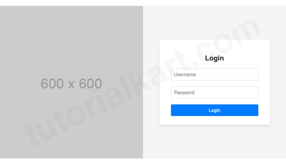
- Split Layout: One side for form, one side for visuals or branding.
- Responsive Design: The layout adapts gracefully to smaller screens.
- Brand Customization: Showcase images, slogans, or key messages.
Design 10: 3D Box Style Form
The 3D Box Style Login Form takes depth and perspective to the next level, incorporating a 3D effect not just for the container but also for the input fields and buttons. This design uses shadows and highlights to make each interactive element appear as a raised or pressed object. It’s an excellent choice for futuristic, gaming, or tech-oriented websites.
This version enhances interactivity by providing a tactile experience where inputs and buttons feel alive, adding an extra layer of engagement.
login.html
<!DOCTYPE html>
<html lang="en">
<head>
    <meta charset="UTF-8">
    <meta name="viewport" content="width=device-width, initial-scale=1.0">
    <title>3D Box Style Login</title>
    <style>
        body {
            margin: 0;
            font-family: 'Arial', sans-serif;
            display: flex;
            justify-content: center;
            align-items: center;
            height: 100vh;
            background: #eef2f3;
        }

        .login-form {
            background: #fff;
            padding: 30px 40px;
            border-radius: 12px;
            box-shadow: 8px 8px 20px rgba(0, 0, 0, 0.2), -8px -8px 20px rgba(255, 255, 255, 0.7);
            width: 350px;
            text-align: center;
        }

        .login-form h2 {
            margin-bottom: 20px;
            font-size: 24px;
            color: #333;
            font-weight: bold;
        }

        .form-group {
            margin-bottom: 20px;
        }

        .form-group input {
            width: calc(100% - 30px);
            padding: 15px;
            border: none;
            border-radius: 12px;
            background: #eef2f3;
            box-shadow: inset 4px 4px 8px rgba(0, 0, 0, 0.1), inset -4px -4px 8px rgba(255, 255, 255, 0.7);
            font-size: 16px;
            color: #333;
            outline: none;
            transition: all 0.2s ease-in-out;
        }

        .form-group input:focus {
            box-shadow: inset 2px 2px 4px rgba(0, 0, 0, 0.2), inset -2px -2px 4px rgba(255, 255, 255, 0.9);
        }

        .login-form button {
            width: 100%;
            padding: 15px;
            border: none;
            border-radius: 12px;
            background: #007BFF;
            box-shadow: 4px 4px 8px rgba(0, 0, 0, 0.2), -4px -4px 8px rgba(255, 255, 255, 0.7);
            color: white;
            font-size: 16px;
            font-weight: bold;
            cursor: pointer;
            transition: all 0.2s ease-in-out;
        }

        .login-form button:active {
            box-shadow: inset 4px 4px 8px rgba(0, 0, 0, 0.2), inset -4px -4px 8px rgba(255, 255, 255, 0.7);
            background: #0056b3;
        }

        .login-form button:hover {
            background: #0056b3;
        }
    </style>
</head>
<body>
    <div class="login-form">
        <h2>Login</h2>
        <form>
            <div class="form-group">
                <input type="text" placeholder="Username" required>
            </div>
            <div class="form-group">
                <input type="password" placeholder="Password" required>
            </div>
            <button type="submit">Login</button>
        </form>
    </div>
</body>
</html>
Preview
- Dynamic Interaction: Inputs and the button respond visually to user interaction, making the form feel alive.
- 3D Container: The form itself is styled with deep shadows, giving it a floating effect.
- 3D Inputs: Input fields have inset shadows, creating a “pressed-in” effect, which changes on focus to enhance interactivity.
- 3D Button: The button pops out with soft shadows, creating a satisfying click animation on press.
Design 11: Social Media Login Form
The Social Media Login Form is a modern design that integrates options to log in using popular social media accounts. This type of login form is perfect for websites that want to simplify user registration and login processes by offering single sign-on (SSO) functionality. It allows users to log in quickly using platforms like Google, Facebook, or Twitter, eliminating the need for remembering additional credentials.
This form is ideal for e-commerce sites, blogs, or any service-oriented platform. The design ensures users have traditional login options alongside social login buttons, maintaining flexibility and inclusivity.
login.html
<!DOCTYPE html>
<html lang="en">
<head>
    <meta charset="UTF-8">
    <meta name="viewport" content="width=device-width, initial-scale=1.0">
    <title>Social Media Login</title>
    <!-- Font Awesome CDN -->
    <link href="https://cdnjs.cloudflare.com/ajax/libs/font-awesome/5.15.4/css/all.min.css" rel="stylesheet">
    <style>
        body {
            margin: 0;
            font-family: 'Arial', sans-serif;
            display: flex;
            justify-content: center;
            align-items: center;
            height: 100vh;
            background: #f0f0f0;
        }

        .login-form {
            background: #fff;
            padding: 30px 40px;
            border-radius: 12px;
            box-shadow: 0 4px 8px rgba(0, 0, 0, 0.1);
            width: 350px;
            text-align: center;
        }

        .login-form h2 {
            margin-bottom: 20px;
            font-size: 24px;
            color: #333;
            font-weight: bold;
        }

        .form-group {
            margin-bottom: 20px;
        }

        .form-group input {
            width: calc(100% - 20px);
            padding: 10px;
            border: 1px solid #ddd;
            border-radius: 5px;
            font-size: 16px;
            color: #333;
            outline: none;
            margin-bottom: 15px;
        }

        .login-form button {
            width: 100%;
            padding: 10px;
            background: #007BFF;
            border: none;
            border-radius: 5px;
            color: white;
            font-size: 16px;
            font-weight: bold;
            cursor: pointer;
            margin-bottom: 15px;
        }

        .login-form button:hover {
            background: #0056b3;
        }

        .social-buttons {
            display: flex;
            flex-direction: column;
            gap: 10px;
        }

        .social-buttons button {
            padding: 10px;
            border: none;
            border-radius: 5px;
            font-size: 16px;
            color: white;
            cursor: pointer;
            display: flex;
            align-items: center;
            justify-content: center;
        }

        .social-buttons .google {
            background: #db4437;
        }

        .social-buttons .facebook {
            background: #4267B2;
        }

        .social-buttons .twitter {
            background: #1DA1F2;
        }

        .social-buttons button i {
            margin-right: 10px;
            font-size: 20px;
        }
    </style>
</head>
<body>
    <div class="login-form">
        <h2>Login</h2>
        <form>
            <div class="form-group">
                <input type="text" placeholder="Username" required>
            </div>
            <div class="form-group">
                <input type="password" placeholder="Password" required>
            </div>
            <button type="submit">Login</button>
        </form>
        <p>Or</p>
        <div class="social-buttons">
            <button class="google"><i class="fab fa-google"></i> Login with Google</button>
            <button class="facebook"><i class="fab fa-facebook-f"></i> Login with Facebook</button>
            <button class="twitter"><i class="fab fa-twitter"></i> Login with Twitter</button>
        </div>
    </div>
</body>
</html>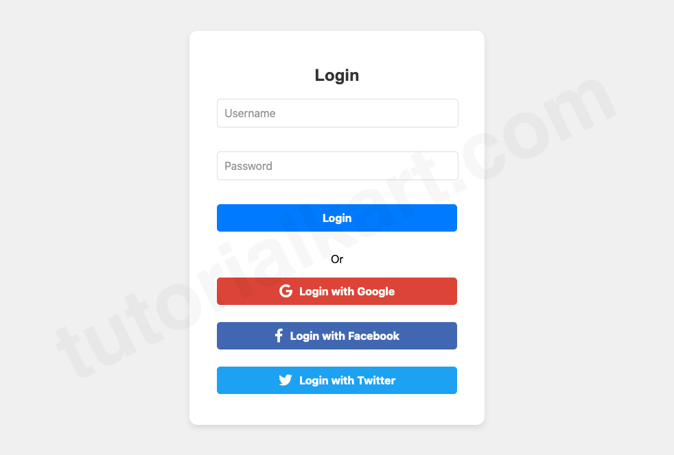
Design 12: Geometric Shape Login Form
The Geometric Shape Login Form uses creative shapes like circles, triangles, and polygons as part of its background or form structure to create a unique and artistic design. This style adds a modern and playful aesthetic, making it ideal for creative portfolios, art websites, or platforms targeting younger audiences.
The geometric shapes act as decorative elements while keeping the form’s functionality clear and user-friendly. The design ensures the login form stands out while maintaining simplicity and usability.
login.html
<!DOCTYPE html>
<html lang="en">
<head>
    <meta charset="UTF-8">
    <meta name="viewport" content="width=device-width, initial-scale=1.0">
    <title>Geometric Shape Login</title>
    <style>
        body {
            margin: 0;
            font-family: 'Arial', sans-serif;
            display: flex;
            justify-content: center;
            align-items: center;
            height: 100vh;
            background: #f0f0f0;
            overflow: hidden;
        }

        .background-shapes {
            position: absolute;
            width: 100%;
            height: 100%;
            top: 0;
            left: 0;
            z-index: -1;
            overflow: hidden;
        }

        .background-shapes .circle {
            position: absolute;
            width: 200px;
            height: 200px;
            background: #74b9ff;
            border-radius: 50%;
            top: -50px;
            left: -50px;
        }

        .background-shapes .triangle {
            position: absolute;
            width: 0;
            height: 0;
            border-left: 100px solid transparent;
            border-right: 100px solid transparent;
            border-bottom: 200px solid #00cec9;
            bottom: -50px;
            right: -50px;
        }

        .login-form {
            position: relative;
            background: #fff;
            padding: 30px;
            clip-path: polygon(50% 0%, 100% 25%, 85% 100%, 15% 100%, 0% 25%);
            width: 300px;
            text-align: center;
            box-shadow: 0 4px 8px rgba(0, 0, 0, 0.2);
            background: linear-gradient(135deg, #6c5ce7, #81ecec);
        }

        .login-form h2 {
            margin-bottom: 20px;
            font-size: 24px;
            color: #fff;
            font-weight: bold;
        }

        .form-group {
            margin-bottom: 20px;
            position: relative;
        }

        .form-group input {
            padding: 15px;
            border: none;
            outline: none;
            text-align: center;
            background: linear-gradient(135deg, #ffeaa7, #fab1a0);
            color: #2d3436;
            font-size: 16px;
            clip-path: polygon(10% 0%, 90% 0%, 100% 100%, 0% 100%);
        }

        .login-button {
            width: 100%;
            padding: 15px;
            border: none;
            cursor: pointer;
            background: linear-gradient(135deg, #00cec9, #0984e3);
            color: #fff;
            font-size: 16px;
            font-weight: bold;
            transition: all 0.3s ease;
            clip-path: polygon(10% 0%, 90% 0%, 100% 100%, 0% 100%);
        }

        .login-button:hover {
            background: linear-gradient(135deg, #0984e3, #00cec9);
        }

        .background-shapes .square {
            position: absolute;
            width: 150px;
            height: 150px;
            background: #ff7675;
            top: 50%;
            left: 50%;
            transform: translate(-50%, -50%) rotate(45deg);
        }
    </style>
</head>
<body>
    <div class="background-shapes">
        <div class="circle"></div>
        <div class="triangle"></div>
        <div class="square"></div>
    </div>
    <div class="login-form">
        <h2>Login</h2>
        <form>
            <div class="form-group">
                <input type="text" placeholder="Username" required>
            </div>
            <div class="form-group">
                <input type="password" placeholder="Password" required>
            </div>
            <button class="login-button" type="submit">Login</button>
        </form>
    </div>
</body>
</html>
Preview
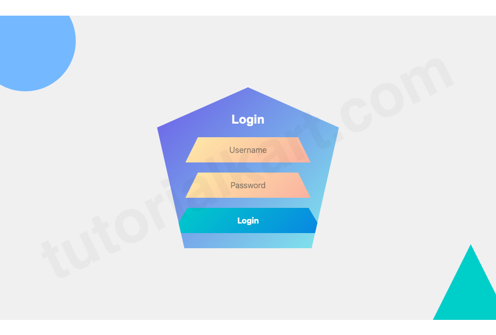
Features of This Design
- Geometric Form:
- The entire form is a polygon (styled using
clip-path), giving it a futuristic and creative appearance.
- The entire form is a polygon (styled using
- Geometric Inputs:
- Input fields have a trapezoidal shape, making them unique yet still functional.
- Geometric Button:
- The login button is also shaped like a trapezoid, creating a cohesive design across all elements.
- Vivid Colors:
- The gradient colors add a modern and playful touch, complementing the geometric aesthetics.
- Background Geometric Shapes:
- Circles, triangles, and squares in the background provide additional depth and visual interest.
Design 13: Login Form with Tabs (Login/Signup)
The Login Form with Tabs design provides users with an intuitive way to toggle between “Login” and “Signup” forms using tabs. This structure is perfect for applications or websites that require both functionalities within a compact and user-friendly interface. The design uses smooth transitions and clearly separated sections to enhance usability.
login.html
<!DOCTYPE html>
<html lang="en">
<head>
    <meta charset="UTF-8">
    <meta name="viewport" content="width=device-width, initial-scale=1.0">
    <title>Tabbed Login/Signup Form</title>
    <style>
        body {
            margin: 0;
            font-family: 'Arial', sans-serif;
            display: flex;
            justify-content: center;
            align-items: center;
            height: 100vh;
            background: #f4f4f4;
        }

        .tabbed-form {
            background: #fff;
            border-radius: 10px;
            box-shadow: 0 4px 10px rgba(0, 0, 0, 0.1);
            width: 400px;
            overflow: hidden;
        }

        .tabbed-form .tabs {
            display: flex;
            background: #007BFF;
        }

        .tabbed-form .tabs button {
            flex: 1;
            padding: 15px;
            border: none;
            background: #007BFF;
            color: white;
            font-size: 16px;
            cursor: pointer;
            transition: background 0.3s ease;
        }

        .tabbed-form .tabs button.active {
            background: #0056b3;
        }

        .tabbed-form .tabs button:hover {
            background: #0056b3;
        }

        .tab-content {
            padding: 20px 30px;
        }

        .tab-content form {
            display: none;
        }

        .tab-content form.active {
            display: block;
        }

        .form-group {
            margin-bottom: 20px;
        }

        .form-group input {
            width: calc(100% - 22px);
            padding: 10px;
            border: 1px solid #ddd;
            border-radius: 5px;
            font-size: 16px;
        }

        .form-group label {
            display: block;
            margin-bottom: 5px;
            font-size: 14px;
            color: #555;
        }

        .form-group button {
            width: 100%;
            padding: 10px;
            border: none;
            background: #007BFF;
            color: white;
            font-size: 16px;
            border-radius: 5px;
            cursor: pointer;
        }

        .form-group button:hover {
            background: #0056b3;
        }
    </style>
    <script>
        function switchTab(tab) {
            const tabs = document.querySelectorAll('.tabs button');
            const forms = document.querySelectorAll('.tab-content form');

            tabs.forEach(button => button.classList.remove('active'));
            forms.forEach(form => form.classList.remove('active'));

            tab.classList.add('active');
            document.querySelector(tab.dataset.target).classList.add('active');
        }
    </script>
</head>
<body>
    <div class="tabbed-form">
        <div class="tabs">
            <button class="active" data-target="#login" onclick="switchTab(this)">Login</button>
            <button data-target="#signup" onclick="switchTab(this)">Signup</button>
        </div>
        <div class="tab-content">
            <form id="login" class="active">
                <div class="form-group">
                    <label for="login-username">Username</label>
                    <input type="text" id="login-username" placeholder="Enter your username" required>
                </div>
                <div class="form-group">
                    <label for="login-password">Password</label>
                    <input type="password" id="login-password" placeholder="Enter your password" required>
                </div>
                <div class="form-group">
                    <button type="submit">Login</button>
                </div>
            </form>
            <form id="signup">
                <div class="form-group">
                    <label for="signup-username">Username</label>
                    <input type="text" id="signup-username" placeholder="Choose a username" required>
                </div>
                <div class="form-group">
                    <label for="signup-email">Email</label>
                    <input type="email" id="signup-email" placeholder="Enter your email" required>
                </div>
                <div class="form-group">
                    <label for="signup-password">Password</label>
                    <input type="password" id="signup-password" placeholder="Create a password" required>
                </div>
                <div class="form-group">
                    <button type="submit">Signup</button>
                </div>
            </form>
        </div>
    </div>
</body>
</html>
Preview
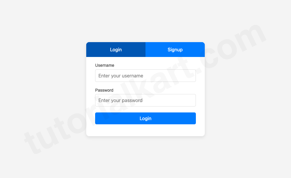
- Tabbed Navigation:
- Two tabs labeled “Login” and “Signup” allow users to toggle between forms easily.
- Active tab is visually distinct for clarity.
- Dynamic Content:
- Only one form (Login or Signup) is visible at a time, ensuring a clean interface.
- Smooth switching between tabs enhances user experience.
- Responsive Design:
- The layout is fully responsive, ensuring usability on all devices.
Features
- User-Friendly Interface:
- Combines login and signup in a single compact layout.
- Easy navigation between tabs reduces complexity.
- Customizable:
- Add more tabs if needed (e.g., Forgot Password).
- Modify colors and text to match your branding.
- Lightweight Script:
- Minimal JavaScript ensures fast loading and easy maintenance.
This design is perfect for websites and apps that aim to streamline user authentication. Let me know if you’d like additional features or further customization!