Salesforce Dashboard is a visual page that displays key values, charts, tables, and other dashboard components from Salesforce report data. A dashboard does not store a separate copy of business data; it presents snapshots from source reports, such as tabular reports, matrix report, summary report and joined report. Before creating a Salesforce dashboard, create or identify the Salesforce reports that provide the data for each component.
Dashboards are used to monitor sales pipeline, service cases, activities, revenue, team performance, and other business information inside Salesforce. A useful dashboard starts with a clear reporting question: what should the viewer understand, compare, or act on after opening the dashboard?
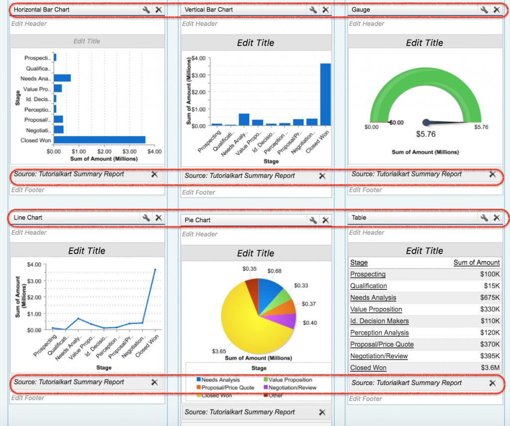
Salesforce dashboard components and dashboard widgets
In Salesforce Classic, the items on a dashboard are commonly called dashboard components. In Lightning Experience, Salesforce often refers to them as dashboard widgets. Both terms refer to the visual blocks that show report data or supporting dashboard content. Salesforce Help explains the current Lightning dashboard builder in Build a Lightning Experience Dashboard.
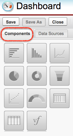
Different Salesforce Dashboard Components are Charts, Gauges, Tables, Metrics and Visualforce Pages. Depending on the Salesforce experience and enabled features in your org, Lightning dashboards can also include rich text, images, and custom Lightning Web Components. Always check your org’s current reports and dashboards limits, because Salesforce limits can vary by edition, release, and enabled features.
| Salesforce dashboard component | Best use | Example |
|---|---|---|
| Chart | Compare values, show trends, or show contribution by category. | Opportunity amount by stage, monthly closed revenue, cases by priority. |
| Gauge | Show progress against a target or threshold. | Closed revenue against quarterly target. |
| Metric | Show one important number clearly. | Total open opportunities, number of overdue cases, current month revenue. |
| Table | Show ranked rows or detailed values from a source report. | Top 10 opportunities by amount. |
| Visualforce page | Display a custom Classic dashboard component when standard components are not enough. | Custom dashboard panel built by a developer. |
| Rich text, image, or custom Lightning Web Component | Add explanations, visual context, or custom Lightning dashboard behavior where supported. | Instruction text, company logo, or custom visualization. |
Salesforce dashboard source reports, folders, and viewer access
A Salesforce dashboard is only as useful as its source reports. The source report controls the fields, filters, groupings, and summarized values used by the dashboard component. If a source report is poorly filtered or grouped, the dashboard component will also be misleading.
- Salesforce Dashboards are stored in Folders.
- Dashboard folder can be hidden, public or restricted to public groups.
- Dashboard viewers need access to the dashboard folder, and they also need access to the underlying report folder when the dashboard depends on reports stored there.
- Field-level security, sharing rules, roles, and object permissions still affect what a user can see. Review Security settings. before sharing dashboards broadly.
- Dashboards won’t refresh automatically unless a refresh schedule, subscription, or manual refresh is used.
- Salesforce Dashboard can be delivered through Email by using dashboard subscriptions where the feature is available.
Before you create a Salesforce dashboard
Complete these checks before opening the dashboard builder. They help you avoid the most common dashboard problems.
- Create the source reports first and verify that each report returns the correct records.
- Use summary or matrix reports when the dashboard component needs grouped values, totals, charts, or summarized measures.
- Save reports in folders that the intended dashboard viewers can access.
- Confirm that users have permission to run reports and view the objects and fields used in those reports.
- Decide whether the dashboard should run as a fixed running user or as the logged-in user.
- Plan the layout so the most important metrics appear at the top of the dashboard.
How to create a dashboard in Salesforce
To create a Dashboard in Salesforce user must have source reports data to build new dashboard. To create Salesforce dashboard login Salesforce and follow the steps given below.
- Navigate to Dashboard tabs | Click on New Dashboard.
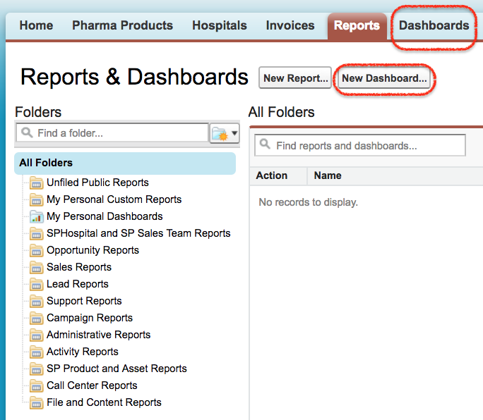
When you click the New Dashboard button, Salesforce opens the dashboard builder. From this screen, you can choose the dashboard folder, add components, select source reports, and arrange the dashboard layout. In Lightning Experience, use the Dashboards tab and click New Dashboard. In Salesforce Classic, the builder screen and labels can look different, but the basic idea is the same: select a component and connect it to a report.
Data Source is the the pre-prepared source reports containing the data you wish to display in Salesforce dashboard. These source reports are stored in folders that your intended dashboard viewers have access or they will not be unable to view the information.
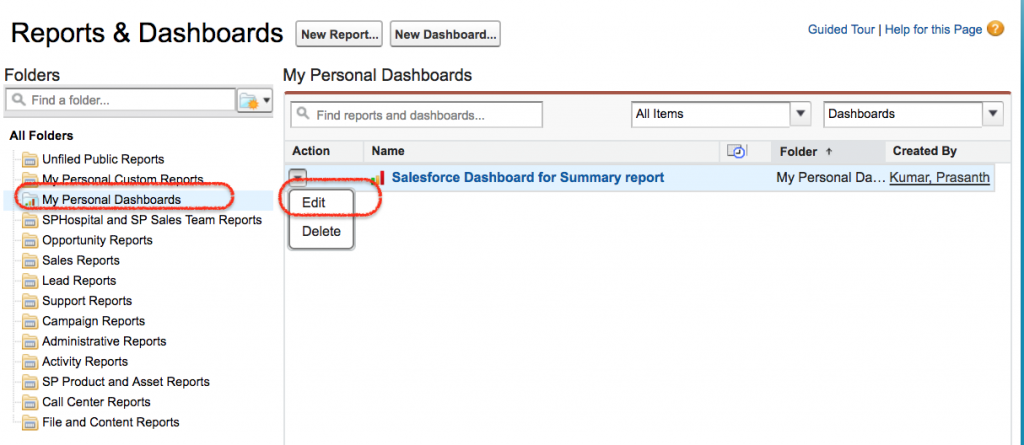
- Now go to Data Source | Reports | My personal Custom Reports.
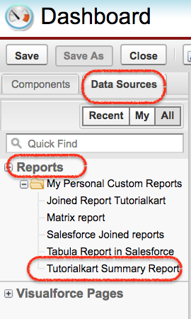
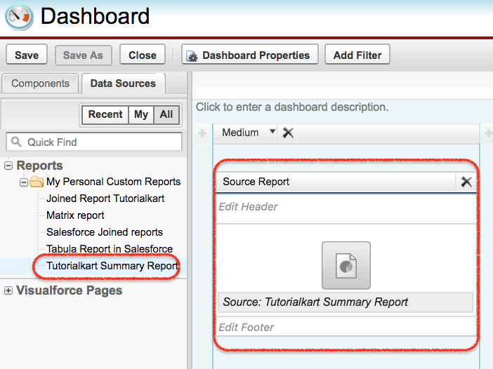
In this Salesforce Tutorial we are going to create Dashboard for Summary report. Now drag and drop the summary report to to Dashboard as shown below.
After selecting the source report, choose the dashboard component that best matches the report data. For example, use a bar chart for comparison, a gauge for a target, a metric for a single value, and a table for ranked rows. Avoid adding a chart only because it looks visual; the component must answer a real business question.
Now drag and drop the component and Data source as shown below. In current Lightning dashboards, Salesforce supports more dashboard widgets than the older Classic 20-component model, but the exact limit should be checked in Reports and Dashboards Limits and Allocations for your org and release.
The most important concept to remember while creating Salesforce dashboard is to understand how to customize the dashboard to show the information that the viewer needs. Place the most important values first, use clear component titles, and avoid mixing unrelated reports on the same dashboard.
Customizing Salesforce dashboard component data and formatting
- We have options called Narrow, medium and wide. We can select any option to get better view of the dashboard.
- We have another two icons called Edit and Delete.
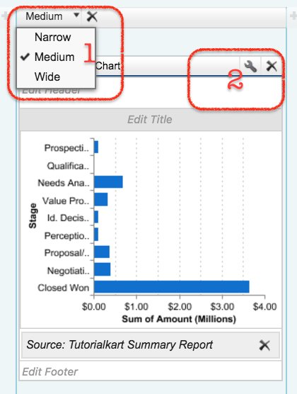
- Now click on Edit button we will find editor. Here we have two sections called component data and Formatting.
Component data : Here we define X-Axis, Y-axis, grouping by any field, combination chart, display units and drill down data. In Lightning dashboard builder, the exact options depend on the selected widget type and source report grouping.
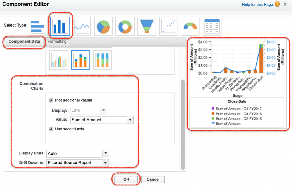
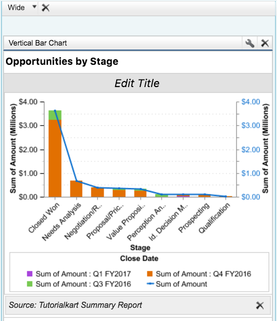
As shown above in component data in X-Axis we have selected Sum of Amount, Y-Axis we have selected Stage and the data is grouped by Closed Data. For a sales pipeline dashboard, this type of setup can show opportunity amount by stage and close period.
- Enter required values and finally click on Save button.
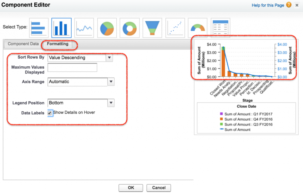
Formatting :- In formatting we can sort rows by ascending or descending and legend position. Use formatting to improve readability, not to hide important context. For example, keep labels clear, use meaningful titles, and choose a chart type that matches the report grouping.
- Enter Description and footer to your Salesforce Dashboard.
- Now finally click on Save button.
Dynamic Dashboard in Salesforce and running user settings
Dynamic Dashboard in Salesforce are used to display information to a specific user using Security settings. Dynamic Salesforce dashboards can be made to visible to a specific user or as a logged in user. In practical terms, the running user setting controls whose data access is used when the dashboard is viewed. Salesforce Help describes this setting in Configure Dashboard Data Visibility in Lightning Experience.
A dashboard can run as a specified user, as the logged-in user, or with other running-user options supported by your edition and permissions. A dynamic dashboard is useful when sales reps, managers, and executives should open the same dashboard but see data according to their own record access. Depending up on the Salesforce Edition, Dynamic dashboard availability and limits may vary. Verify the current limit in your Salesforce org instead of relying on older fixed edition counts.
Creating Dynamic Dashboard in Salesforce
- To create dynamic dashboard in Salesforce login to Salesfore.com and navigate to Dashboard | dashboards lists.
- Now list of all Dashboard will be displayed.
- Click on Edit button as shown below.
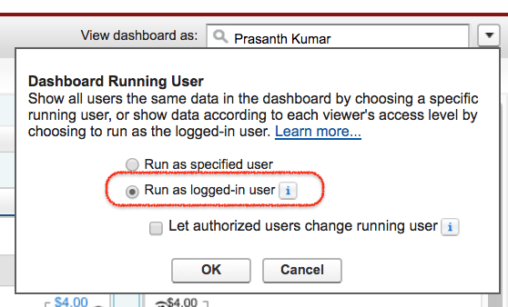
- Now click on the button next to the View dashboard as field and select Run as Logged-in user option as shown below.
- Optionally, select Let authorized users change running user to enable those with permission to change the running user on the dashboard view page.
- Click on OK.
- In the View dashboard as field, enter a running user if the dashboard must run as a specified user instead of the logged-in viewer.
- Save the dashboard.
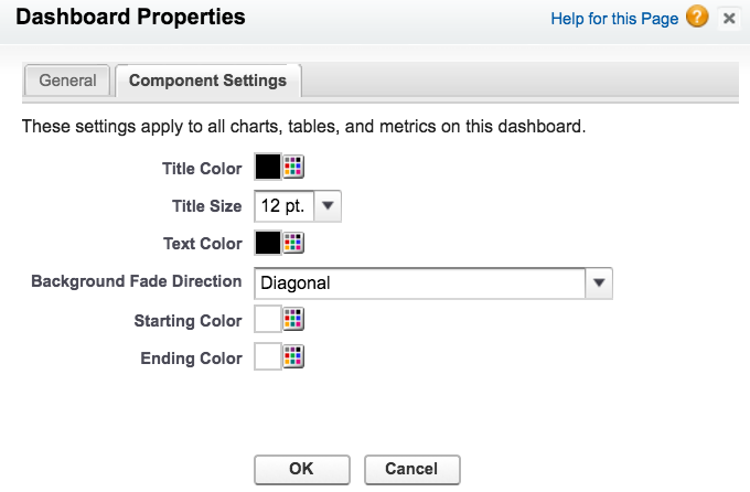
Customizing Salesforce dashboard is very simple. We can edit, delete, Print and can set dashboard properties. Dashboard title colour, Size, background fade and text color can be done at component settings.
- Navigate to Dashboard Properties | Component Settings.
Salesforce dashboard filters, refresh, and email subscriptions
Dashboard filters let viewers apply a selected data perspective without creating separate dashboards for every team, region, product, or time period. For example, a sales manager can filter the same dashboard by opportunity stage or region. Salesforce Help explains the feature in Filter a Dashboard.
Dashboard refresh controls when Salesforce recalculates the dashboard values from the source reports. If a dashboard appears outdated, refresh it manually or review the scheduled refresh and subscription settings. For slow dashboards, check the source reports first because dashboard performance depends heavily on the performance of the underlying reports. Salesforce also provides guidance in Improve Dashboard Performance.
Deleting and printing Salesforce Dashboard
- To delete Salesforce dashboard navigate to Dashboard Tab | Dashboard lists | Go to dashboard folder.
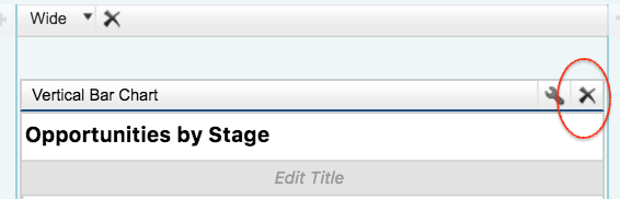
- Click on X to delete your Salesforce dashboard.
Printing Salesforce dashboard
Salesforce dashboard can be printed using web browser option. And the paper orientation to print must be set to landscape so that it is wide enough to fit all three columns of the dashboard. Before printing, refresh the dashboard and check that the browser print preview includes the complete dashboard area.
Adding Salesforce dashboard to the Home page
Created Salesforce Dashboard can be added to home page. To add navigate to Setup | Build | Customize |Home | Home page layout | Edit (page layout).
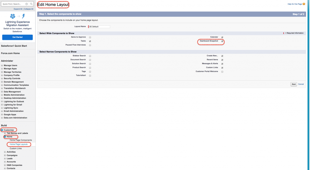
- Check Dashboard Snapshot to add on Home page layout.
- Click on next button.
- Now move the position.
- Click on Save button.
- Now go to Home page.
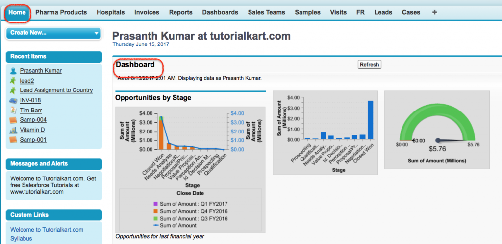
Now we see Salesforce dashboard on home page. In Lightning Experience, adding dashboard information to a home page is usually handled through Lightning App Builder and Lightning page components rather than the older Classic home page layout option.
Salesforce dashboard troubleshooting checks
| Dashboard issue | Likely reason | What to check |
|---|---|---|
| User cannot see dashboard data | Folder access, report access, object access, field-level security, or record sharing is blocking visibility. | Check dashboard folder sharing, report folder sharing, source report access, and the dashboard running user. |
| Dashboard value does not match expectation | The source report filter, grouping, or summary field is not correct. | Open the source report and verify filters, report type, date range, and summary values. |
| Dashboard is slow to refresh | One or more source reports are slow or too broad. | Simplify filters, reduce unnecessary columns, review report type, and test each source report separately. |
| Chart type is not available | The source report does not have the grouping or summary needed for that visualization. | Use a summary or matrix report and add the required grouping fields. |
| Dynamic dashboard limit is reached | The org has reached the number of dashboards that can run as the logged-in user. | Review existing dynamic dashboards and current Salesforce limits for your edition. |
Salesforce dashboard QA checklist for admins
- Each dashboard component has a clear title that explains the value being shown.
- Every component is connected to the correct source report.
- Source reports are saved in accessible folders and tested with realistic users.
- The dashboard running user setting matches the intended security model.
- Dashboard filters use fields that make sense across the selected components.
- The dashboard is not overloaded with unrelated charts, duplicate metrics, or unused widgets.
- The refresh or subscription setting matches how often users need updated information.
- The dashboard layout is readable on the screen size used by the target users.
FAQs on Salesforce dashboards
What is a Salesforce dashboard?
A Salesforce dashboard is a visual page that displays report data through components such as charts, metrics, gauges, and tables. It helps users review key values and trends without opening each report separately.
Which report types can be used in Salesforce dashboard components?
Dashboard components commonly use summary and matrix reports because they provide grouped and summarized data. Tabular reports can be used in limited dashboard scenarios, but they are less suitable when the component needs grouped chart values.
What is the difference between a standard dashboard and a dynamic dashboard in Salesforce?
A standard dashboard usually runs as a specified user, so viewers see data based on that running user’s access. A dynamic dashboard can run as the logged-in user, so each viewer sees dashboard data according to their own security and sharing access.
Why can’t a user see the same Salesforce dashboard data as an admin?
The user may not have access to the dashboard folder, source report folder, object, field, or records used by the source reports. The dashboard running user setting can also change what data appears. Test the source report and dashboard using a user profile similar to the affected viewer.
How many components can be added to a Salesforce dashboard?
The number of dashboard components depends on the Salesforce experience, release, and org limits. Older Salesforce Classic material often mentions 20 dashboard components. Current Lightning dashboard limits are different, so check Salesforce Help or your org’s setup information before designing a large dashboard.
Conclusion: building useful Salesforce dashboards from reports
In this Salesforce Tutorial we learned how dashboard data can be reported and presented within Salesforce CRM. We looked at Salesforce dashboard components, source reports, dashboard folders, dynamic dashboards, and customization options. A good Salesforce dashboard depends on well-built reports, correct security settings, clear component titles, and a layout that answers the viewer’s reporting questions. For report building basics, also review the report builder.