 TutorialKart.com
Apex PageBlockSection component
Apex PageBlockSection component, written as <apex:pageBlockSection> in Visualforce, is used to create sections inside an <apex:pageBlock>. It helps group related Salesforce fields, labels, and values into a layout that looks similar to standard Salesforce detail and edit pages.
A page block section is commonly used when a Visualforce page needs record information arranged under headings such as Account Information, Contact Details, Billing Address, or System Information. The component can show a title, display fields in one or more columns, and optionally allow the user to collapse or expand the section.
Each component found in the body of an <apex: pageblock section> is placed into the next cell in a row until the no. of columns is reached. Apex pageBlockSection must be a child component to <apex:pageBlock> component. <apex:inputField> and <apex:outputField> are the two components used to add fields from a Salesforce object.
How <apex:pageBlockSection> arranges label and value cells
The <apex:pageBlockSection> component arranges its child components in a label-and-value style layout. When you use <apex:inputField> or <apex:outputField>, Visualforce can display the field label and field value using Salesforce metadata. This is useful because the label, field type, and formatting come from the object definition.
If you need more control over how the label and value are paired, use <apex:pageBlockSectionItem> inside the section. It lets you explicitly define the label part and the value part instead of relying only on automatic field rendering.
<apex:pageBlock>
    <apex:pageBlockSection title="Account Information" columns="2">
        <apex:outputField value="{!Account.Name}" />
        <apex:outputField value="{!Account.Industry}" />
    </apex:pageBlockSection>
</apex:pageBlock>
Apex PageBlockSection component attributes.
| Title | This attribute will display the title of Apex PageBlockSection component |
| Collapsible | Collapsible is a boolean type. It Specifies whether the page block section can be expanded and collapsed by a user, by default its “TRUE” |
| Columns | Columns is an Integer type. It specifies t specifies the no. of columns that can be included in a single row of a pageblock section |
| Dir | It specifies the text direction RTL or LTR |
Important <apex:pageBlockSection> attributes for Visualforce layouts
| Attribute | Use in <apex:pageBlockSection> |
|---|---|
| title | Displays the section heading, such as Account Information or Address Details. |
| columns | Specifies how many field columns are shown in one row. Common values are 1 and 2. |
| collapsible | Controls whether the user can expand and collapse the section. |
| rendered | Controls whether the section is displayed based on a Boolean expression. |
| id | Gives the section a component identifier, often useful when rerendering part of a Visualforce page. |
| showHeader | Controls whether the section header is shown. |
| dir | Sets text direction, such as left-to-right or right-to-left. |
The most frequently used attributes are title, columns, collapsible, and rendered. These attributes are usually enough for building clean record sections in a Visualforce form or read-only page.
Visualforce page
<apex:page >
    <apex:form>
        <apex:pageBlock title="Tutorialkart" mode="Account">
            <apex:pageBlockSection title="Page Block Section - 1" columns="2" collapsible="true" >
                <apex:outputLabel> Prasanth Kumar </apex:outputLabel>
                <apex:outputLabel>Prasanth Kumar </apex:outputLabel>
                <apex:outputLabel> Prasanth Kumar</apex:outputLabel>
            </apex:pageBlockSection>
            <apex:pageBlockSection title="page block section - 2" columns="3">
                <apex:outputLabel> Prasanth Kumar</apex:outputLabel>
                <apex:outputLabel> Prasanth Kumar</apex:outputLabel>
                <apex:outputLabel> Prasanth Kumar</apex:outputLabel>
            </apex:pageBlockSection>
        </apex:pageBlock>
    </apex:form>
</apex:page>
We can add any number of Apex Page Block Section component in <apex:pageblock> component. To specify Apex PageBlockSection as expanded and Collapsed use Collapsible attribute as shown above.
- To specify the number of columns use columns attribute and enter the integer value in page block section.
Output
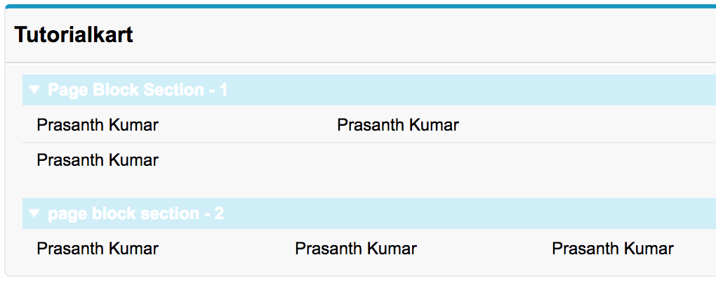
In the first page block section, we entered 2 columns for the row and in Second block section we enter 3 columns for the row. Now we understood the working and usage of Apex pageblockSection component.
Using <apex:pageBlockSection> with Salesforce object fields
In real Visualforce pages, <apex:pageBlockSection> is usually used with fields from a Salesforce object. The example below uses the standard Account controller and displays Account fields in a two-column section.
<apex:page standardController="Account">
    <apex:form>
        <apex:pageBlock title="Account Details">
            <apex:pageBlockSection title="Account Information" columns="2" collapsible="true">
                <apex:outputField value="{!Account.Name}" />
                <apex:outputField value="{!Account.Industry}" />
                <apex:outputField value="{!Account.Phone}" />
                <apex:outputField value="{!Account.Website}" />
            </apex:pageBlockSection>
        </apex:pageBlock>
    </apex:form>
</apex:page>
Use <apex:outputField> when the field is read-only on the page. Use <apex:inputField> when the user must edit the record value and submit the form. In both cases, Visualforce uses Salesforce field metadata for labels and formatting.
Using <apex:pageBlockSectionItem> inside <apex:pageBlockSection>
<apex:pageBlockSectionItem> is useful when a normal field component does not give enough control over the label and value cells. For example, you may want to display a custom label, a calculated value, or a command component next to a label.
<apex:pageBlockSection title="Custom Section" columns="1">
    <apex:pageBlockSectionItem>
        <apex:outputLabel value="Account Name" />
        <apex:outputText value="{!Account.Name}" />
    </apex:pageBlockSectionItem>
</apex:pageBlockSection>
Use this approach when the label and value must be controlled separately. For simple record fields, <apex:inputField> and <apex:outputField> are usually cleaner.
Collapsible <apex:pageBlockSection> behavior
The collapsible attribute controls whether a user can collapse and expand the page block section. This is useful when a Visualforce page has many groups of fields and you want users to focus on one part of the form at a time.
<apex:pageBlockSection title="Billing Address" columns="2" collapsible="false">
    <apex:outputField value="{!Account.BillingStreet}" />
    <apex:outputField value="{!Account.BillingCity}" />
</apex:pageBlockSection>
Set collapsible=”false” when the section should always remain visible. This is common for required information, confirmation screens, or compact pages where collapsing the section does not help the user.
Common <apex:pageBlockSection> layout mistakes
- Using too many columns: A high column count can make field labels and values difficult to read. For most Salesforce record layouts, one or two columns are easier to scan.
- Nesting page block sections unnecessarily: Use multiple sibling <apex:pageBlockSection> components inside the same <apex:pageBlock> instead of trying to create complex nested section layouts.
- Using outputLabel for record fields: For Salesforce fields, prefer <apex:outputField> or <apex:inputField> so that labels and field formatting follow metadata.
- Forgetting the parent page block: A page block section is intended to be used inside <apex:pageBlock>, not as a standalone layout container.
- Mixing layout and business logic: Keep the Visualforce section responsible for display, and place calculations or record processing in the controller or extension.
Where <apex:pageBlockSection> fits with Visualforce and Lightning
<apex:pageBlockSection> is a Visualforce component. It is still relevant for maintaining existing Visualforce pages and for orgs that use Visualforce for custom record screens, console pages, or legacy workflows. For new Salesforce UI work, many teams also evaluate Lightning Web Components, but Visualforce remains useful where an existing page or controller-based Visualforce design is already in place.
If you are updating an old Visualforce page, review whether the page only needs a small layout change or whether the feature should be redesigned in Lightning. A page block section is appropriate for Visualforce record-style layouts, but it is not a general replacement for Lightning page regions or Lightning Web Components.
Apex PageBlockSection component FAQ
What is <apex:pageBlockSection> in Visualforce?
<apex:pageBlockSection> is a Visualforce component used to group related content inside an <apex:pageBlock>. It is commonly used to display Salesforce fields under a section title in a record-style layout.
Can <apex:pageBlockSection> contain inputField and outputField components?
Yes. <apex:inputField> and <apex:outputField> are commonly placed inside <apex:pageBlockSection>. They help display editable or read-only Salesforce record fields using the object field metadata.
What is the difference between <apex:pageBlockSection> and <apex:pageBlockSectionItem>?
<apex:pageBlockSection> creates the overall section. <apex:pageBlockSectionItem> is used inside the section when you need direct control over a label cell and its related value cell.
How many columns should I use in an Apex pageBlockSection?
Use one or two columns for most Visualforce record pages. More columns can fit more values in a row, but the page may become harder to read, especially when field labels or values are long.
Are Visualforce pageBlockSection layouts the same as Salesforce page layouts?
No. A Salesforce page layout is configured in Setup for standard record pages. <apex:pageBlockSection> is a Visualforce component used by developers inside a custom Visualforce page. They can look similar, but they are configured in different places.
Editorial QA checklist for Apex PageBlockSection tutorials
- Confirm every Visualforce tag is written with the correct apex: prefix and valid XML-style closing.
- Keep <apex:pageBlockSection> examples inside <apex:pageBlock> so the layout context is correct.
- Use <apex:inputField> or <apex:outputField> for Salesforce object fields instead of plain labels when metadata-based field rendering is intended.
- Use <apex:pageBlockSectionItem> only when the example needs separate label and value control.
- Check that the explanation does not confuse Visualforce page sections with Salesforce Setup page layouts or Lightning page components.
Conclusion
In this Salesforce tutorial, we learned how the Apex PageBlockSection component is used in Visualforce to group fields and content inside an <apex:pageBlock>. We also covered important attributes such as title, columns, and collapsible, along with examples that use Salesforce object fields and <apex:pageBlockSectionItem>. In the next Visualforce tutorial, we will learn more about the Apex pageBlockSectionItem component and its attributes.