 TutorialKart.com
apex:pageBlock component in Visualforce
The apex:pageBlock component is used in a Visualforce page to create a bordered content block with Salesforce-style page layout formatting. It is commonly used when you want a Visualforce page to look similar to a Salesforce record detail page, with a title area, optional help link, buttons, sections, and body content.
In this Salesforce tutorial, we will learn how apex:pageBlock works, which attributes are commonly used, how it is different from apex:pageBlockSection, and how to use it with a simple Visualforce example.
What apex:pageBlock does in a Visualforce page
The apex:pageBlock tag creates the outer block or container. It does not automatically create fields or a two-column layout by itself. If you need a section with columns, you normally place an apex:pageBlockSection inside the page block. If you need Save, Cancel, Edit, or custom command buttons, you usually add apex:pageBlockButtons inside the page block.
A simple way to understand the structure is:
apex:pageBlockcreates the main styled block.apex:pageBlockButtonsadds buttons to the block.apex:pageBlockSectiongroups fields or related content inside the block.apex:pageBlockSectionItemcan be used when you need more control over labels and values inside a section.
apex:pageBlock component attributes
The following table explains commonly used apex:pageBlock attributes. Attribute names are case-sensitive in Visualforce markup, so use the correct spelling while writing the page.
| Attribute | Description |
|---|---|
title | Displays a title in the header area of the page block. |
helpTitle | Specifies the tooltip text displayed when the user hovers over the help link for the page block. |
helpUrl | Specifies the URL that opens when the help link is clicked. |
dir | Specifies the text direction for the content. Common values are LTR and RTL. |
rendered | A Boolean expression that controls whether the page block is displayed on the page. |
id | Provides an identifier for the component so it can be referenced in the Visualforce page, especially for rerendering or styling scenarios. |
mode | Controls the page block display style, such as detail or edit style, depending on how the page is designed. |
tabStyle | Applies styling associated with a Salesforce object tab, such as Account, to the page block. |
The apex:pageBlock component also supports several JavaScript event attributes, such as onclick, ondblclick, onkeydown, onkeypress, and onkeyup. Use these only when client-side behavior is required.
Visualforce page using apex:pageBlock
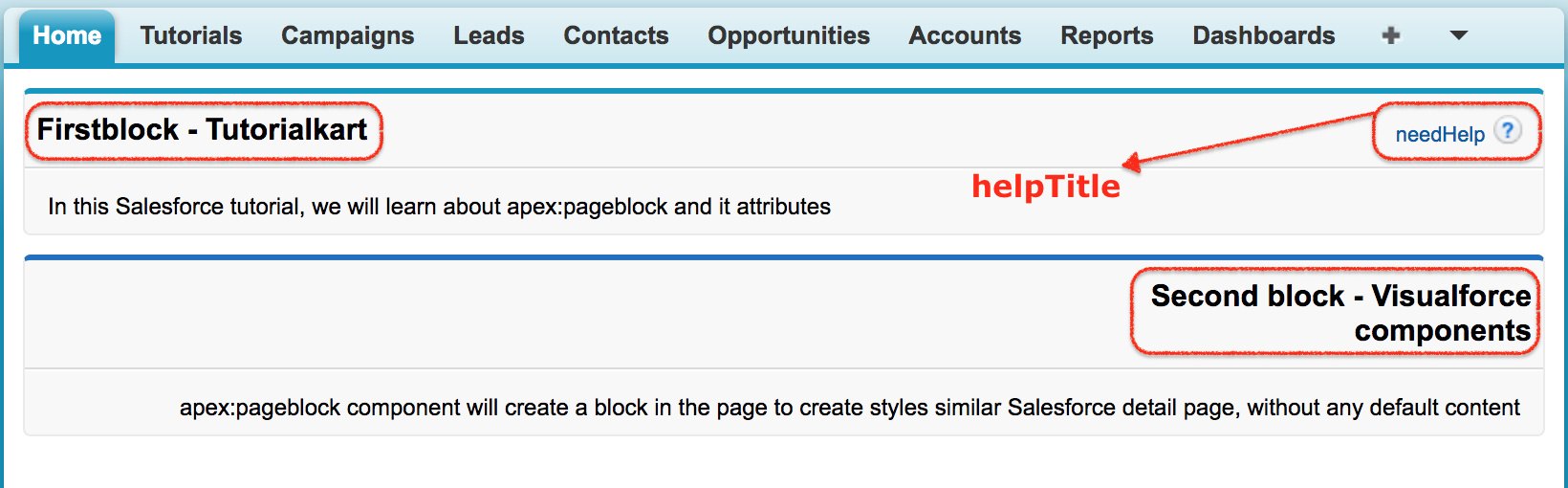
The following Visualforce page creates three page blocks. The first block has a title and help link. The second block uses right-to-left direction and tab styling. The third block uses the rendered attribute and does not appear in the output because the expression evaluates to false.
<apex:page sidebar="false">
    <apex:pageBlock  title="Firstblock - Tutorialkart"
                     helpTitle="needHelp"
                     helpUrl="https://www.tutorialkart.com">
        <p>
            In this Salesforce tutorial, we will learn about apex:pageblock and it attributes
        </p>
    </apex:pageBlock>
    <apex:pageBlock title="Second block - Visualforce components"
                    dir="RTL" tabStyle="Account">
        <p>
            apex:pageblock component will create a block in the page to
            create styles similar Salesforce detail page, without any default content
        </p>
    </apex:pageBlock>
    <apex:pageBlock title="Third block - apex:pageblock"
                    rendered="{!NOT(true)}">
    </apex:pageBlock>
</apex:page>
In the above Visualforce page, we have added three page blocks. In the first pageblock we added Title, helpTitle and helpUrl. When we click on needHelp it will redirect to ”https:www.tutorialakart.com”. In Second pageblock we have added direction as “Right to Left” and in third pageblock we added rendered attribute as {!NOT(true), this will not display third block in the output. If we added {!NOT(false)}, third block will be displayed as usual.
In correct Visualforce syntax, the third block uses rendered="{!NOT(true)}". Since NOT(true) returns false, Salesforce does not render that page block. If the expression is changed to rendered="{!NOT(false)}", the expression returns true and the block is displayed.
Output of apex:pageBlock example
apex:pageBlock with buttons and pageBlockSection
In real Visualforce pages, apex:pageBlock is often used with a form, command buttons, and one or more page block sections. The page block gives the outer Salesforce-style container, while the section organizes fields into columns.
<apex:page standardController="Account">
    <apex:form>
        <apex:pageBlock title="Account Details" mode="edit">
            <apex:pageBlockButtons>
                <apex:commandButton action="{!save}" value="Save"/>
                <apex:commandButton action="{!cancel}" value="Cancel"/>
            </apex:pageBlockButtons>

            <apex:pageBlockSection title="Basic Information" columns="2">
                <apex:inputField value="{!Account.Name}"/>
                <apex:inputField value="{!Account.Phone}"/>
                <apex:inputField value="{!Account.Industry}"/>
                <apex:inputField value="{!Account.Website}"/>
            </apex:pageBlockSection>
        </apex:pageBlock>
    </apex:form>
</apex:page>
In this example, apex:pageBlock creates the Account Details block. The apex:pageBlockButtons component displays Save and Cancel buttons, and apex:pageBlockSection arranges Account fields in two columns.
Difference between apex:pageBlock and apex:pageBlockSection
| Component | Purpose | Typical use |
|---|---|---|
apex:pageBlock | Creates the main Salesforce-styled block container. | Use it as the outer wrapper for a form, details area, or custom page content. |
apex:pageBlockSection | Creates a titled section inside a page block and can arrange fields in columns. | Use it to group related fields, such as Basic Information or Address Information. |
apex:pageBlockSectionItem | Creates a custom label-and-value item inside a page block section. | Use it when default field rendering is not enough and you need custom layout control. |
When to use apex:pageBlock in Salesforce Visualforce
Use apex:pageBlock when you are building or maintaining a Visualforce page that should follow the older Salesforce page layout style. It is useful for admin-style pages, record detail pages, custom edit forms, and Visualforce pages that use standard controllers.
For new user interfaces, especially in Lightning Experience, consider whether Lightning Web Components are a better fit. Visualforce still supports apex:pageBlock, but the component is mainly used in Visualforce-based pages rather than modern Lightning component development.
Common mistakes with apex:pageBlock
- Using
apex:pageBlockalone and expecting fields to be arranged automatically in two columns. Useapex:pageBlockSectionfor column layout. - Forgetting to wrap input fields and command buttons inside
apex:formwhen server-side actions are required. - Writing an invalid Boolean expression in the
renderedattribute. - Using the wrong attribute case, such as
helptitleinstead ofhelpTitle. - Adding many nested page blocks when page block sections would provide a cleaner structure.
FAQs on apex:pageBlock component
What is apex:pageBlock in Visualforce?
apex:pageBlock is a Visualforce component that creates a Salesforce-styled content block with a title area and body. It is commonly used as the outer container for forms, page block buttons, and page block sections.
Does apex:pageBlock create a two-column layout automatically?
No. The page block creates the main container. To create a two-column field layout, place an apex:pageBlockSection inside the page block and set its columns attribute.
How do I hide an apex:pageBlock conditionally?
Use the rendered attribute with a Boolean expression. For example, rendered="{!showBlock}" displays the block only when the controller property or expression evaluates to true.
Can apex:pageBlock contain command buttons?
Yes. Add apex:pageBlockButtons inside apex:pageBlock, and then place apex:commandButton components inside it. If the buttons call controller actions, the page block should be inside an apex:form.
Is apex:pageBlock used in Lightning Web Components?
No. apex:pageBlock is a Visualforce component. Lightning Web Components use different base components and HTML templates instead of Visualforce page block tags.
Editorial QA checklist for this apex:pageBlock tutorial
- Confirm that every Visualforce tag uses the correct case, such as
apex:pageBlock,helpTitle, andhelpUrl. - Check that examples distinguish clearly between
apex:pageBlockandapex:pageBlockSection. - Verify that conditional rendering examples return a Boolean value.
- Ensure any command button example is placed inside an
apex:form. - Keep the existing output image and Visualforce example intact while adding clarifying notes around it.