 TutorialKart.com
Kotlin Android Color Picker Using ARGB SeekBars
This tutorial builds a custom Android color picker in Kotlin using four SeekBar controls. Each SeekBar selects one component of an ARGB color: alpha, red, green, or blue. The selected color is displayed as a hexadecimal value and applied to a preview button.
The example uses standard Android View components and does not require a third-party color picker library. The picker appears as an overlay inside the activity, supports direct hexadecimal input, and provides Cancel and Apply actions.
ARGB Values Used by the Android Color Picker
Android colors can include four 8-bit channels. Each channel accepts a decimal value from 0 to 255, which is represented by two hexadecimal digits from 00 to FF.
| Channel | Purpose | Range | Hex position |
|---|---|---|---|
| Alpha | Controls transparency | 0–255 | AA |
| Red | Controls the red component | 0–255 | RR |
| Green | Controls the green component | 0–255 | GG |
| Blue | Controls the blue component | 0–255 | BB |
The complete format is #AARRGGBB. For example, #FFFF0000 represents fully opaque red. A six-digit value such as #FF0000 omits alpha, so the example assigns an alpha value of 255.
Following is a sample screenshot of the Kotlin Android color picker built in this tutorial.
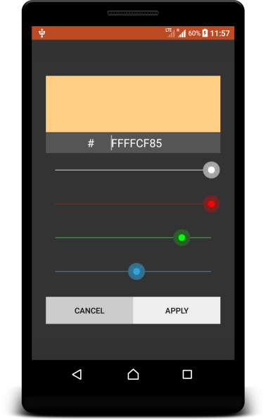
As shown above, the interface has four SeekBars with a minimum value of 0 and a maximum value of 255. An EditText accepts a six-digit RGB value or an eight-digit ARGB value without the leading #. The button at the top of the picker displays a live preview.
Steps to Build the Kotlin Android Color Picker
- Add four SeekBars for the alpha, red, green, and blue channels. Set the maximum value of each SeekBar to 255.
- Add an EditText that displays the combined hexadecimal color and also accepts a manually entered RGB or ARGB value.
- Add a preview button whose background is updated whenever a SeekBar value changes.
- Add Cancel and Apply buttons. Cancel closes the picker without changing the selected-color button, while Apply saves the current color to that button.
Kotlin Android Color Picker Example Project
The main activity contains a selected-color button and a button labelled Color Picker. Tapping either button makes the color picker layout visible. Moving a SeekBar updates the preview and hexadecimal field; tapping Apply assigns the result to the selected-color button.
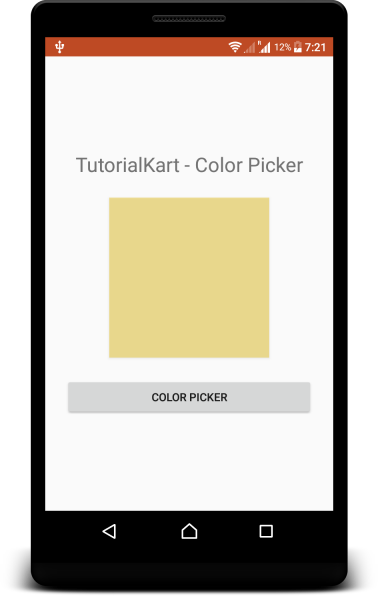
The following layout and Activity files implement the example. The activity is written in Kotlin. The project also uses drawable resources to style the SeekBar tracks and thumbs.
Compatibility note: The original example below uses Kotlin Android Extensions synthetic view references. That mechanism is no longer supported in current Android projects. Keep the color-selection logic, but use View Binding or findViewById() when adapting the example to a current project.
Main Activity Layout: activity_main.xml
<?xml version="1.0" encoding="utf-8"?>
<RelativeLayout xmlns:android="http://schemas.android.com/apk/res/android"
    xmlns:tools="http://schemas.android.com/tools"
    android:layout_width="match_parent"
    android:layout_height="match_parent"
    tools:context=".MainActivity">
    <LinearLayout
        android:orientation="vertical"
        android:gravity="center"
        android:layout_width="match_parent"
        android:layout_height="match_parent">
        <TextView
            android:text="TutorialKart - Color Picker"
            android:textSize="25sp"
            android:padding="25sp"
            android:gravity="center"
            android:layout_width="match_parent"
            android:layout_height="wrap_content" />
        <Button
            android:id="@+id/btnColorSelected"
            android:layout_width="200sp"
            android:layout_height="200sp" />
        <Button
            android:id="@+id/btnColorPicker"
            android:layout_margin="25sp"
            android:layout_width="match_parent"
            android:layout_height="wrap_content"
            android:text="Color Picker" />
    </LinearLayout>
    <include layout="@layout/colorpicker" />
</RelativeLayout>
The root RelativeLayout holds both the activity content and the included picker overlay. The overlay starts with android:visibility="gone", so the normal activity remains visible until the user opens the picker.
Color Picker Overlay Layout: colorpicker.xml
<RelativeLayout
    xmlns:android="http://schemas.android.com/apk/res/android"
    android:id="@+id/colorSelector"
    android:visibility="gone"
    android:background="#CC000000"
    android:layout_width="match_parent"
    android:layout_height="match_parent" >
    <LinearLayout
        android:orientation="vertical"
        android:layout_centerVertical="true"
        android:padding="50px"
        android:background="#333333"
        android:layout_width="match_parent"
        android:layout_height="wrap_content">
        <LinearLayout
            android:orientation="vertical"
            android:background="#FFFFFF"
            android:layout_width="match_parent"
            android:layout_height="wrap_content">
            <Button
                android:id="@+id/btnColorPreview"
                android:background="#F00"
                android:layout_width="match_parent"
                android:layout_height="200px" />
            <LinearLayout
                android:gravity="center"
                android:background="#555555"
                android:layout_gravity="center"
                android:layout_width="match_parent"
                android:layout_height="wrap_content">
                <TextView
                    android:text="#"
                    android:textColor="#FFFFFF"
                    android:textSize="20sp"
                    android:layout_width="wrap_content"
                    android:layout_height="wrap_content" />
                <EditText
                    android:id="@+id/strColor"
                    android:text="FFFF0000"
                    android:textSize="20sp"
                    android:maxLength="8"
                    android:textColor="#FFFFFF"
                    android:background="#555555"
                    android:padding="5sp"
                    android:imeOptions="actionDone"
                    android:textAlignment="center"
                    android:layout_width="150sp"
                    android:layout_height="wrap_content" />
            </LinearLayout>
        </LinearLayout>
        <SeekBar
            android:id="@+id/colorA"
            android:padding="30px"
            android:progress="255"
            android:progressDrawable="@drawable/seekbar_a_progress"
            android:thumb="@drawable/seekbar_a_thumb"
            android:layout_width="match_parent"
            android:layout_height="wrap_content" />
        <SeekBar
            android:id="@+id/colorR"
            android:padding="30px"
            android:progress="255"
            android:progressDrawable="@drawable/seekbar_r_progress"
            android:thumb="@drawable/seekbar_r_thumb"
            android:layout_width="match_parent"
            android:layout_height="wrap_content" />
        <SeekBar
            android:id="@+id/colorG"
            android:padding="30px"
            android:progress="0"
            android:progressDrawable="@drawable/seekbar_g_progress"
            android:thumb="@drawable/seekbar_g_thumb"
            android:layout_width="match_parent"
            android:layout_height="wrap_content" />
        <SeekBar
            android:id="@+id/colorB"
            android:padding="30px"
            android:progress="0"
            android:progressDrawable="@drawable/seekbar_b_progress"
            android:thumb="@drawable/seekbar_b_thumb"
            android:layout_weight="0.9"
            android:layout_width="match_parent"
            android:layout_height="wrap_content" />
        <LinearLayout
            android:orientation="horizontal"
            android:gravity="center"
            android:layout_marginTop="30px"
            android:layout_width="match_parent"
            android:layout_height="wrap_content">
            <Button
                android:id="@+id/colorCancelBtn"
                android:text="Cancel"
                android:background="#CCCCCC"
                android:layout_weight="0.5"
                android:layout_width="wrap_content"
                android:layout_height="wrap_content" />
            <Button
                android:id="@+id/colorOkBtn"
                android:background="#EEEEEE"
                android:text="Apply"
                android:layout_weight="0.5"
                android:layout_width="wrap_content"
                android:layout_height="wrap_content" />
        </LinearLayout>
    </LinearLayout>
</RelativeLayout>
The picker layout defines the preview, hexadecimal input, four channel controls, and action buttons. Its semi-transparent root background visually separates the picker from the activity beneath it.
Color Selection Logic: MainActivity.kt
package com.tutorialkart.colorpicker
import android.app.Activity
import android.graphics.Color
import android.os.Bundle
import android.view.View
import android.widget.SeekBar
import kotlinx.android.synthetic.main.activity_main.*
import kotlinx.android.synthetic.main.colorpicker.*
import android.text.Editable
import android.text.TextWatcher
class MainActivity : Activity() {
    override fun onCreate(savedInstanceState: Bundle?) {
        super.onCreate(savedInstanceState)
        setContentView(R.layout.activity_main)
        btnColorPicker.setOnClickListener {
            colorSelector.visibility = View.VISIBLE
        }
        btnColorSelected.setOnClickListener {
            colorSelector.visibility = View.VISIBLE
        }
        strColor.addTextChangedListener(object : TextWatcher {
            override fun afterTextChanged(s: Editable) {
                if (s.length == 6){
                    colorA.progress = 255
                    colorR.progress = Integer.parseInt(s.substring(0..1), 16)
                    colorG.progress = Integer.parseInt(s.substring(2..3), 16)
                    colorB.progress = Integer.parseInt(s.substring(4..5), 16)
                } else if (s.length == 8){
                    colorA.progress = Integer.parseInt(s.substring(0..1), 16)
                    colorR.progress = Integer.parseInt(s.substring(2..3), 16)
                    colorG.progress = Integer.parseInt(s.substring(4..5), 16)
                    colorB.progress = Integer.parseInt(s.substring(6..7), 16)
                }
            }
            override fun beforeTextChanged(s: CharSequence, start: Int,
                                           count: Int, after: Int) {
            }
            override fun onTextChanged(s: CharSequence, start: Int,
                                       before: Int, count: Int) {
            }
        })
        colorA.max = 255
        colorA.setOnSeekBarChangeListener(object : SeekBar.OnSeekBarChangeListener {
            override fun onStopTrackingTouch(seekBar: SeekBar) {}
            override fun onStartTrackingTouch(seekBar: SeekBar) {}
            override fun onProgressChanged(seekBar: SeekBar, progress: Int,
                                           fromUser: Boolean) {
                val colorStr = getColorString()
                strColor.setText(colorStr.replace("#","").toUpperCase())
                btnColorPreview.setBackgroundColor(Color.parseColor(colorStr))
            }
        })
        colorR.max = 255
        colorR.setOnSeekBarChangeListener(object : SeekBar.OnSeekBarChangeListener {
            override fun onStopTrackingTouch(seekBar: SeekBar) {}
            override fun onStartTrackingTouch(seekBar: SeekBar) {}
            override fun onProgressChanged(seekBar: SeekBar, progress: Int,
                                           fromUser: Boolean) {
                val colorStr = getColorString()
                strColor.setText(colorStr.replace("#","").toUpperCase())
                btnColorPreview.setBackgroundColor(Color.parseColor(colorStr))
            }
        })
        colorG.max = 255
        colorG.setOnSeekBarChangeListener(object : SeekBar.OnSeekBarChangeListener {
            override fun onStopTrackingTouch(seekBar: SeekBar) {}
            override fun onStartTrackingTouch(seekBar: SeekBar) {}
            override fun onProgressChanged(seekBar: SeekBar, progress: Int,
                                           fromUser: Boolean) {
                val colorStr = getColorString()
                strColor.setText(colorStr.replace("#","").toUpperCase())
                btnColorPreview.setBackgroundColor(Color.parseColor(colorStr))
            }
        })
        colorB.max = 255
        colorB.setOnSeekBarChangeListener(object : SeekBar.OnSeekBarChangeListener {
            override fun onStopTrackingTouch(seekBar: SeekBar) {}
            override fun onStartTrackingTouch(seekBar: SeekBar) {}
            override fun onProgressChanged(seekBar: SeekBar, progress: Int,
                                           fromUser: Boolean) {
                val colorStr = getColorString()
                strColor.setText(colorStr.replace("#","").toUpperCase())
                btnColorPreview.setBackgroundColor(Color.parseColor(colorStr))
            }
        })
        colorCancelBtn.setOnClickListener {
            colorSelector.visibility = View.GONE
        }
        colorOkBtn.setOnClickListener {
            val color:String = getColorString()
            btnColorSelected.setBackgroundColor(Color.parseColor(color))
            colorSelector.visibility = View.GONE
        }
    }
    fun getColorString(): String {
        var a = Integer.toHexString(((255*colorA.progress)/colorA.max))
        if(a.length==1) a = "0"+a
        var r = Integer.toHexString(((255*colorR.progress)/colorR.max))
        if(r.length==1) r = "0"+r
        var g = Integer.toHexString(((255*colorG.progress)/colorG.max))
        if(g.length==1) g = "0"+g
        var b = Integer.toHexString(((255*colorB.progress)/colorB.max))
        if(b.length==1) b = "0"+b
        return "#" + a + r + g + b
    }
}
How the Kotlin Color Picker Updates the Preview
- The click listeners make
colorSelectorvisible when the picker is requested. - The TextWatcher splits a six-digit value into red, green, and blue pairs. For an eight-digit value, it reads alpha first.
- Each SeekBar listener calls
getColorString(), places the resulting value in the EditText, and sends it toColor.parseColor(). getColorString()converts every decimal channel to hexadecimal and adds a leading zero when a channel has only one hexadecimal digit.- Apply updates
btnColorSelected. Cancel only hides the overlay.
Hex Input Validation for the Android Color Picker
The example parses the EditText as soon as its length reaches six or eight characters. A production implementation should verify that every character is a hexadecimal digit before calling Integer.parseInt(). Otherwise, an input such as GG0000 can cause a NumberFormatException.
It is also useful to show an inline error for incomplete values and to apply the color only after validation succeeds. If the UI includes the # character inside the EditText rather than in a separate TextView, remove it before validating the remaining six or eight digits.
View-Based Picker, Dialog, or Jetpack Compose Picker
This example is a custom View-based picker embedded in the activity layout. The same channel and hexadecimal conversion logic can be placed inside a Dialog or DialogFragment when the picker should be reusable across several screens. In a Jetpack Compose application, sliders and Compose state can replace SeekBars and TextWatcher callbacks. A third-party Android color picker library may provide hue wheels, palettes, saved colors, and Compose components, but it also adds a dependency. The custom approach is appropriate when four ARGB channels and a preview are sufficient.
Kotlin Android Color Picker FAQs
What is the difference between RGB and ARGB in Android?
RGB contains red, green, and blue channels. ARGB adds an alpha channel that controls transparency. RGB is commonly written as #RRGGBB, while ARGB is written as #AARRGGBB.
Why does each color SeekBar use a maximum value of 255?
Each ARGB channel is represented by eight bits. Eight bits can store values from 0 through 255, corresponding to hexadecimal values from 00 through FF.
How is transparency selected in this Kotlin color picker?
The alpha SeekBar controls transparency. An alpha value of 0 is fully transparent, while 255 is fully opaque. The selected alpha becomes the first two digits in the eight-digit ARGB value.
Can this Android color picker be shown in a dialog?
Yes. Move the color picker layout and selection logic into a DialogFragment or another reusable dialog component. Return the selected integer color through a callback or shared state when the user taps Apply.
Does this example require an Android color picker library?
No. It uses standard Android Views and android.graphics.Color. A library is optional if the application needs additional interfaces such as a hue wheel, saturation panel, preset palette, or ready-made Jetpack Compose component.
Kotlin Android Color Picker QA Checklist
- Confirm that all four SeekBars accept values from 0 to 255.
- Verify that six-digit RGB input sets alpha to 255.
- Verify that eight-digit ARGB input updates all four SeekBars correctly.
- Test hexadecimal values containing leading zeros, such as
0000FFand80000000. - Reject non-hexadecimal and incomplete input without crashing the activity.
- Confirm that Cancel preserves the previously applied color and Apply saves the previewed color.
- Check the picker in portrait and landscape orientations and verify state restoration after activity recreation.
- Use View Binding or another supported view-access method when creating a current Android project.
Kotlin Android Color Picker Summary
In this Kotlin Android Tutorial, we built an Android Color Picker with four SeekBars, hexadecimal input, a live preview, and Apply and Cancel actions. The example demonstrates the underlying ARGB conversion without a third-party library and can be adapted to a dialog, View Binding project, or Jetpack Compose interface.