 TutorialKart.com
Kotlin Android TextView
Android TextView is a user interface widget used to display text in an activity. It can show a label, heading, message, value, or multi-line block of text. The displayed text and its appearance can be configured in an XML layout or Kotlin code.
This tutorial explains how to add a TextView to an Android layout, access it from Kotlin, change its text at runtime, and configure commonly used TextView attributes such as text size, color, padding, alignment, and line wrapping.
TextView displayed in an Android activity
Create an Android application named TextViewExample with an empty activity, and then run the application.
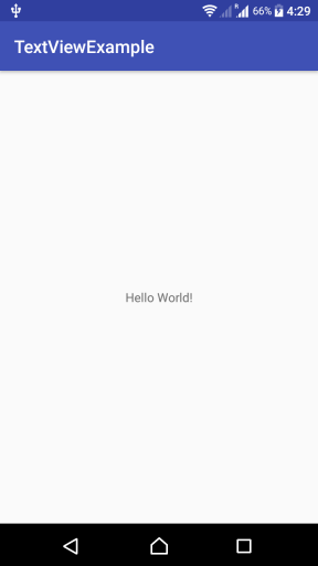
The “Hello World!” text displayed at the center of the activity is rendered by a TextView. Its position is controlled by the surrounding layout, while attributes on the TextView control the content and appearance.
Basic Android TextView example using XML
Create an Android Application with Kotlin Support and locate the activity_main.xml layout file and MainActivity.kt.
The following original example uses the older Android Support Library and Kotlin synthetic view access. It is retained as a reference for projects created with those APIs. A current AndroidX example is provided in the next section.
Open activity_main.xml, which defines the layout for MainActivity, and use the following code.
activity_main.xml
<?xml version="1.0" encoding="utf-8"?>
<android.support.constraint.ConstraintLayout xmlns:android="http://schemas.android.com/apk/res/android"
    xmlns:app="http://schemas.android.com/apk/res-auto"
    xmlns:tools="http://schemas.android.com/tools"
    android:layout_width="match_parent"
    android:layout_height="match_parent"
    tools:context=".MainActivity">

    <TextView
        android:layout_width="wrap_content"
        android:layout_height="wrap_content"
        android:text="Hello World!"
        app:layout_constraintBottom_toBottomOf="parent"
        app:layout_constraintLeft_toLeftOf="parent"
        app:layout_constraintRight_toRightOf="parent"
        app:layout_constraintTop_toTopOf="parent" />

</android.support.constraint.ConstraintLayout>
MainActivity.kt
package com.tutorialkart.webviewexample

import android.support.v7.app.AppCompatActivity
import android.os.Bundle
import kotlinx.android.synthetic.main.activity_main.*

class MainActivity : AppCompatActivity() {

    override fun onCreate(savedInstanceState: Bundle?) {
        super.onCreate(savedInstanceState)
        setContentView(R.layout.activity_main)
    }
}
In this example, android:text supplies the displayed value. The four constraints place the TextView at the center of its parent ConstraintLayout.
Modern AndroidX TextView layout example
For a current Android project, use the AndroidX version of ConstraintLayout. Give the TextView an ID when Kotlin code needs to locate or update it. Text shown to users should normally be stored in res/values/strings.xml so that it can be translated and reused.
res/values/strings.xml
<resources>
    <string name="app_name">TextViewExample</string>
    <string name="welcome_message">Welcome to the TextView example</string>
</resources>
res/layout/activity_main.xml
<?xml version="1.0" encoding="utf-8"?>
<androidx.constraintlayout.widget.ConstraintLayout
    xmlns:android="http://schemas.android.com/apk/res/android"
    xmlns:app="http://schemas.android.com/apk/res-auto"
    android:layout_width="match_parent"
    android:layout_height="match_parent">

    <TextView
        android:id="@+id/welcomeTextView"
        android:layout_width="wrap_content"
        android:layout_height="wrap_content"
        android:padding="16dp"
        android:text="@string/welcome_message"
        android:textSize="20sp"
        app:layout_constraintBottom_toBottomOf="parent"
        app:layout_constraintEnd_toEndOf="parent"
        app:layout_constraintStart_toStartOf="parent"
        app:layout_constraintTop_toTopOf="parent" />

</androidx.constraintlayout.widget.ConstraintLayout>
The ID @+id/welcomeTextView creates a resource identifier for the view. Horizontal and vertical constraints center the TextView, while 16dp of padding adds space between its text and its boundaries.
Change TextView text from Kotlin
Use findViewById() after calling setContentView() to obtain the TextView declared in XML. Assign a String or string resource to its text property.
package com.example.textviewexample

import android.os.Bundle
import android.widget.TextView
import androidx.appcompat.app.AppCompatActivity

class MainActivity : AppCompatActivity() {
    override fun onCreate(savedInstanceState: Bundle?) {
        super.onCreate(savedInstanceState)
        setContentView(R.layout.activity_main)

        val welcomeTextView = findViewById<TextView>(R.id.welcomeTextView)
        welcomeTextView.text = getString(R.string.welcome_message)
    }
}
The view must be looked up after its layout has been assigned to the activity. Calling findViewById() before setContentView() does not search the intended layout.
Access the Android TextView with View Binding
View Binding generates a binding class for each XML layout and provides type-safe references to views that have IDs. After View Binding is enabled for the Android module, an activity_main.xml file generates an ActivityMainBinding class.
package com.example.textviewexample

import android.os.Bundle
import androidx.appcompat.app.AppCompatActivity
import com.example.textviewexample.databinding.ActivityMainBinding

class MainActivity : AppCompatActivity() {
    private lateinit var binding: ActivityMainBinding

    override fun onCreate(savedInstanceState: Bundle?) {
        super.onCreate(savedInstanceState)

        binding = ActivityMainBinding.inflate(layoutInflater)
        setContentView(binding.root)

        binding.welcomeTextView.text = getString(R.string.welcome_message)
    }
}
View Binding replaces the synthetic view access used in older Kotlin Android projects. The generated welcomeTextView property corresponds to the welcomeTextView ID in the XML layout.
Create a TextView programmatically in Kotlin
A TextView can also be created without XML. Instantiate TextView with an Android Context, configure it, and add it to a parent view or use it as the activity content.
package com.example.textviewexample

import android.os.Bundle
import android.view.Gravity
import android.widget.TextView
import androidx.appcompat.app.AppCompatActivity

class MainActivity : AppCompatActivity() {
    override fun onCreate(savedInstanceState: Bundle?) {
        super.onCreate(savedInstanceState)

        val messageTextView = TextView(this).apply {
            text = getString(R.string.welcome_message)
            textSize = 20f
            gravity = Gravity.CENTER
            setPadding(32, 32, 32, 32)
        }

        setContentView(messageTextView)
    }
}
Values passed directly to setPadding() are pixels. For a production interface, convert density-independent values to pixels or define dimensions in Android resources.
Android TextView attributes and their effects
TextView attributes determine its size, content, spacing, appearance, and behavior. The basic example uses the following attributes:
android:layout_width="wrap_content"makes the view wide enough for its content, subject to parent constraints.android:layout_height="wrap_content"makes the view tall enough for its content.android:textsupplies the text displayed by the TextView.
| TextView attribute | Purpose | Typical value |
|---|---|---|
android:id | Identifies the TextView in Kotlin and XML | @+id/titleTextView |
android:text | Sets the displayed text | @string/page_title |
android:textSize | Sets the text size | 18sp |
android:textColor | Sets a color or color-state resource | @color/text_primary |
android:textStyle | Applies a style such as bold or italic | bold |
android:fontFamily | Selects a font family | sans |
android:gravity | Positions text inside the TextView | center |
android:padding | Adds inner space around the text | 16dp |
android:maxLines | Limits the number of displayed lines | 2 |
android:ellipsize | Shows an ellipsis when limited text is truncated | end |
android:lineSpacingExtra | Adds vertical space between text lines | 4dp |
android:breakStrategy | Controls line-breaking behavior on supported Android versions | high_quality |
Use sp for text sizes because it respects the user’s font-size preference. Use dp for layout dimensions, margins, and padding.
You can explore additional TextView properties by opening the layout file in Android Studio’s Design view. Select the TextView and click View all attributes, as shown below.
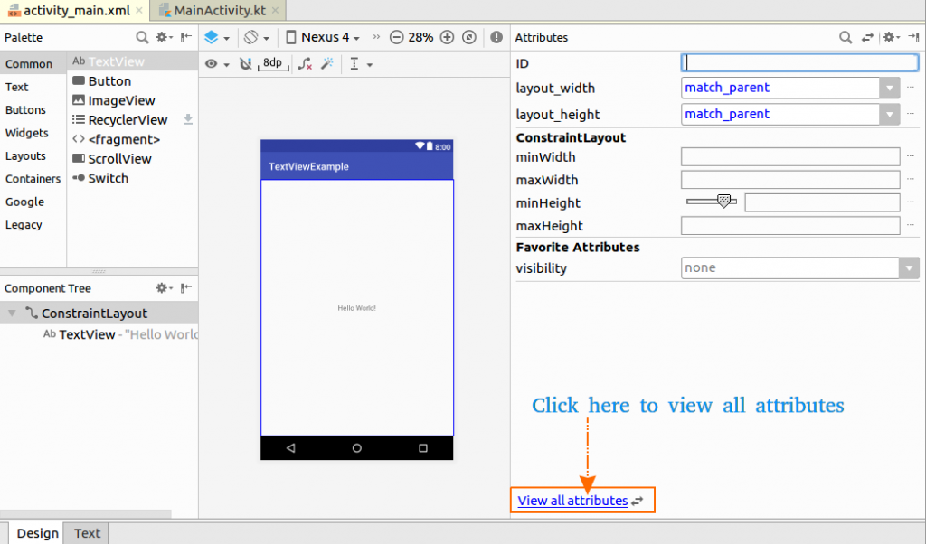
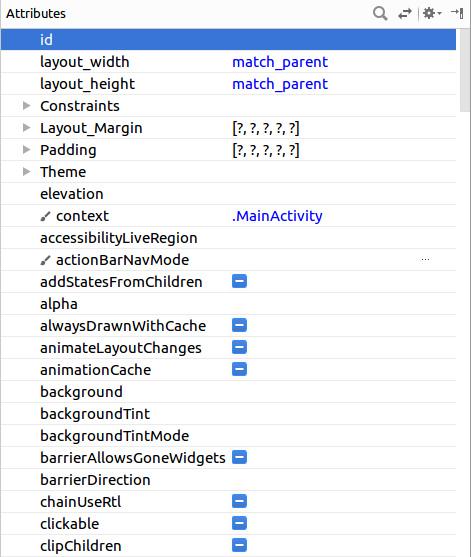
The Attributes panel lists properties supported by the selected TextView. The available controls can vary with the Android Studio version, project theme, and minimum Android version.
TextView padding, gravity, and text alignment
Padding adds space inside the TextView, between its boundaries and its text. A margin adds space outside the TextView and is configured through layout parameters. These two forms of spacing are not interchangeable.
The android:gravity attribute controls where text appears inside the TextView. The android:layout_gravity attribute, when supported by the parent layout, controls where the TextView itself is placed inside that parent. For layouts that support bidirectional text, prefer start and end over left and right.
<TextView
    android:layout_width="match_parent"
    android:layout_height="wrap_content"
    android:gravity="center"
    android:paddingStart="16dp"
    android:paddingTop="12dp"
    android:paddingEnd="16dp"
    android:paddingBottom="12dp"
    android:text="@string/welcome_message"
    android:textAlignment="viewStart" />
Multi-line TextView wrapping and ellipsis
A TextView wraps text when its available width is smaller than the rendered line. Set the width to match_parent, 0dp with suitable constraints, or another bounded size when predictable wrapping is required. A TextView using wrap_content may continue expanding until the parent layout limits it.
The following TextView displays no more than two lines and places an ellipsis at the end if additional text does not fit.
<TextView
    android:layout_width="match_parent"
    android:layout_height="wrap_content"
    android:breakStrategy="high_quality"
    android:ellipsize="end"
    android:maxLines="2"
    android:text="@string/welcome_message" />
breakStrategy affects how Android calculates line breaks and is relevant only on Android versions that support the selected strategy. Test long text with the minimum Android version used by the application.
Android TextView implementation checklist
- Confirm that every TextView has an appropriate
layout_width,layout_height, and parent-layout constraints or positioning rules. - Store user-visible TextView content in string resources instead of hard-coding it in the layout or Kotlin source.
- Use
spfor text size anddpfor TextView padding and layout dimensions. - Test long and translated text for wrapping, clipping, and ellipsis at larger system font sizes.
- Use
startandendalignment values so TextView layouts can adapt to left-to-right and right-to-left languages. - Verify that text and background colors remain readable in each supported theme, including dark mode.
- Use an ID only when the TextView must be referenced by Kotlin code, another XML view, or a test.
Android TextView questions and answers
What is a TextView in Android?
A TextView is an Android UI widget that displays text. It can show static text from an XML resource or text assigned dynamically from Kotlin code.
How do I set TextView text in Kotlin?
Obtain the TextView through View Binding or findViewById(), and then assign a value to its text property. For user-visible text, use getString(R.string.resource_name).
What is the difference between TextView padding and margin?
Padding is the space inside a TextView between its text and boundaries. A margin is the space outside the TextView between the view and surrounding elements.
How can I limit an Android TextView to two lines?
Set android:maxLines="2". Add android:ellipsize="end" when an ellipsis should indicate that additional text has been truncated.
When should I use EditText instead of TextView?
Use TextView when the application displays text that the user does not need to edit. Use EditText, or a suitable Material text-input component, when the user must enter or modify text.
Summary of the Kotlin Android TextView example
In this Kotlin Android Tutorial, we used a TextView in an XML layout, accessed it from Kotlin, updated its text at runtime, and reviewed attributes for text appearance, padding, alignment, wrapping, and line limits.