 TutorialKart.com
Floating Label in Android EditText Using TextInputLayout
A floating label identifies an input field while the user enters or reviews text. In an Android Views layout, place a TextInputEditText or EditText inside TextInputLayout and assign the label through the parent layout’s android:hint attribute.
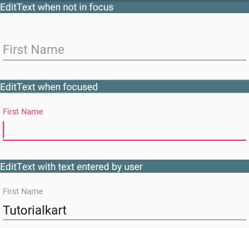
When the field is empty and inactive, the hint appears within the input area. It moves above the input when the field receives focus or contains text. The label therefore remains visible after the user enters a value and moves to another field.
The following screenshot shows three input fields in different states, including an empty field, a focused field, and a field containing text.
Current Material TextInputLayout Floating Label Setup
Current Android projects use com.google.android.material.textfield.TextInputLayout from the Material Components library. Use TextInputEditText as its child so the input field integrates with the label, error, helper text, counter, and end-icon behavior supplied by TextInputLayout.
Make sure the Material Components dependency is available in the app module and that the application uses a compatible Material theme. If the project uses a Gradle version catalog, the dependency may already appear as implementation(libs.material).
Add the Material namespace and define the floating label on TextInputLayout:
<com.google.android.material.textfield.TextInputLayout
    android:id="@+id/firstNameLayout"
    style="@style/Widget.MaterialComponents.TextInputLayout.OutlinedBox"
    android:layout_width="match_parent"
    android:layout_height="wrap_content"
    android:hint="First name">

    <com.google.android.material.textfield.TextInputEditText
        android:id="@+id/firstName"
        android:layout_width="match_parent"
        android:layout_height="wrap_content"
        android:inputType="textPersonName"
        android:maxLines="1" />

</com.google.android.material.textfield.TextInputLayout>
The android:hint value is the label. The OutlinedBox style draws an outline around the field, while the floating behavior is managed by TextInputLayout.
Floating Label and Placeholder Text in the Same EditText
A label and a placeholder serve different purposes. The floating label identifies the field, while placeholder text can show an example or expected format after the label moves above the field.
Use android:hint for the floating label and app:placeholderText for the example value:
<com.google.android.material.textfield.TextInputLayout
    android:id="@+id/emailLayout"
    style="@style/Widget.MaterialComponents.TextInputLayout.OutlinedBox"
    android:layout_width="match_parent"
    android:layout_height="wrap_content"
    android:hint="Email address"
    app:placeholderText="name@example.com">

    <com.google.android.material.textfield.TextInputEditText
        android:id="@+id/emailEditText"
        android:layout_width="match_parent"
        android:layout_height="wrap_content"
        android:inputType="textEmailAddress"
        android:maxLines="1" />

</com.google.android.material.textfield.TextInputLayout>
This requires the app namespace on the root layout:
xmlns:app="http://schemas.android.com/apk/res-auto"Steps to Display a Floating Label in Legacy EditText Code
The original example below uses the retired Android Support Design Library. Keep this section only when maintaining an older project that still imports android.support.design. For a current project, use the com.google.android.material classes shown above.
Step 1: The original project adds the Design Support Library dependency whose version matches its Android support libraries and compile SDK configuration.
For example:
android {
    compileSdkVersion 27
    ...
}
dependencies {
    ...
    implementation 'com.android.support:design:27.1.1'
    ...
}
Step 2: Add android.support.design.widget.TextInputLayout to the XML layout and place an EditText inside it. Set the hint on TextInputLayout. The hint appears within the empty field and becomes a floating label when the field is focused or contains text.
<android.support.design.widget.TextInputLayout
    android:layout_width="match_parent"
    android:layout_height="wrap_content"
    android:hint="First Name">
    <EditText
        android:id="@+id/firstName"
        android:layout_width="match_parent"
        android:layout_height="wrap_content"/>
</android.support.design.widget.TextInputLayout>
Legacy Kotlin Floating Label Example with Two EditText Fields
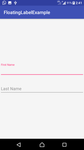
This original Kotlin Android application contains two TextInputLayout widgets. Moving focus between them demonstrates how an empty hint becomes a floating label and how a label remains above a field containing text.
activity_main.xml
<?xml version="1.0" encoding="utf-8"?>
<LinearLayout xmlns:android="http://schemas.android.com/apk/res/android"
    xmlns:tools="http://schemas.android.com/tools"
    android:orientation="vertical"
    android:gravity="center"
    android:background="#F5F5F5"
    android:layout_width="match_parent"
    android:layout_height="match_parent"
    tools:context=".MainActivity">
    <android.support.design.widget.TextInputLayout
        android:layout_width="match_parent"
        android:layout_height="wrap_content"
        android:paddingBottom="20sp"
        android:hint="First Name">
        <EditText
            android:id="@+id/firstName"
            android:layout_width="match_parent"
            android:layout_height="wrap_content"/>
    </android.support.design.widget.TextInputLayout>
    <android.support.design.widget.TextInputLayout
        android:layout_width="match_parent"
        android:layout_height="wrap_content"
        android:hint="Last Name">
        <EditText
            android:id="@+id/lastName"
            android:layout_width="match_parent"
            android:layout_height="wrap_content"/>
    </android.support.design.widget.TextInputLayout>
</LinearLayout>
MainActivity.kt
package com.tutorialkart.floatinglabelexample
import android.support.v7.app.AppCompatActivity
import android.os.Bundle
class MainActivity : AppCompatActivity() {
    override fun onCreate(savedInstanceState: Bundle?) {
        super.onCreate(savedInstanceState)
        setContentView(R.layout.activity_main)
    }
}
Run the application on an Android device or emulator. Select each input field and enter text to observe the label in its resting and floating states.
Read and Set Text in a TextInputEditText with Kotlin
The floating-label behavior does not change how Kotlin reads or assigns the field value. With View Binding, access the child TextInputEditText and use its text property:
// Set the value
binding.firstName.setText("Anita")

// Read the current value
val firstName = binding.firstName.text?.toString().orEmpty()
Call setText() on the child input, not on TextInputLayout. The parent manages the label and supporting UI, while the child stores the editable value.
Show Validation Errors Below the Floating Label Field
Set validation errors on TextInputLayout. This places the error message with the field instead of replacing the floating label or manually adding another TextView.
val name = binding.firstName.text?.toString()?.trim().orEmpty()

binding.firstNameLayout.error = if (name.isEmpty()) {
    "Enter your first name"
} else {
    null
}
Clearing the error by assigning null removes the old validation message after the value becomes valid.
Control TextInputLayout Floating Label Behavior
Floating labels and their animation are enabled by default. These attributes provide explicit control when a design requires different behavior:
app:hintEnabled="false"disables the floating label.app:hintAnimationEnabled="false"keeps the label behavior but disables the transition animation.app:expandedHintEnabled="false"prevents the hint from appearing in its expanded position inside an empty field.
Do not disable the label merely to imitate placeholder text. If the field needs both a persistent label and an example value, keep the label enabled and use app:placeholderText.
Floating Label EditText QA Checklist
- Verify that the current example imports
com.google.android.material.textfield.TextInputLayoutandTextInputEditText, not the retired support package. - Confirm that the floating label is assigned to the parent
TextInputLayout. - Test the field while empty, focused, populated, and unfocused to check every label state.
- Check that labels, placeholders, helper text, and errors remain distinct and readable at larger system font sizes.
- Verify that each field has a suitable
android:inputTypeand a unique, descriptive ID.
Floating Label and TextInputLayout FAQs
What is a floating label in an Android EditText?
A floating label is the field label that initially appears inside an empty input and moves above it when the field receives focus or contains text. TextInputLayout manages this behavior for its child input.
Can a TextInputLayout have different floating label and placeholder text?
Yes. Set the field label with android:hint on TextInputLayout and set the example value with app:placeholderText. The placeholder appears when the label has moved out of the input area.
How do I set text in a TextInputEditText using Kotlin?
Call setText(value) on the child TextInputEditText. To read it, use editText.text?.toString().orEmpty().
What does @+id mean in the EditText XML?
In android:id="@+id/firstName", the plus sign instructs Android to create the ID resource if it does not already exist. Kotlin code or View Binding can then use that ID to reference the input field.
Kotlin Android Floating Label Summary
Place a TextInputEditText inside Material TextInputLayout and define the field label with android:hint. Use app:placeholderText for a separate example value and set validation messages through the parent’s error property. The original support-library implementation remains above for older projects. Continue with the Kotlin Android Tutorial for related Android Views examples.