 TutorialKart.com
Custom Button Background in Kotlin Android
There is a default style for a Button in Android, but it may not fit every application theme. In this Android Tutorial, we shall create custom Button backgrounds using drawable XML resources and apply them from an Android layout used by a Kotlin Activity.
The main idea is simple: create a drawable XML file under res/drawable, define the shape, color, gradient, border, or corner radius, and set that drawable as the Button background. Kotlin code is not required for the background itself unless you want to change it at runtime.
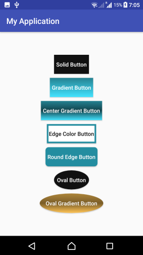
In the following screenshot will have custom Button designs that we shall create in this tutorial.
Button Background Drawable XML in Kotlin Android
Following are the steps in creating a custom background drawable for a Button in Android.
Step 1: Create a drawable xml file in /app/res/drawable/ folder. Say button_background.xml
Step 2: Mention the shape of drawable, and its properties in the xml. An example would be as shown in the following.
button_background.xml
<?xml version="1.0" encoding="utf-8"?>
<shape xmlns:android="http://schemas.android.com/apk/res/android"
    android:shape="rectangle">
    <gradient android:startColor="#777"
        android:centerColor="#000"
        android:endColor="#444"
        android:angle="90" />
    <corners android:radius="2dp" />
    <stroke android:width="6px" android:color="#cc9b0a" />
</shape>
Step 3: Create a button in the layout xml file and provide the drawable, button_background.xml as background. Example code snippet is shown in the following.
<Button
    android:layout_width="wrap_content"
    android:layout_height="wrap_content"
    android:background="@drawable/button_background"
    android:textColor="#FFFFFF"
    android:layout_margin="5dp"
    android:padding="5dp"
    android:textAllCaps="false"
    android:text="Custom Button"/>
Step 4: You may change some properties of the Button like padding, margin, textColor etc., for a proper look and to suit your application theme.
Useful Drawable XML Properties for Android Button Backgrounds
A custom Button background is usually built with a few drawable properties. Use only the properties needed for your design.
| Drawable XML property | Purpose in Button background |
|---|---|
android:shape | Sets the base shape, such as rectangle or oval. |
<solid> | Creates a single-color Button background. |
<gradient> | Creates a background with two or more colors. |
<corners> | Rounds the Button corners for a softer rectangular shape. |
<stroke> | Adds a border around the Button. |
<padding> | Defines internal spacing inside the drawable, though layout padding is often easier to manage on the Button. |
For most layouts, use dp for corner radius, border width, margins, and padding. A value in dp scales better across different screen densities than a raw pixel value.
Example Kotlin Android Application details for customizing Button Backgrounds
Following are the layout file, Activity file and drawable resources that could generate the buttons shown at the starting of the tutorial.
res/drawable/btn_solid_color.xml
<?xml version="1.0" encoding="utf-8"?>
<shape xmlns:android="http://schemas.android.com/apk/res/android"
    android:shape="rectangle" android:tint="#111">
</shape>
res/drawable/btn_gradient.xml
<?xml version="1.0" encoding="utf-8"?>
<shape xmlns:android="http://schemas.android.com/apk/res/android"
    android:shape="rectangle">
    <gradient android:startColor="#44e3ff"
        android:endColor="#258191"
        android:angle="90" />
</shape>
res/drawable/btn_center_gradient.xml
<?xml version="1.0" encoding="utf-8"?>
<shape xmlns:android="http://schemas.android.com/apk/res/android"
    android:shape="rectangle">
    <gradient android:startColor="#44e3ff"
        android:centerColor="#12434c"
        android:endColor="#258191"
        android:angle="90" />
</shape>
res/drawable/btn_edge_color.xml
<?xml version="1.0" encoding="utf-8"?>
<shape xmlns:android="http://schemas.android.com/apk/res/android"
    android:shape="rectangle">
    <gradient android:startColor="#FFFFFF"
        android:endColor="#FFFFFF"
        android:angle="90" />
    <stroke android:width="4dp" android:color="#238da0" />
</shape>
res/drawable/btn_round_edge.xml
<?xml version="1.0" encoding="utf-8"?>
<shape xmlns:android="http://schemas.android.com/apk/res/android"
    android:shape="rectangle">
    <gradient android:startColor="#FFFFFF"
        android:endColor="#FFFFFF"
        android:angle="90" />
    <stroke android:width="4dp" android:color="#238da0" />
</shape>
The file name btn_round_edge.xml suggests rounded corners. If you want visibly rounded corners, add a <corners> element to this drawable in your own project.
<corners android:radius="12dp" />res/drawable/btn_oval.xml
<?xml version="1.0" encoding="utf-8"?>
<shape xmlns:android="http://schemas.android.com/apk/res/android"
    android:shape="oval">
    <gradient android:startColor="#111"
        android:endColor="#111"
    />
</shape>
res/drawable/btn_oval_gradient.xml
<?xml version="1.0" encoding="utf-8"?>
<shape xmlns:android="http://schemas.android.com/apk/res/android"
    android:shape="oval">
    <gradient android:startColor="#ffc456"
        android:centerColor="#7a5d28"
        android:endColor="#ad853a"
        android:angle="90"
    />
</shape>
Till now are the drawable resources that we are going to use as background for buttons. You may choose only one or some of these in your project, and discard the rest. Accordingly make changes in the layout file.
You may also change the colors, or other values like stroke widths, border radius, etc., based on the requirement.
activity_custom_button.xml
<?xml version="1.0" encoding="utf-8"?>
<LinearLayout xmlns:android="http://schemas.android.com/apk/res/android"
    xmlns:tools="http://schemas.android.com/tools"
    android:layout_width="match_parent"
    android:layout_height="match_parent"
    android:orientation="vertical"
    android:gravity="center"
    tools:context="com.tutorialkart.myapplication.CustomButtonActivity">

    <Button
        android:layout_width="wrap_content"
        android:layout_height="wrap_content"
        android:background="@drawable/btn_solid_color"
        android:textColor="#FFFFFF"
        android:layout_margin="5dp"
        android:padding="5dp"
        android:textAllCaps="false"
        android:text="Solid Button"/>
    <Button
        android:layout_width="wrap_content"
        android:layout_height="wrap_content"
        android:background="@drawable/btn_gradient"
        android:textColor="#FFFFFF"
        android:layout_margin="5dp"
        android:padding="5dp"
        android:textAllCaps="false"
        android:text="Gradient Button"/>
    <Button
        android:layout_width="wrap_content"
        android:layout_height="wrap_content"
        android:background="@drawable/btn_center_gradient"
        android:textColor="#FFFFFF"
        android:layout_margin="5dp"
        android:padding="5dp"
        android:textAllCaps="false"
        android:text="Center Gradient Button"/>

    <Button
        android:layout_width="wrap_content"
        android:layout_height="wrap_content"
        android:background="@drawable/btn_edge_color"
        android:layout_margin="5dp"
        android:padding="5dp"
        android:textAllCaps="false"
        android:text="Edge Color Button"/>

    <Button
        android:layout_width="wrap_content"
        android:layout_height="wrap_content"
        android:background="@drawable/btn_round_edge"
        android:textColor="#FFFFFF"
        android:layout_margin="5dp"
        android:padding="5dp"
        android:textAllCaps="false"
        android:text="Round Edge Button"/>

    <Button
        android:layout_width="wrap_content"
        android:layout_height="wrap_content"
        android:background="@drawable/btn_oval"
        android:textColor="#FFFFFF"
        android:layout_margin="5dp"
        android:padding="5dp"
        android:textAllCaps="false"
        android:text="Oval Button"/>

    <Button
        android:layout_width="wrap_content"
        android:layout_height="wrap_content"
        android:background="@drawable/btn_oval_gradient"
        android:textColor="#FFFFFF"
        android:layout_margin="5dp"
        android:padding="15dp"
        android:textAllCaps="false"
        android:text="Oval Gradient Button"/>

</LinearLayout>
CustomButtonActivity.kt
package com.tutorialkart.myapplication

import android.support.v7.app.AppCompatActivity
import android.os.Bundle

class CustomButtonActivity : AppCompatActivity() {

    override fun onCreate(savedInstanceState: Bundle?) {
        super.onCreate(savedInstanceState)
        setContentView(R.layout.activity_custom_button)
    }
}
Why the Kotlin Activity Does Not Need Button Background Code
The Button backgrounds in this example are applied from XML using android:background. Therefore, CustomButtonActivity.kt only loads the layout with setContentView(). This keeps visual styling in drawable and layout resources, while Kotlin remains focused on screen behavior.
If your app changes Button style after a user action, you can set the background from Kotlin. For example, you can apply a drawable resource using setBackgroundResource().
val button = findViewById<Button>(R.id.my_button)
button.setBackgroundResource(R.drawable.btn_gradient)
Pressed State Background for a Custom Android Button
A real Button should give visual feedback when it is pressed. You can use a selector drawable to use one background while the Button is pressed and another background in the normal state.
res/drawable/btn_custom_selector.xml
<?xml version="1.0" encoding="utf-8"?>
<selector xmlns:android="http://schemas.android.com/apk/res/android">
    <item
        android:state_pressed="true"
        android:drawable="@drawable/btn_center_gradient" />

    <item android:drawable="@drawable/btn_gradient" />
</selector>
Then set the selector as the Button background.
android:background="@drawable/btn_custom_selector"Custom Button Background Not Showing in Android
If your custom Button background does not appear as expected, check these points before changing the Kotlin code.
- Confirm that the drawable file is saved under
app/src/main/res/drawable. - Use the drawable name without the
.xmlextension, for example@drawable/btn_gradient. - Check that the XML file has no invalid color value or missing closing tag.
- If the Button text is not readable, change
android:textColorto contrast with the background. - If your project theme tints buttons automatically, clear the background tint for that Button.
For projects where the theme applies a tint over the Button background, the following attribute is often enough for a normal Android Button.
android:backgroundTint="@null"If you are using Material Components, prefer configuring a MaterialButton with Material attributes instead of forcing an old-style background on every button. Use one approach consistently within the same screen.
Run this application, and you would get the following output on your Android Screen.
FAQs on Custom Button Background in Kotlin Android
How do I create a custom design for Button background in Kotlin Android?
Create a drawable XML file in res/drawable, define the Button shape and colors, and set it on the Button using android:background="@drawable/your_file_name". The Kotlin Activity can simply load the layout unless the background must change at runtime.
Can I make a rounded Button background using drawable XML?
Yes. Use a rectangle <shape> and add <corners android:radius="12dp" />. Increase or decrease the radius based on how rounded the Button should appear.
How do I add a border to an Android Button background?
Add a <stroke> element inside the drawable XML. Set android:width for the border thickness and android:color for the border color.
Why is my custom Button background color not visible?
The Button may be tinted by the app theme, the drawable may be in the wrong resource folder, or the layout may be referencing the wrong drawable name. Check the drawable path, XML validity, and any background tint applied by the theme.
Can I use the same drawable background for multiple Buttons?
Yes. A drawable resource can be reused on any number of Buttons. Reusing one drawable also helps keep the screen design consistent.
QA Checklist for Kotlin Android Button Background Tutorial
- The drawable XML files are placed in
res/drawableand referenced without the.xmlextension. - Each Button uses the correct
android:backgroundvalue for the intended drawable. - Button text color has enough contrast against solid, gradient, and bordered backgrounds.
- Rounded Button examples include a
<corners>element where rounded corners are expected. - Pressed-state behavior is explained with a selector drawable, not only with a static shape.
- The Kotlin Activity is kept minimal because the Button background is defined in XML resources.
- Troubleshooting covers common issues such as wrong resource names, theme tinting, and unreadable text.
Conclusion
In this Kotlin Android Tutorial, we have learnt how to set custom backgrounds to Button widget in Android using Kotlin. We created drawable XML resources for solid, gradient, bordered, rounded, oval, and selector-based Button backgrounds, and applied them from the layout XML.