 TutorialKart.com
TopAppBar
TopAppBar is a bar that is placed at the top of screen. TopAppBar can be used to display information like title related to the current screen in the application. Also, TopAppBar can display actions, if any, related to the current screen.
The following code is the definition of TopAppBar.
fun TopAppBar(
    title: @Composable () -> Unit,
    modifier: Modifier = Modifier,
    navigationIcon: @Composable (() -> Unit)? = null,
    actions: @Composable RowScope.() -> Unit = {},
    backgroundColor: Color = MaterialTheme.colors.primarySurface,
    contentColor: Color = contentColorFor(backgroundColor),
    elevation: Dp = AppBarDefaults.TopAppBarElevation
)
where
| Parameter | Description |
|---|---|
title | This Unit/Composable is displayed in the center of the TopAppBar. |
modifier | This Modifier object is applied to this TopAppBar. |
navigationIcon | This navigation icon, which should be either IconButton or IconToggleButton, is displayed at the start of this TopAppBar |
actions | These actions, where each of them is an IconButton, are displayed in a Row at the end of this TopAppBar. |
backgroundColor | This Color is applied to the background of this TopAppBar. |
contentColor | This Color is applied to the children on this TopAppBar. |
elevation | This elevation value is applied to this TopAppBar. |
Except title, other parameters are optional.
Example
Let us create a simple TopAppBar with just a Text composable for title parameter.
In the following example, we will display a Scaffold in the screen.
We shall create a composable function MyTopAppBar() that contains TopAppBar.
For the topBar parameter of the Scaffold, we will give MyTopAppBar which displays our TopAppBar.
Create a Project in Android Studio with Empty Compose Activity template, and modify MainActivity.kt file as shown in the following.
MainActivity.kt
package com.example.myapplication
import android.os.Bundle
import androidx.activity.compose.setContent
import androidx.appcompat.app.AppCompatActivity
import androidx.compose.material.Scaffold
import androidx.compose.material.Text
import androidx.compose.material.TopAppBar
import androidx.compose.runtime.Composable
import com.example.myapplication.ui.theme.MyApplicationTheme
class MainActivity : AppCompatActivity() {
override fun onCreate(savedInstanceState: Bundle?) {
super.onCreate(savedInstanceState)
setContent {
MyApplicationTheme {
Scaffold(
topBar = { MyTopAppBar() }
) {
//content
}
}
}
}
}
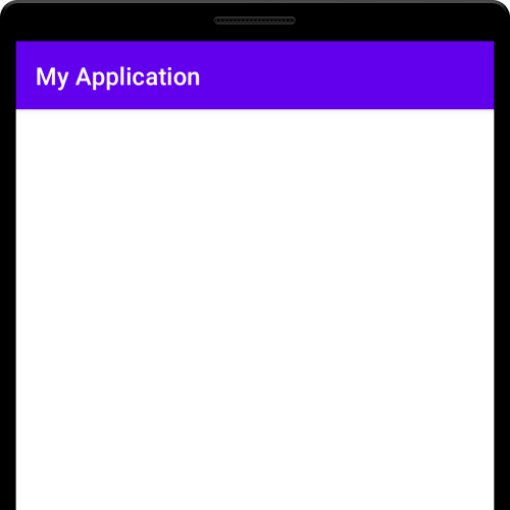
@Composable
fun MyTopAppBar(){
TopAppBar(
title = { Text("My Application")},
)
}Screenshot
Instead of a Scaffold, we can also display it as a first unit in our application, as shown in the following example.
MainActivity.kt
package com.example.myapplication

import android.os.Bundle
import androidx.activity.compose.setContent
import androidx.appcompat.app.AppCompatActivity
import androidx.compose.foundation.layout.Column
import androidx.compose.material.Text
import androidx.compose.material.TopAppBar
import androidx.compose.runtime.Composable

import com.example.myapplication.ui.theme.MyApplicationTheme

class MainActivity : AppCompatActivity() {
    override fun onCreate(savedInstanceState: Bundle?) {
        super.onCreate(savedInstanceState)
        setContent {
            MyApplicationTheme {
                Column {
                    TopAppBar(
                        title = { Text("My Application")},
                    )
                }
            }
        }
    }
}
Screenshot
TopAppBar Tutorials
The following tutorials cover different aspects of TopAppBar like actions, background color, navigation icon, etc.
Conclusion
In this Android Jetpack Compose Tutorial, we learned about TopAppBar and how to use it in our application.