 TutorialKart.com
Flutter BoxShadow
Flutter BoxShadow class is used to display a shadow cast by the widget.
Syntax
The syntax of BoxShadow() constructor with the parameters and their default values is
</>
Copy
BoxShadow({
  Color color = const Color(0xFF000000),
  Offset offset = Offset.zero,
  double blurRadius = 0.0,
  double spreadRadius = 0.0,
  BlurStyle blurStyle = BlurStyle.normal
})
where
| Parameter | Description |
|---|---|
| color | Color of the shadow. |
| offset | Displacement of the shadow along X, and Y axes. |
| blurRadius | More blur radius, more is the smoothness of shadow, and thus creates an illusion of raised effect from the background. |
| spreadRadius | Amount of shadow to be spread before blurring. |
| blurStyle | The style to be used for blurring. |
Example
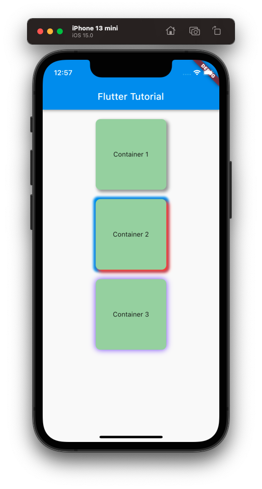
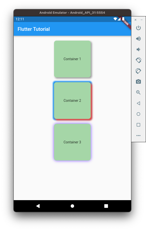
In the following example, we create a Flutter Application with three Container widgets. Each of these Container widgets are set with different box shadow properties.
We can also apply multiple box shadows, just like we applied for the second Container widget.
main.dart
</>
Copy
import 'package:flutter/material.dart';

void main() => runApp(const MyApp());

class MyApp extends StatelessWidget {
  const MyApp({Key? key}) : super(key: key);

  static const String _title = 'Flutter Tutorial';

  @override
  Widget build(BuildContext context) {
    return MaterialApp(
      title: _title,
      home: Scaffold(
        appBar: AppBar(title: const Text(_title)),
        body: const MyStatefulWidget(),
      ),
    );
  }
}

class MyStatefulWidget extends StatefulWidget {
  const MyStatefulWidget({Key? key}) : super(key: key);

  @override
  State<MyStatefulWidget> createState() => _MyStatefulWidgetState();
}

class _MyStatefulWidgetState extends State<MyStatefulWidget> {
  @override
  Widget build(BuildContext context) {
    return Center(
      child: Column(
        children: <Widget>[
          const SizedBox(height: 20,),
          Container(
            height: 150,
            width: 150,
            alignment: Alignment.center,
            decoration: BoxDecoration(
              borderRadius: BorderRadius.circular(10),
              boxShadow: const [
                BoxShadow(
                  color: Colors.grey,
                  blurRadius: 5,
                  spreadRadius: 1,
                  offset: Offset(4, 4)
                ),
              ],
              color: Colors.green[200],
            ),
            child: const Text('Container 1'),
          ),
          const SizedBox(height: 20,),
          Container(
            height: 150,
            width: 150,
            alignment: Alignment.center,
            decoration: BoxDecoration(
              borderRadius: BorderRadius.circular(10),
              boxShadow: const [
                BoxShadow(
                    color: Colors.blue,
                    blurRadius: 3,
                    spreadRadius: 5,
                    offset: Offset(0, 0)
                ),
                BoxShadow(
                    color: Colors.red,
                    blurRadius: 5,
                    spreadRadius: 1,
                    offset: Offset(5, 5)
                ),
              ],
              color: Colors.green[200],
            ),
            child: const Text('Container 2'),
          ),
          const SizedBox(height: 20,),
          Container(
            height: 150,
            width: 150,
            alignment: Alignment.center,
            decoration: BoxDecoration(
              borderRadius: BorderRadius.circular(10),
              boxShadow: const [
                BoxShadow(
                    color: Colors.deepPurpleAccent,
                    blurRadius: 10,
                    spreadRadius: 0,
                    offset: Offset(0, 0)
                ),
              ],
              color: Colors.green[200],
            ),
            child: const Text('Container 3'),
          ),
        ]
      ),
    );
  }
}
Screenshot – iPhone Simulator
Screenshot – Android Emulator
Conclusion
In this Flutter Tutorial, we learned how to use BoxShadow class to set box shadow for a widget, with examples.