 TutorialKart.com
Flutter Slider
Flutter Slider widget is used to select a value from a range of values.
Syntax
The following is a quick code snippet to that defines a Slider widget with different properties set.
Slider(
  value: sliderValue,
  min: 0,
  max: 100,
  onChanged: (double value) {
    setState(() {
      sliderValue = value;
    });
  },
  divisions: 100,
  label: '$sliderValue',
),
Simple Slider Widget
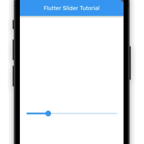
In the following example, we create a Flutter Application, with a Slider widget. Only the value, and onChanged properties are set.
onChanged property takes a function as value. The function receives the current slider value as argument.
main.dart
import 'package:flutter/material.dart';

void main() => runApp(const MyApp());

class MyApp extends StatelessWidget {
  const MyApp({Key? key}) : super(key: key);

  static const String _title = 'Flutter Slider Tutorial';

  @override
  Widget build(BuildContext context) {
    return MaterialApp(
      title: _title,
      home: Scaffold(
        appBar: AppBar(title: const Text(_title)),
        body: const MyStatefulWidget(),
      ),
    );
  }
}

class MyStatefulWidget extends StatefulWidget {
  const MyStatefulWidget({Key? key}) : super(key: key);

  @override
  State<MyStatefulWidget> createState() => _MyStatefulWidgetState();
}

class _MyStatefulWidgetState extends State<MyStatefulWidget> {
  double sliderValue = 0.2;

  @override
  Widget build(BuildContext context) {
    return Column(
      mainAxisAlignment: MainAxisAlignment.center,
        children: [
          Slider(
            value: sliderValue,
            onChanged: (double value) {
              setState(() {
                sliderValue = value;
              });
            },
          ),
        ]
    );
  }
}
Screenshot
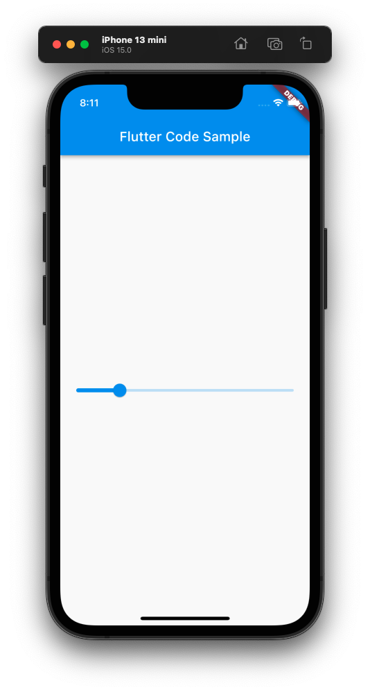
Display Slider Value in Text Widget
This example demonstrates how to use the slider value in other widgets, or how to access the slider value.
We have set the value of a Text widget with the Slider’s current value.
main.dart
import 'package:flutter/material.dart';

void main() => runApp(const MyApp());

class MyApp extends StatelessWidget {
  const MyApp({Key? key}) : super(key: key);

  static const String _title = 'Flutter Slider Tutorial';

  @override
  Widget build(BuildContext context) {
    return MaterialApp(
      title: _title,
      home: Scaffold(
        appBar: AppBar(title: const Text(_title)),
        body: const MyStatefulWidget(),
      ),
    );
  }
}

class MyStatefulWidget extends StatefulWidget {
  const MyStatefulWidget({Key? key}) : super(key: key);

  @override
  State<MyStatefulWidget> createState() => _MyStatefulWidgetState();
}

class _MyStatefulWidgetState extends State<MyStatefulWidget> {
  double sliderValue = 0.2;

  @override
  Widget build(BuildContext context) {
    return Column(
      mainAxisAlignment: MainAxisAlignment.center,
        children: [
          Slider(
            value: sliderValue,
            onChanged: (double value) {
              setState(() {
                sliderValue = value;
              });
            },
          ),
          Text('Slider Value : $sliderValue'),
        ]
    );
  }
}
Screenshot

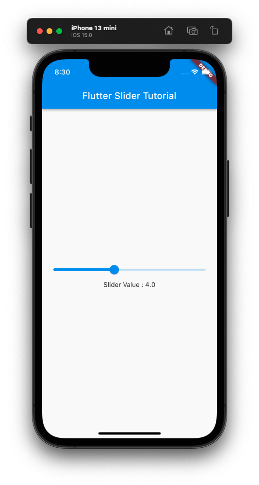
Slider with Minimum and Maximum Values
We can set the minimum and maximum values for the Slider, for selection, using min and max properties respectively.
In the following example, we have set the min property with 0, and max property with 10. So, the minimum value we can select using the Slider is 0, and the maximum value we can select using the Slider is 10.
main.dart
import 'package:flutter/material.dart';

void main() => runApp(const MyApp());

class MyApp extends StatelessWidget {
  const MyApp({Key? key}) : super(key: key);

  static const String _title = 'Flutter Slider Tutorial';

  @override
  Widget build(BuildContext context) {
    return MaterialApp(
      title: _title,
      home: Scaffold(
        appBar: AppBar(title: const Text(_title)),
        body: const MyStatefulWidget(),
      ),
    );
  }
}

class MyStatefulWidget extends StatefulWidget {
  const MyStatefulWidget({Key? key}) : super(key: key);

  @override
  State<MyStatefulWidget> createState() => _MyStatefulWidgetState();
}

class _MyStatefulWidgetState extends State<MyStatefulWidget> {
  double sliderValue = 4;

  @override
  Widget build(BuildContext context) {
    return Column(
      mainAxisAlignment: MainAxisAlignment.center,
        children: [
          Slider(
            value: sliderValue,
            min: 0,
            max: 10,
            onChanged: (double value) {
              setState(() {
                sliderValue = value;
              });
            },
          ),
          Text('Slider Value : $sliderValue'),
        ]
    );
  }
}
Screenshot
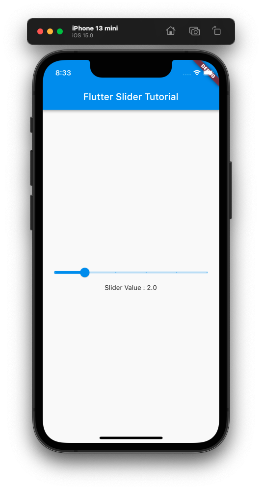
Slider with Divisions
We can set the Slider to select only discrete values using divisions property. This property takes an integer value, and makes the specified number of divisions on the Slider.
In the following example, we have set the number of divisions to 5.
main.dart
import 'package:flutter/material.dart';

void main() => runApp(const MyApp());

class MyApp extends StatelessWidget {
  const MyApp({Key? key}) : super(key: key);

  static const String _title = 'Flutter Slider Tutorial';

  @override
  Widget build(BuildContext context) {
    return MaterialApp(
      title: _title,
      home: Scaffold(
        appBar: AppBar(title: const Text(_title)),
        body: const MyStatefulWidget(),
      ),
    );
  }
}

class MyStatefulWidget extends StatefulWidget {
  const MyStatefulWidget({Key? key}) : super(key: key);

  @override
  State<MyStatefulWidget> createState() => _MyStatefulWidgetState();
}

class _MyStatefulWidgetState extends State<MyStatefulWidget> {
  double sliderValue = 4;

  @override
  Widget build(BuildContext context) {
    return Column(
      mainAxisAlignment: MainAxisAlignment.center,
        children: [
          Slider(
            value: sliderValue,
            min: 0,
            max: 10,
            onChanged: (double value) {
              setState(() {
                sliderValue = value;
              });
            },
            divisions: 5,
          ),
          Text('Slider Value : $sliderValue'),
        ]
    );
  }
}
Screenshot
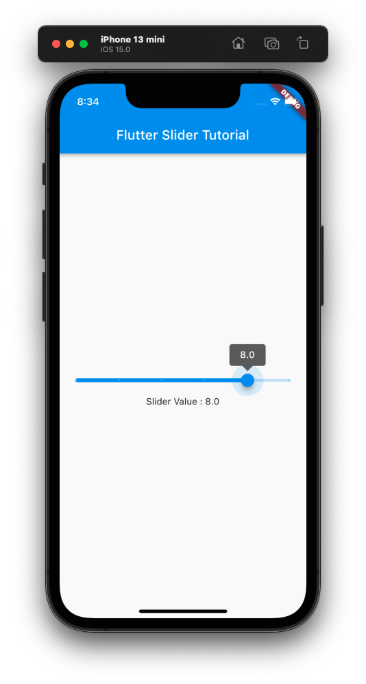
Slider with Label
A label can be displayed above the slider thumb using label property, when divisions property is set for the Slider.
In the following example, we have set the label property with the Slider value itself.
main.dart
import 'package:flutter/material.dart';

void main() => runApp(const MyApp());

class MyApp extends StatelessWidget {
  const MyApp({Key? key}) : super(key: key);

  static const String _title = 'Flutter Slider Tutorial';

  @override
  Widget build(BuildContext context) {
    return MaterialApp(
      title: _title,
      home: Scaffold(
        appBar: AppBar(title: const Text(_title)),
        body: const MyStatefulWidget(),
      ),
    );
  }
}

class MyStatefulWidget extends StatefulWidget {
  const MyStatefulWidget({Key? key}) : super(key: key);

  @override
  State<MyStatefulWidget> createState() => _MyStatefulWidgetState();
}

class _MyStatefulWidgetState extends State<MyStatefulWidget> {
  double sliderValue = 4;

  @override
  Widget build(BuildContext context) {
    return Column(
      mainAxisAlignment: MainAxisAlignment.center,
        children: [
          Slider(
            value: sliderValue,
            min: 0,
            max: 10,
            onChanged: (double value) {
              setState(() {
                sliderValue = value;
              });
            },
            divisions: 5,
            label: '$sliderValue',
          ),
          Text('Slider Value : $sliderValue'),
        ]
    );
  }
}
Screenshot
Conclusion
In this Flutter Tutorial, we learned about Slider widget, and how to use its properties to change the behaviour, with examples.