 TutorialKart.com
Flutter Icon Widget Tutorial
Flutter Icon Tutorial: In this tutorial, we will learn about Icon widget, how to use it in your Flutter application, how to change some of its properties, etc., using examples.
Icons can be used as a representative symbol for a quick understanding of the functionality, or path of the navigation, etc.
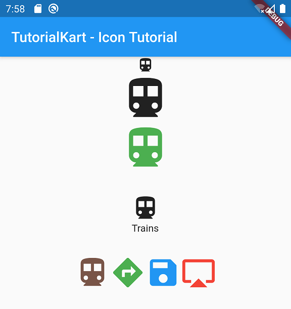
Following are the list of examples we shall discuss.
- Basic Icon widget example, with default values.
- Change Icon Size using size property.
- Change Icon Color using color property.
- Icon with a Text Label below it with the help of Column widget.
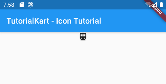
Example – A simple Icon Widget Example
This example demonstrates a Flutter Icon with just the icon specified and other properties left to default values.
You can specify the required icon as argument to Icon class. The list of all icons that come with flutter are available in Icons class. You can also use icons from assets.
Icon(Icons.directions_transit)Icon accepts IconData as argument to display the icon. Icons class IconData constants that are regularly used. You can also use codePoint with IconData class to specify the icon. Browse through icons.dart and you shall understand.
main.dart
import 'package:flutter/material.dart';

void main() => runApp(MyApp());

class MyApp extends StatelessWidget {
  // This widget is the root of your application.
  @override
  Widget build(BuildContext context) {
    return MaterialApp(
      title: 'Flutter Icon Tutorial',
      theme: ThemeData(
        primarySwatch: Colors.blue,
      ),
      home: MyHomePage(),
    );
  }
}

class MyHomePage extends StatefulWidget {
  @override
  _MyHomePageState createState() => _MyHomePageState();
}

class _MyHomePageState extends State<MyHomePage> {
  @override
  Widget build(BuildContext context) {
    return Scaffold(
      appBar: AppBar(
        title: Text('TutorialKart - Icon Tutorial'),
      ),
      body: Column(children: <Widget>[
        Center(child: Icon(Icons.directions_transit)),
      ]),
    );
  }
}
Output
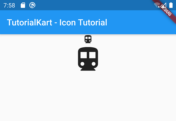
Increase the Size of Icon
You can increase the size of Icon to a required value by assigning the size property with specific double value.
Icon(
  Icons.directions_transit,
  size: 70,
)
Following is the complete code to change the size of icon.
main.dart
import 'package:flutter/material.dart';

void main() => runApp(MyApp());

class MyApp extends StatelessWidget {
  // This widget is the root of your application.
  @override
  Widget build(BuildContext context) {
    return MaterialApp(
      title: 'Flutter Icon Tutorial',
      theme: ThemeData(
        primarySwatch: Colors.blue,
      ),
      home: MyHomePage(),
    );
  }
}

class MyHomePage extends StatefulWidget {
  @override
  _MyHomePageState createState() => _MyHomePageState();
}

class _MyHomePageState extends State<MyHomePage> {
  @override
  Widget build(BuildContext context) {
    return Scaffold(
      appBar: AppBar(
        title: Text('TutorialKart - Icon Tutorial'),
      ),
      body: Column(children: <Widget>[
        //basic example
        Center(child: Icon(Icons.directions_transit)),
        //increase the size of icon
        Center(child: Icon(Icons.directions_transit, size: 70,)),
      ]),
    );
  }
}
Output
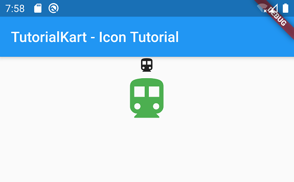
Change Color of Icon
You can change the color of Icon widget using color property. Provide a value of type Color to the color property as shown below. You can specify color using Colors class, Color.fromARGB(), Color.fromRGBO(), etc.
main.dart
import 'package:flutter/material.dart';

void main() => runApp(MyApp());

class MyApp extends StatelessWidget {
  // This widget is the root of your application.
  @override
  Widget build(BuildContext context) {
    return MaterialApp(
      title: 'Flutter Icon Tutorial',
      theme: ThemeData(
        primarySwatch: Colors.blue,
      ),
      home: MyHomePage(),
    );
  }
}

class MyHomePage extends StatefulWidget {
  @override
  _MyHomePageState createState() => _MyHomePageState();
}

class _MyHomePageState extends State<MyHomePage> {
  @override
  Widget build(BuildContext context) {
    return Scaffold(
      appBar: AppBar(
        title: Text('TutorialKart - Icon Tutorial'),
      ),
      body: Column(children: <Widget>[
        //basic example
        Center(child: Icon(Icons.directions_transit)),
        //change color of icon
        Center(child: Icon(Icons.directions_transit, color:Colors.green, size: 70,)),
      ]),
    );
  }
}
Output
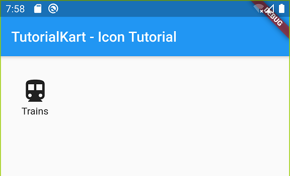
Icon with Text Label
Most of the times, you see applications with an Icon and text below it. You can build that in Flutter using a Column widget. Enclose Icon and Text widgets in Column as shown in the following code.
main.dart
import 'package:flutter/material.dart';

void main() => runApp(MyApp());

class MyApp extends StatelessWidget {
  // This widget is the root of your application.
  @override
  Widget build(BuildContext context) {
    return MaterialApp(
      title: 'Flutter Icon Tutorial',
      theme: ThemeData(
        primarySwatch: Colors.blue,
      ),
      home: MyHomePage(),
    );
  }
}

class MyHomePage extends StatefulWidget {
  @override
  _MyHomePageState createState() => _MyHomePageState();
}

class _MyHomePageState extends State<MyHomePage> {
  @override
  Widget build(BuildContext context) {
    return Scaffold(
      appBar: AppBar(
        title: Text('TutorialKart - Icon Tutorial'),
      ),
      body: Column(children: <Widget>[
        //icon with label below it
        Container(
          padding: EdgeInsets.all(30),
          child: Column(
            children: <Widget>[
              Icon(Icons.directions_transit, size: 40),
              Text('Trains')
            ],
          ),
        )
      ]),
    );
  }
}
Output
Complete Code in GitHub
You can get the complete code of the Flutter Application used in the above examples at the following link.
https://github.com/tutorialkart/flutter/tree/master/flutter_icon_tutorial.
Conclusion
In this Flutter Tutorial, we learned about Icon widget and its usage with examples for different scenarios.