 TutorialKart.com
Flutter Tooltip
In Flutter, Tooltip widget is a material design tooltip used to let user know about the functionality of a button or UI action.
When a widget is equipped with tooltip, if user long presses the widget or some appropriate action on the widget, tooltip appears as a floating label.
Tooltip is usually used to increase the accessibility of your application, providing text based clues for visual based widgets.
Example – Flutter Tooltip
To provide tooltip for a button, surround the button with Tooltip.
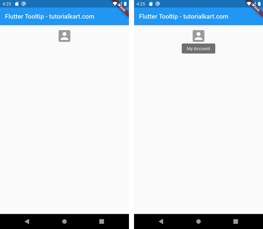
In this example application, we take a FlatButton with Icon as child, i.e., a visual object. We shall surround this button with Tooltip. So, if you long press on this button, you will see a label with the message provided for Tooltip widget.
main.dart
import 'package:flutter/material.dart';

void main() {
  runApp(MyApp());
}

class MyApp extends StatefulWidget {
  @override
  _MyAppState createState() => _MyAppState();
}

class _MyAppState extends State<MyApp> {
  @override
  Widget build(BuildContext context) {
    return MaterialApp(
      home: Scaffold(
          appBar: AppBar(
            title: Text('Flutter Tooltip - tutorialkart.com'),
          ),
          body: Center(
              child: Column(children: <Widget>[
            Container(
              margin: EdgeInsets.all(10),
              child: Tooltip(
                message: 'My Account',
                child: FlatButton(
                  child: Icon(
                    Icons.account_box,
                    size: 50,
                  ),
              )),
            ),
          ]))),
    );
  }
}
Long press on the icon to show tooltip.
Conclusion
In this Flutter Tutorial, we learned how to use Flutter Tooltip widget to provide accessibility to widgets.