 TutorialKart.com
Flutter IconButton Tutorial
Flutter IconButton acts just like a button, but with an icon instead of an usual button.
You can execute a set of statements when the IconButton is pressed using onPressed property. Also, you get the animations like splash when you click this IconButton, just like a regular button.
If you do not specify onPressed property (not even null), the IconButton is displayed as disabled button.
You get a visual feedback of a click with a splash. Following video demonstrates the splash when we tap on the IconButton.
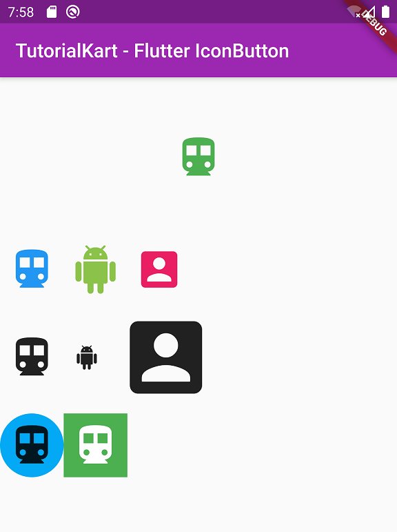
You can change many properties like size, color, background shape/color, etc. as shown in the following picture.
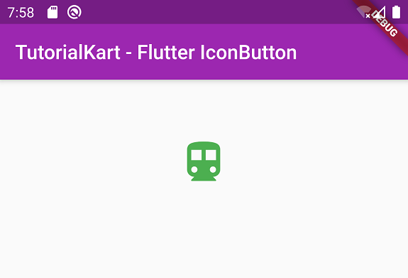
Example – Basic IconButton Example
Following is a simple example of IconButton.
main.dart
import 'package:flutter/material.dart';

void main() => runApp(MyApp());

class MyApp extends StatelessWidget {
  @override
  Widget build(BuildContext context) {
    return MaterialApp(
      title: 'TutorialKart - Flutter',
      theme: ThemeData(
        primarySwatch: Colors.purple,
      ),
      home: MyHomePage(),
    );
  }
}

class MyHomePage extends StatefulWidget {
  @override
  _MyHomePageState createState() => _MyHomePageState();
}

class _MyHomePageState extends State<MyHomePage> {
  @override
  Widget build(BuildContext context) {
    return Scaffold(
      appBar: AppBar(
        title: Text('TutorialKart - Flutter IconButton'),
      ),
      body: Column(children: <Widget>[
        Container(
          padding: EdgeInsets.all(50),
          alignment: Alignment.center,
          child: IconButton(
            icon: Icon(
              Icons.directions_transit,
            ),
            iconSize: 50,
            color: Colors.green,
            splashColor: Colors.purple,
            onPressed: () {},
          ),
        ),
      ]),
    );
  }
}
Output
Change Color of IconButton Widget in Flutter
You can change color of IconButton using color property of IconButton class.
IconButton(
  icon: Icon(
    Icons.directions_transit,
  ),
  color: Colors.green,
  onPressed: () {},
),
Change Size of IconButton Widget in Flutter
You can change the size of IconButton widget, by assigning a specific double value to iconSize property as shown below.
IconButton(
  icon: Icon(
    Icons.directions_transit,
  ),
  iconSize: 50,
  onPressed: () {},
),
Note: Do not change the size in Icon() class. This effects the center of splash and is not recommended.
Change Background of IconButton
You can change the background of IconButton by wrapping it around Ink widget as shown below.
Ink(
  decoration: const ShapeDecoration(
  color: Colors.lightBlue,
  shape: CircleBorder(),
  ),
  child: IconButton(
	icon: Icon(
	  Icons.directions_transit,
	),
	iconSize: 50,
	onPressed: () {},
  )),
Change Splash Color of IconButton
Splash color is the color that appears like an animated splash when you click the IconButton. You can change the splash color by assigning a Color to splashColor property of IconButton as shown below.
IconButton(
  icon: Icon(
    Icons.directions_transit,
  ),
  splashColor: Colors.purple,
  onPressed: () {},
),
IconButton onPressed
When you click on the IconButton, you can execute a set of statements, by writing them in function of onPressed property as shown below.
IconButton(
  icon: Icon(
    Icons.directions_transit,
  ),
  onPressed: () {
    //statements
    print('IconButton is pressed');
  },
),
Complete Code in GitHub
You can get the complete code of the Flutter Application used in the above examples at the following link.
https://github.com/tutorialkart/flutter/tree/master/flutter_iconbutton_tutorial.
Conclusion
In this Flutter Tutorial, we learned about Icon widget and its usage with examples for different scenarios.