 TutorialKart.com
Flutter FlatButton
FlatButton was a Material Design button used for low-emphasis actions in older Flutter applications. It displayed a text label without elevation and was commonly used for secondary actions such as opening another screen, changing a setting, or dismissing a dialog.
FlatButton has been depreciated. Please use TextButton instead.
The correct term is deprecated. Flutter replaced FlatButton with TextButton as part of the newer Material button API. Existing legacy code may still contain FlatButton, but new applications should use TextButton.
Flutter FlatButton Properties and Press Behavior
FlatButton does not have an elevation unlike Raised Button. Also, by default, there is no color to the button and text is black.
But you may provide color to the text and button using textColor and color respectively.
You can access the callback function onPressed() when the FlatButton is pressed.
childdefines the widget displayed inside the button, usually aTextwidget.onPressedspecifies the function executed when the user presses the button.colorsets the legacy FlatButton background color.textColorsets the color of the button label.- Setting
onPressedtonulldisables the button.
Example – Flutter FlatButton
In this example Flutter application, we have displayed a default FlatButton and then with some styling like text color and button color.
main.dart
import 'package:flutter/material.dart';

void main() {
  runApp(MyApp());
}

class MyApp extends StatefulWidget {
  @override
  _MyAppState createState() => _MyAppState();
}

class _MyAppState extends State<MyApp> {
  @override
  Widget build(BuildContext context) {
    return MaterialApp(
      home: Scaffold(
          appBar: AppBar(
            title: Text('Flutter FlatButton - tutorialkart.com'),
          ),
          body: Center(child: Column(children: <Widget>[
            Container(
              margin: EdgeInsets.all(20),
              child: FlatButton(
                child: Text('Login'),
                onPressed: () {},
              ),
            ),
            Container(
              margin: EdgeInsets.all(20),
              child: FlatButton(
                child: Text('Login'),
                color: Colors.blueAccent,
                textColor: Colors.white,
                onPressed: () {},
              ),
            ),
          ]))),
    );
  }
}
The first button uses the default FlatButton appearance. The second button uses color and textColor to display a blue background with a white label. Both callbacks are empty, so pressing either button does not perform an application action.
When you run this application, you should see UI as shown below.
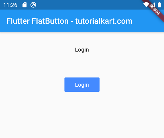
Disabled Flutter FlatButton with a Null onPressed Callback
If you do not provide onPressed() function for FlatButton, the button is displayed as a disabled button.
More precisely, a Material button is disabled when its onPressed value is null. An empty callback such as onPressed: () {} keeps the button enabled even though the callback contains no statements.
FlatButton(
  child: Text('Disabled'),
  onPressed: null,
)
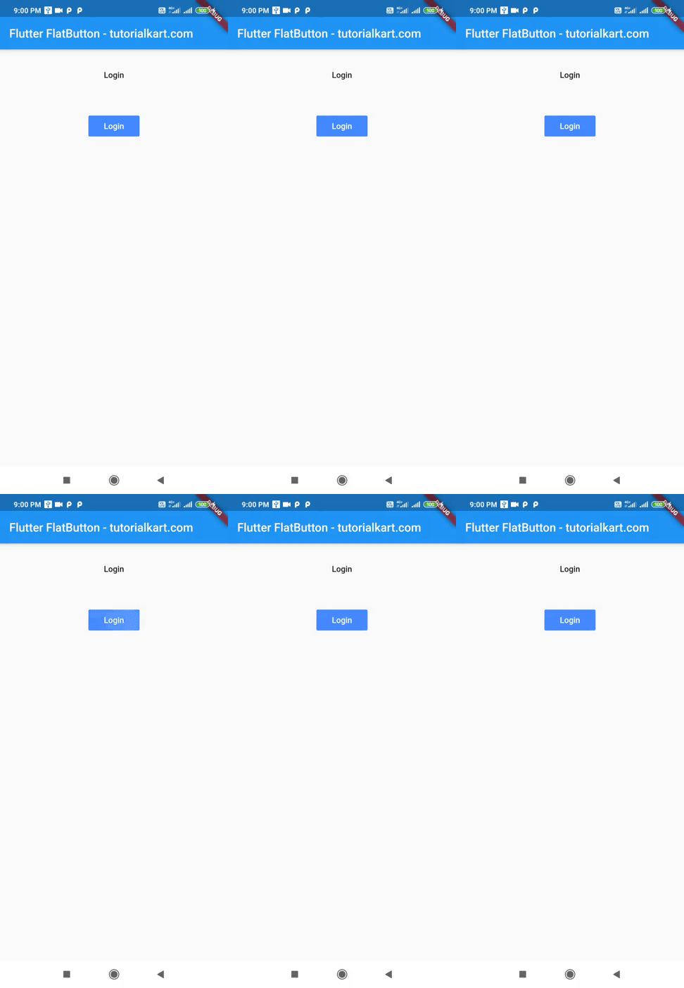
In the following GIF, you could observe the behavior of FlatButton when pressed.
Replace Flutter FlatButton with TextButton
For current Flutter projects, replace FlatButton with TextButton. The callback and child are passed in a similar way, while visual properties are configured through the button’s style.
TextButton(
  onPressed: () {
    print('Login button pressed');
  },
  child: const Text('Login'),
)
To reproduce the colored FlatButton from the earlier example, use TextButton.styleFrom() and set its background and foreground colors.
TextButton(
  style: TextButton.styleFrom(
    backgroundColor: Colors.blueAccent,
    foregroundColor: Colors.white,
  ),
  onPressed: () {
    print('Login button pressed');
  },
  child: const Text('Login'),
)
Flutter FlatButton to TextButton Property Mapping
| FlatButton property | TextButton replacement |
|---|---|
textColor | foregroundColor in TextButton.styleFrom() |
color | backgroundColor in TextButton.styleFrom() |
disabledTextColor | A disabled foreground color supplied with ButtonStyle |
padding | padding in TextButton.styleFrom() or ButtonStyle |
shape | shape in TextButton.styleFrom() or ButtonStyle |
onPressed | onPressed |
child | child |
Use TextButton.styleFrom() for straightforward styling. Use a complete ButtonStyle when the appearance must vary between states such as hovered, focused, pressed, and disabled.
Complete Flutter TextButton Replacement Example
The following current-style example creates default, colored, and disabled text buttons without using the deprecated FlatButton class.
import 'package:flutter/material.dart';

void main() {
  runApp(const MyApp());
}

class MyApp extends StatelessWidget {
  const MyApp({super.key});

  @override
  Widget build(BuildContext context) {
    return MaterialApp(
      home: Scaffold(
        appBar: AppBar(
          title: const Text('Flutter TextButton Example'),
        ),
        body: Center(
          child: Column(
            mainAxisSize: MainAxisSize.min,
            children: [
              TextButton(
                onPressed: () {},
                child: const Text('Default Login'),
              ),
              const SizedBox(height: 16),
              TextButton(
                style: TextButton.styleFrom(
                  backgroundColor: Colors.blueAccent,
                  foregroundColor: Colors.white,
                ),
                onPressed: () {},
                child: const Text('Styled Login'),
              ),
              const SizedBox(height: 16),
              const TextButton(
                onPressed: null,
                child: Text('Disabled Login'),
              ),
            ],
          ),
        ),
      ),
    );
  }
}
Common Flutter FlatButton Migration Issues
- FlatButton is undefined: The installed Flutter SDK no longer provides the old API. Replace it with
TextButton. - color or textColor is not accepted: These FlatButton arguments are not direct TextButton arguments. Move them into
TextButton.styleFrom(). - The button appears disabled: Check whether
onPressedisnull. - The button has an unexpected size: Review its padding, minimum size, parent constraints, and surrounding layout widgets.
- The callback does nothing: An empty function enables the button but performs no action. Add the required navigation, state update, or method call inside the callback.
Flutter FlatButton Questions
Why is FlatButton deprecated in Flutter?
Flutter replaced FlatButton with TextButton as part of a revised Material button API. The newer API provides a consistent styling system across text, outlined, and elevated buttons.
What is the replacement for FlatButton?
Use TextButton for the closest equivalent. It is intended for low-emphasis actions that do not require a raised appearance.
How do I set a TextButton background color?
Assign a style created with TextButton.styleFrom() and set its backgroundColor. Use foregroundColor for the label and icon color.
How do I disable a FlatButton or TextButton?
Set onPressed to null. Flutter then applies the disabled visual state and prevents press callbacks.
Flutter FlatButton Tutorial Summary
In this Flutter Tutorial, we learned how legacy FlatButton widgets handled labels, colors, callbacks, and disabled states. For current Flutter code, use TextButton and configure its appearance with TextButton.styleFrom() or ButtonStyle.