 TutorialKart.com
Flutter RaisedButton
RaisedButton was a Material Design button used in older Flutter applications. It displayed a button above the interface surface with elevation and a visible shadow, making it suitable for prominent actions such as submitting a form, saving changes, or continuing to the next screen.
RaisedButton is depreciated. Please refer ElevatedButton to display a button.
The correct term is deprecated. New Flutter applications should use ElevatedButton instead of RaisedButton. The legacy examples on this page remain useful when maintaining or migrating older Flutter code.
Flutter RaisedButton Properties and Callbacks
You can set many properties of RaisedButton like text color, button color, color of button when disabled, animation time, shape, elevation, padding, etc.
The most commonly used legacy RaisedButton properties include:
childspecifies the widget shown inside the button, usually aTextorRowwidget.colorsets the button background color.textColorsets the label and icon color.disabledColoranddisabledTextColorcontrol the disabled appearance.elevationcontrols the size of the button shadow in its normal state.highlightElevationcontrols elevation while the button is pressed.paddingadds space around the child widget.shapedefines the border and corner shape.splashColorcontrols the ink splash color shown after a press.
You can also disable the button using enabled property.
RaisedButton does not have a separate enabled property. Its enabled state is determined by its callbacks. The button is enabled when either onPressed or onLongPress contains a callback, and it is disabled when both are null.
There are callback functions:
- onPressed() is triggered when user presses this button.
- onLongPress() is triggered when user long presses on this button.
Please note that Raised button shall be in disabled state if both onPressed() and onLongPress() callbacks are not provided. In this state, any properties applied to the button are not effective.
State-specific properties can still affect a disabled button. For example, disabledColor and disabledTextColor can be used to customize its disabled appearance.
Example – Flutter RaisedButton
In this example, we shall build a Flutter Application with many raised buttons. Each of them shall demonstrate a property of RaisedButton. Only some of the properties are discussed here. You may explore RaisedButton documentation to discover all of its properties.
main.dart
import 'package:flutter/material.dart';

void main() {
  runApp(MyApp());
}

class MyApp extends StatefulWidget {
  @override
  _MyAppState createState() => _MyAppState();
}

class _MyAppState extends State<MyApp> {
  @override
  Widget build(BuildContext context) {
    return MaterialApp(
      home: Scaffold(
          appBar: AppBar(
            title: Text('Flutter RaisedButton - tutorialkart.com'),
          ),
          body: Center(
            child: Column(children: <Widget>[
              Text(
                'Raised Buttons with Different Properties',
                style: TextStyle(fontSize: 16),
              ),
              RaisedButton(child: Text('Disabled Button')),
              RaisedButton(
                child: Text('Default Enabled'),
                onPressed: () {},
              ),
              RaisedButton(
                child: Text('Text Color Changed'),
                textColor: Colors.red,
                onPressed: () {},
              ),
              RaisedButton(
                child: Text('Color Changed'),
                color: Colors.green,
                onPressed: () {},
              ),
              RaisedButton(
                child: Text('Button with Padding'),
                padding: EdgeInsets.all(20),
                onPressed: () {},
              ),
              RaisedButton(
                child: Text('More Rounded Corners'),
                color: Colors.purpleAccent,
                shape: RoundedRectangleBorder(
                    borderRadius: BorderRadius.all(Radius.circular(16.0))),
                onPressed: () {},
              ),
              RaisedButton(
                child: Text('Elevation increased'),
                elevation: 5,
                onPressed: () {},
              ),
              RaisedButton(
                child: Text('Splash Color as red'),
                splashColor: Colors.red,
                onPressed: () {},
              ),
              RaisedButton(
                child: Text('Zero Elevation'),
                elevation: 0,
                onPressed: () {},
              ),
              RaisedButton(
                onPressed: () {},
                textColor: Colors.white,
                padding: const EdgeInsets.all(0.0),
                child: Container(
                  decoration: const BoxDecoration(
                    gradient: LinearGradient(
                      colors: <Color>[
                        Color(0xFF0D47A1),
                        Color(0xFF1976D2),
                        Color(0xFF42A5F5),
                      ],
                    ),
                  ),
                  padding: const EdgeInsets.all(10.0),
                  child: const Text('Gradient Color'),
                ),
              ),
          ]))),
    );
  }
}
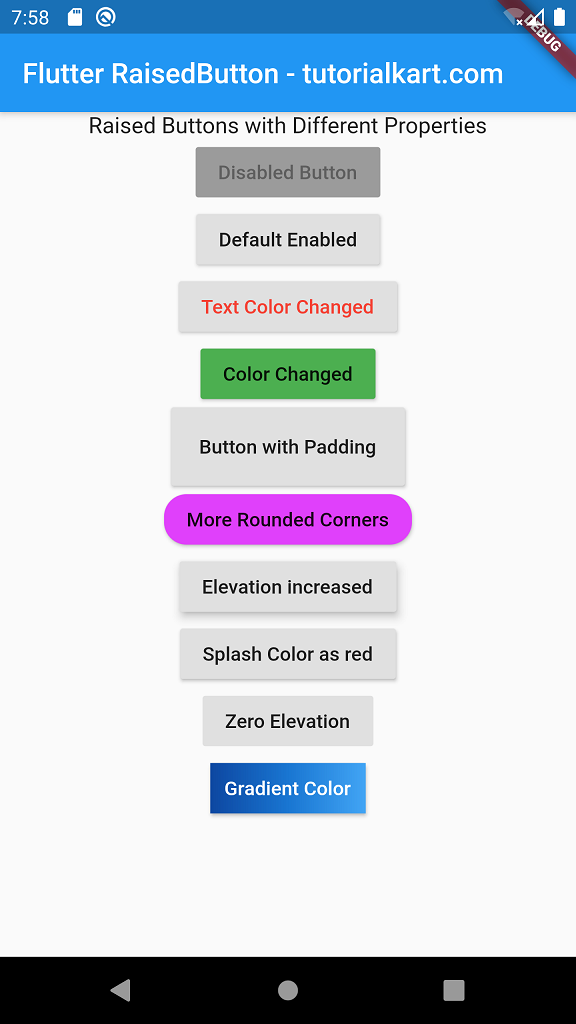
The example begins with a disabled button because it has no callback. The remaining buttons demonstrate an enabled state, label color, background color, padding, rounded corners, elevation, splash color, zero elevation, and a gradient child.
Run this application, and you should see UI similar to the following screenshot.
Enable and Disable a Flutter RaisedButton
Provide an onPressed callback to enable a RaisedButton. Set the callback to null to disable it. This pattern is useful when the button should become available only after a form is valid or a required selection has been made.
bool isFormValid = true;

RaisedButton(
  onPressed: isFormValid
      ? () {
          print('Form submitted');
        }
      : null,
  child: Text('Submit'),
)
When isFormValid is true, the callback is assigned and the button is enabled. When it is false, onPressed becomes null and Flutter displays the button in its disabled state.
Handle RaisedButton Press and Long-Press Actions
Use onPressed for a normal tap and onLongPress for an action that should run after the user holds the button. Avoid assigning destructive or unexpected behavior to a long press unless the interface clearly communicates it.
RaisedButton(
  onPressed: () {
    print('Button pressed');
  },
  onLongPress: () {
    print('Button long-pressed');
  },
  child: Text('Continue'),
)
Replace Flutter RaisedButton with ElevatedButton
ElevatedButton is the direct replacement for RaisedButton. Its onPressed and child arguments follow the same basic pattern, while visual properties are supplied through the style argument.
ElevatedButton(
  onPressed: () {
    print('Button pressed');
  },
  child: const Text('Continue'),
)
For straightforward styling, create a button style with ElevatedButton.styleFrom().
ElevatedButton(
  style: ElevatedButton.styleFrom(
    backgroundColor: Colors.green,
    foregroundColor: Colors.white,
    elevation: 5,
    padding: const EdgeInsets.all(20),
    shape: RoundedRectangleBorder(
      borderRadius: BorderRadius.circular(16),
    ),
  ),
  onPressed: () {
    print('Styled button pressed');
  },
  child: const Text('Save'),
)
RaisedButton to ElevatedButton Property Mapping
| RaisedButton property | ElevatedButton replacement |
|---|---|
color | backgroundColor in ElevatedButton.styleFrom() |
textColor | foregroundColor in ElevatedButton.styleFrom() |
disabledColor | A disabled background color supplied through ButtonStyle |
disabledTextColor | A disabled foreground color supplied through ButtonStyle |
elevation | elevation in ElevatedButton.styleFrom() or ButtonStyle |
padding | padding in ElevatedButton.styleFrom() |
shape | shape in ElevatedButton.styleFrom() |
splashColor | overlayColor in a ButtonStyle |
onPressed | onPressed |
onLongPress | onLongPress |
child | child |
Use ElevatedButton.styleFrom() when the same appearance can be applied across the button’s states. Use a complete ButtonStyle when colors, elevation, or other properties need different values for pressed, hovered, focused, and disabled states.
Complete Flutter ElevatedButton Replacement Example
The following example recreates several common RaisedButton configurations using the current ElevatedButton API.
import 'package:flutter/material.dart';

void main() {
  runApp(const MyApp());
}

class MyApp extends StatelessWidget {
  const MyApp({super.key});

  @override
  Widget build(BuildContext context) {
    return MaterialApp(
      home: Scaffold(
        appBar: AppBar(
          title: const Text('Flutter ElevatedButton Example'),
        ),
        body: Center(
          child: SingleChildScrollView(
            child: Column(
              mainAxisSize: MainAxisSize.min,
              children: [
                const ElevatedButton(
                  onPressed: null,
                  child: Text('Disabled Button'),
                ),
                const SizedBox(height: 12),
                ElevatedButton(
                  onPressed: () {},
                  child: const Text('Default Enabled'),
                ),
                const SizedBox(height: 12),
                ElevatedButton(
                  style: ElevatedButton.styleFrom(
                    backgroundColor: Colors.green,
                    foregroundColor: Colors.white,
                  ),
                  onPressed: () {},
                  child: const Text('Color Changed'),
                ),
                const SizedBox(height: 12),
                ElevatedButton(
                  style: ElevatedButton.styleFrom(
                    padding: const EdgeInsets.all(20),
                    elevation: 5,
                    shape: RoundedRectangleBorder(
                      borderRadius: BorderRadius.circular(16),
                    ),
                  ),
                  onPressed: () {},
                  child: const Text('Styled Button'),
                ),
              ],
            ),
          ),
        ),
      ),
    );
  }
}
Add an Icon to the ElevatedButton Replacement
When a button needs both an icon and a label, use the named ElevatedButton.icon constructor instead of manually arranging the widgets in a row.
ElevatedButton.icon(
  onPressed: () {
    print('Saved');
  },
  icon: const Icon(Icons.save),
  label: const Text('Save'),
)
Common Flutter RaisedButton Migration Problems
- RaisedButton is undefined: Replace the old widget with
ElevatedButton. - color or textColor causes an error: Move these values to
ElevatedButton.styleFrom()and usebackgroundColorandforegroundColor. - The button is disabled: Confirm that
onPressedoronLongPressis notnull. - The button does not perform an action: An empty callback enables the button but does not change the interface. Add the required navigation, method call, or state update.
- The button overflows its layout: Review its padding, minimum size, parent constraints, and whether a scrollable parent is needed.
- The disabled colors are not applied: Use state-aware values in
ButtonStylewhen the disabled appearance must differ from the enabled appearance.
Flutter RaisedButton Questions
Why is RaisedButton deprecated in Flutter?
Flutter replaced RaisedButton with ElevatedButton as part of a revised Material button API. The newer API uses a consistent styling model across elevated, text, and outlined buttons.
What is the replacement for RaisedButton?
Use ElevatedButton. It provides the same general raised-button role and supports callbacks, icons, elevation, padding, colors, and state-aware styling.
How do I change the ElevatedButton background and text colors?
Pass a style created by ElevatedButton.styleFrom(). Set backgroundColor for the button surface and foregroundColor for its text and icon.
How do I disable a RaisedButton or ElevatedButton?
Set both press callbacks to null. In most cases, this means setting onPressed: null. Flutter then prevents interaction and applies the disabled visual state.
When should I use ElevatedButton instead of TextButton?
Use ElevatedButton for an action that should have more visual emphasis and a filled, elevated surface. Use TextButton for lower-emphasis actions that do not need a prominent background.
Flutter RaisedButton Tutorial Summary
In this Flutter Tutorial, we learned how legacy RaisedButton widgets used callbacks, colors, padding, shapes, splash effects, and elevation. For current Flutter applications, use ElevatedButton and configure its appearance with ElevatedButton.styleFrom() or a state-aware ButtonStyle.