Salesforce Lightning Alert banners communicate a state that affects the entire system, not just a feature or page. It persists over a session and appears without the user initiating the action.
Alert – Accessibility
Alert notifications should contain role="alert" on the container to signal to assistive technology that they require the user’s immediate attention.
Use a span with the class slds-assistive-text to let the user know what type of notification it is.
Alert – Base
Use the info alert when notifying the user of neutral information about the system.
Alert – CSS Classes
The following table lists out the CSS classes for Lightning Alert component, their usage, and the CSS selectors that these AlertCSS classes can be used on.
| CSS Class Name | Description |
|---|---|
| slds-notify_alert | Initializes alert notification. This CSS class can be used for the elements with CSS selector div only. |
| slds-avatar__initials | Used for initials inside an avatar. This CSS class can be used for the elements with CSS selector .slds-avatar abbr only. |
| slds-alert_warning | Sets styling for warning alert notification. This CSS class can be used for the elements with CSS selector .slds-notify_alert only. |
| slds-alert_error | Sets styling for error alert notification. This CSS class can be used for the elements with CSS selector .slds-notify_alert only. |
| slds-alert_offline | Sets styling for offline alert notification. This CSS class can be used for the elements with CSS selector .slds-notify_alert only. |
| slds-notify__close | Alert close button. This CSS class can be used for the elements with CSS selector .slds-notify_alert div only. |
<aura:component>
    <div class="slds-notify slds-notify_alert" role="alert">
        <span class="slds-assistive-text">info</span>
        <span class="slds-icon_container slds-icon-utility-user slds-m-right_x-small" title="Description of icon when needed">
            <svg class="slds-icon slds-icon_x-small" aria-hidden="true">
                <span xlink:href="/assets/icons/utility-sprite/svg/symbols.svg#user"></span>
            </svg>
        </span>
        <h2>Logged in as Tutorislkart (tutorialkart@tk.com).
            <a href="#">Log out</a>
        </h2>
        <div class="slds-notify__close">
            <button class="slds-button slds-button_icon slds-button_icon-small slds-button_icon-inverse" title="Close">
                <svg class="slds-button__icon" aria-hidden="true">
                    <span xlink:href="/assets/icons/utility-sprite/svg/symbols.svg#close"></span>
                </svg>
                <span class="slds-assistive-text">Close</span>
            </button>
        </div>
    </div>
</aura:component>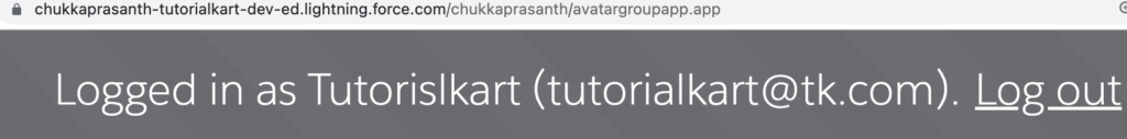
Alert – Variations
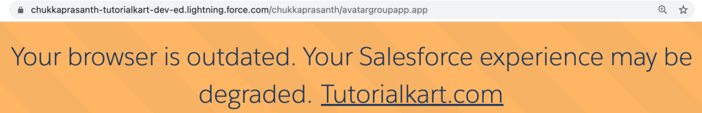
Alert – Warning
Use the warning variant to warn the user about important system information that deserves caution.
<div class="slds-notify slds-notify_alert slds-alert_warning" role="alert">
  <span class="slds-assistive-text">warning</span>
  <span class="slds-icon_container slds-icon-utility-warning slds-m-right_x-small" title="Description of icon when needed">
    <svg class="slds-icon slds-icon_x-small" aria-hidden="true">
      <use xlink:href="/assets/icons/utility-sprite/svg/symbols.svg#warning"></use>
    </svg>
  </span>
  <h2>Your browser is outdated. Your Salesforce experience may be degraded.
    <a href="https://www.tutorialkart.com">Tutorialkart.com</a>
  </h2>
  <div class="slds-notify__close">
    <button class="slds-button slds-button_icon slds-button_icon-small" title="Close">
      <svg class="slds-button__icon" aria-hidden="true">
        <use xlink:href="/assets/icons/utility-sprite/svg/symbols.svg#close"></use>
      </svg>
      <span class="slds-assistive-text">Close</span>
    </button>
  </div>
</div>